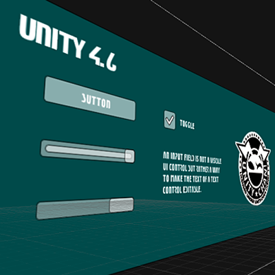
Unity 4.6|UIコンポーネントプロパティ一覧
2014.08.29
この記事は公開されてから1年以上経過しています。情報が古い可能性がありますので、ご注意ください。

Rect Transform
| Property | Funtion |
| Pos (X, Y and Z) | Position of the rectangle’s pivot point relative to the anchors. |
| Width/Height | Width and height of the rectangle. |
| Left, Top, Right, Bottom | Positions of the rectangle’s edges relative to their anchors. This can be thought of as padding inside the rectangle defined by the anchors. Shown in place of Pos and Width/Height when the anchors are separated (see below). |
| Anchors Min | The anchor point for the lower left corner of the rectangle defined as a fraction of the size of the parent rectangle. 0,0 corresponds to anchoring to the lower left corner of the parent, while 1,1 corresponds to anchoring to the upper right corner of the parent. |
| Anchors Max | The anchor point for the upper right corner of the rectangle defined as a fraction of the size of the parent rectangle. 0,0 corresponds to anchoring to the lower left corner of the parent, while 1,1 corresponds to anchoring to the upper right corner of the parent. |
| Pivot | Location of the pivot point around which the rectangle rotates, defined as a fraction of the size of the rectangle itself. 0,0 corresponds to the lower left corner while 1,1 corresponds to the upper right corner. |
| Rotation | Angle of rotation (in degrees) of the object around its pivot point along the X, Y and Z axis. |
| Scale | Scale factor applied to the object in the X, Y and Z dimensions. |
Canvas Components
Canvas
| Property | Funtion |
| Render Mode | The way the UI is rendered to the screen or as an object in 3D space (see below). The options are Screen Space - Overlay, Screen Space - Camera and World Space. |
| Pixel Perfect (Screen Space modes only) | Should the UI be rendered without antialiasing for precision? |
| Render Camera (Screen Space - Camera mode only) | The camera to which the UI should be rendered (see below). |
| Plane Distance (Screen Space - Camera mode only) | The distance at which the UI plane should be placed in front of the camera. |
| Event Camera (World Space mode only) | The camera that will be used to process UI events. |
| Receives Events | Are UI events processed by this Canvas? |
Canvas Group
| Property | Funtion |
| Alpha | Alpha transparency level, 0–1. |
| Interactable | Determines if this component will accept input. When it is set to false interaction is disabled. |
| Block Raycasts | Will this component act as a collider for Raycasts? |
Canvas Renderer
| Property | Funtion |
| N/A | The Canvas Renderer has no properties exposed in the inspector. |
Reference Resolution
| Property | Funtion |
| Script | ReferenceResolution |
| Resolution | X, Y |
| Match Width or Height | - |
Physical Resolution
| Property | Funtion |
| Script | PhysicalResolution |
| Unit | Units used, Centimeters, Millimeters, Inches, Points or Picas. |
| Default DPI | Default setting in Dots per Inch |
Visual Components
Text
| Property | Funtion |
| Text | The text displayed by the control. |
| Font | The Font used to display the text. |
| Font Style | he style applied to the text. The options are Normal, Bold, Italic and Bold And Italic. |
| Font Size | The size of the displayed text. |
| Line Spacing | The vertical separation between lines of text. |
| Rich Text | Should markup elements in the text be interpreted as Rich Text styling? |
Image
| Property | Funtion |
| Source Image | The texture that represents the image to display (which must be imported as a Sprite). |
| Color | The color to apply to the image. |
| Material | The Material to use for rendering the image. |
| Image Type | The method used to display the image. The options are Simple, Sliced, Tiled and Filled (see below). |
| Preserve Aspect (Simple and Filled Image Types only) | Should the image’s original proportions of height and width be kept rather than rescaled? |
| Fill Center (Sliced and Tiled Image Types only) | Should the center slice of the image be filled as well as the borders? |
| Fill Method (Filled Image Type only) | Specifies the way the image should “grow” to fill the space during an animation. The options are Horizontal, Vertical, Radial90, Radial180 and Radial360 (see below). |
| Fill Origin (Filled Image Type only) | The point in the image from which the fill should proceed. The options are various combinations of Bottom, Top, Left and Right, depending on which Fill Method is selected (see below). |
| Fill Amount (Filled Image Type only) | The fraction of the image (range 0.0 to 1.0) that is currently filled. |
| Clockwise (Filled Image Type only) | The fraction of the image (range 0.0 to 1.0) that is currently filled. |
| Clockwise (Filled Image Type only) | Should the fill proceed in a clockwise direction? (Radial fills only.) |
| Set Native Size | Button to set the dimensions of the image box to the original pixel size of the texture. |
Raw Image
| Property | Function |
| Texture | The texture that represents the image to display. |
| Color | The color to apply to the image. |
| Material | The Material to use for rendering the image. |
| UV Rectangle | The image’s offset and size within the control rectangle, given in normalized coordinates (range 0.0 to 1.0). The edges of the image are stretched to fill the space around the UV rectangle. |
Mask
| Property | Funtion |
| Show Graphic | Should the graphic of the masking (parent) object be drawn with alpha over the child object? |
UI Effect Components
Shadow
| Property | Funtion |
| Script | Shadow |
| Effect Color | - |
| Effect Distance | X, Y |
Outline
| Property | Funtion |
| Script | Outline |
| Effect Color | - |
| Effect Distance | X, Y |
Position as UV1
| Property | Funtion |
| Script | PositionAsUV1 |
Interaction Components
Selectable Base Class
| Property | Funtion |
| Interactible | This determines if this component will accept input. When it is set to false interaction is disabled and the transition state will be set to the disabled state. |
| Transition | Within a selectable component there are several Transition Options depending on what state the selectable is currently in. The different states are: normal, highlighted, pressed and disabled. |
| Navigation | There are also a number of Navigation Options to control how keyboard navigation of the controls is implemented. |
| Property | Funtion |
| Color Tint | Changes the colour of the button depending on what state it is in, it is possible to select the colour for each individual state. It is also possible to set the Fade Duration between the different states. The higher the number is, the slower the fade between colors will be. |
| SpriteSwap | Allows different sprites to display depending on what state the button is currently in, the sprites can be customised. |
| Animation | Allows animations to occur depending on the state of the button, an animator component must exist in order to use animation transition. It’s important to make sure root motion is disabled. To create an animation controller click on generate animation (or create your own) and make sure that an animation controller has been added to the animator component of the button. |
| None | This option is for the button to have no state effects at all. |
| Property | Funtion |
| Navigation | The Navigation options refers to how the navigation of uGUI elements in play mode will be controlled. |
| None | No keyboard navigation |
| Horizontal | Navigates Horizontally |
| Vertical | Navigates Vertically |
| Automatic | Automatic Navigation |
| Explicit | In this mode you can explicitly specify where the control navigates to for different arrow keys. |
| Visualize | Selecting Visualize gives you a visual representation of the navigation you have set up in the scene window. See below. |
Button
| Property | Funtion |
| Interactable | Will this component will accept input? See Interactable. |
| Transition | Properties that determine the way the control responds visually to user actions. See Transition Options. |
| Navigation | Properties that determine the sequence of controls. See Navigation Options. |
Events
| Event | Funtion |
| On Click | Handles the button’s response when a user clicks and releases it. |
Toggle
| Property | Funtion |
| Interactable | Will this component will accept input? See Interactable. |
| Transition | Properties that determine the way the control responds visually to user actions. See Transition Options. |
| Navigation | Properties that determine the sequence of controls. See Navigation Options. |
| Active | Does the toggle initally have the “enabled” value? |
| Toggle Transition | The way the toggle reacts graphically when its value is changed. The options are None (ie, the checkmark simply appears or disappears) and Fade (ie, the checkmark fades in or out). |
| Graphic | The image used for the checkmark. |
| Group | The Toggle Group (if any) that this Toggle belongs to. |
Events
| Event | Funtion |
| On Value Changed | Handles the toggle’s response when its value is changed. |
Toggle Group
| Property | Funtion |
| N/A | The Toggle Group has no properties. |
Slider
| Property | Funtion |
| Interactable | Will this component will accept input? See Interactable. |
| Transition | Properties that determine the way the control responds visually to user actions. See Transition Options. |
| Navigation | Properties that determine the sequence of controls. See Navigation Options. |
| Fill Rect | The graphic used for the fill area of the control. |
| Handle Rect | The graphic used for the sliding “handle” part of the control. |
| Direction | The direction in which the slider’s value will increase when the handle is dragged. The options are Left To Right, Right To Left, Bottom To Top and Top To Bottom. |
| Min Value | The value of the slider when the handle is at its extreme lower end (determined by the Direction property). |
| Max Value | The value of the slider when the handle is at its extreme upper end (determined by the Direction property). |
| Whole Numbers | Should the slider be constrained to integer values? |
| Value | Current numeric value of the slider. If the value is set in the inspector it will be used as the initial value, but this will change at runtime when the value changes. |
Events
| Event | Funtion |
| On Value Changed | Called whenever the slider’s numeric value changes as a result of dragging. The value is passed to the responding function as a float type regardless of whether the Whole Numbers property is enabled. |
Scrollbar
| Property | Will this component will accept input? See Interactable. |
| Transition | Properties that determine the way the control responds visually to user actions. See Transition Options. |
| Navigation | Properties that determine the sequence of controls. See Navigation Options. |
| Fill Rect | The graphic used for the background area of the control. |
| Handle Rect | The graphic used for the sliding “handle” part of the control |
| Direction | The direction in which the Scrollbar’s value will increase when the handle is dragged. The options are Left To Right, Right To Left, Bottom To Top and Top To Bottom. |
| Value | Initial position value of the Scrollbar, in the range 0.0 to 1.0. |
| Size | Fractional size of the handle within the Scrollbar, in the range 0.0 to 1.0. |
| Number Of Steps | The number of distinct scroll positions allowed by the Scrollbar. |
Events
| Event | Funtion |
| On Value Changed | Called whenever the Scrollbar’s position value changes as a result of dragging. The value is passed to the responding function as a float type. |
Scroll Rect
| Property | Funtion |
| Horizontal | Enables horizontal scrolling |
| Vertical | Enables vertical scrolling |
| Movement Type | Unrestricted, Elastic or Clamped. Use Elastic or Clamped to force the content to remain within the bounds of the Scroll Rect. Elastic mode bounces the content when it reaches the edge of the Scroll Rect |
| Elasticity | This is the amount of bounce used in the elasticity mode. |
| Inertia | When Inertia is set the content will continue to move when the pointer is released after a drag. When Inertia is not set the content will only move when dragged. |
| Deceleration Rate | When Inertia is set the deceleration rate determines how quickly the contents stop moving. A rate of 0 will stop the movement immediately. A value of 1 means the movement will never slow down. |
| Horizontal Scrollbar | Optional reference to a horizontal scrollbar element. |
| Vertical Scrollbar | Optional reference to a vertical scrollbar element. |
Input Field
| Property | Funtion |
| Text | The Text control to be made editable by this Input Field. |
| Starting Value | The initial text placed in the field before editing begins. |
| Character Limit | The maximum number of characters that the user can type into the field. |
| Active Text Color | The color of the editable text (which may be different from the color specified in the Text control). |
| Selection Color | The background color of the selected portion of text. |
| Multi Line | Should the field let the user insert line breaks with the enter/return key? |
| Interactable | Will this component will accept input? See Interactable. |
| Transition | Properties that determine the way the control responds visually to user actions. See Transition Options. |
| Navigation | Properties that determine the sequence of controls. See Navigation Options. |
Auto Layout
Content Size Fitter
| Property | Funtion |
| Horizontal Fit | Unconstrained, MinSize, PreferredSize |
| Vertical Fit | Unconstrained, MinSize, PreferredSize |
Layout Element
| Property | Funtion |
| Min Width | true, false |
| Min Height | true, false |
| Preferred Width | true, false |
| Preferred Height | true, false |
| Flexible Width | true, false |
| Flexible Height | true, false |
Horizontal Layout Group
| Property | Funtion |
| Padding | Left, Right, Top, Bottom |
| Spacing | - |
| Child Alignment | UpperLeft, UpperCenter, UpperRight, MiddleLeft, MiddleCenter, MiddleRight, LowerLeft, LowerCenter, LowerRight |
Vertical Layout Group
| Property | Funtion |
| Padding | Left, Right, Top, Bottom |
| Spacing | - |
| Child Alignment | UpperLeft, UpperCenter, UpperRight, MiddleLeft, MiddleCenter, MiddleRight, LowerLeft, LowerCenter, LowerRight |
Grid Layout Group
| Property | Funtion |
| Padding | Left, Right, Top, Bottom |
| Cell Size | - |
| Spacing | - |
| Start Corner | UpperLeft, UpperRight, LowerLeft, LowerRight |
| Start Axis | Horizontal, Vertical |
| Child Alignment | UpperLeft, UpperCenter, UpperRight, MiddleLeft, MiddleCenter, MiddleRight, LowerLeft, LowerCenter, LowerRight |

