![[iOS] Material Designの適用をサポートしてくれるライブラリ「Material Components」を試してみた](https://devio2023-media.developers.io/wp-content/uploads/2015/01/ios_ui.png)
[iOS] Material Designの適用をサポートしてくれるライブラリ「Material Components」を試してみた
この記事は公開されてから1年以上経過しています。情報が古い可能性がありますので、ご注意ください。
はじめに
こんにちは。モバイルアプリサービス部の平屋です。
Material Designの適用をサポートしてくれるライブラリ「Material Components」(iOS, Android, Web向け)が公開されたそうです。
Android/iOS/Webで Material Design が使いやすくなるライブラリ、Material Componentsが公開されましまた!https://t.co/vPtgIAoBxI
— Takuo Suzuki (@taquo) 2017年5月12日
ライブラリのソースコードはGitHubで公開されていて、このライブラリのコアメンバーはGoogleのエンジニアやUXデザイナーだそうです。
本記事では、iOSアプリ向けの「Material Components for iOS」のドキュメントやデモの内容、iOSアプリでの使用方法などを紹介します。
検証環境
- macOS Sierra Version 10.12.4
- Xcode Version 8.3.2
ドキュメント
チュートリアルなどのドキュメントやその他の資料へのリンクなどは以下のページにまとめられています。
デモアプリ
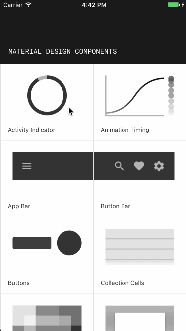
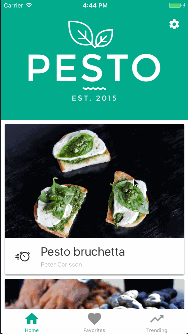
Material Components for iOSにはいくつかデモアプリが同梱されているので、各コンポーネントの見た目や動きを簡単に確認できます。
Catalog
こちらは、コンポーネントごとの使用例を確認できるデモです。
Pesto
レシピアプリのデモです。以下のコンポーネントが使われています。
- Flexible Header
- Floating Action Button
- Collections
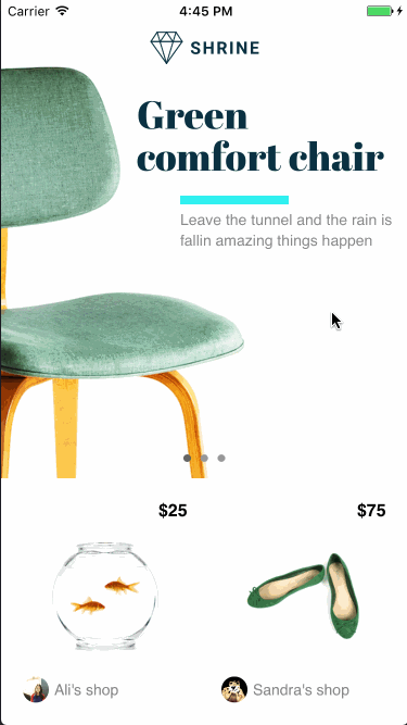
Shrine
ショッピングアプリのデモです。以下のコンポーネントが使われています。
- Flexible Header
- Custom Typography
- Collections
導入
CocoaPods を使用して導入できます。
use_frameworks!

target "MyApp" do
  pod 'MaterialComponents'
end
実装例
こちらのページによると、Material Componentsは全部で25のコンポーネントを提供します。
今回は以下の3つのコンポーネントを触ってみました。
- Collection
- Buttons
- Dialogs
Collections
このコンポーネントを使用すると、Material Designのレイアウト・スタイリングが適用されたリストを作成できます。Google製アプリの設定画面などでよく見かけますね。
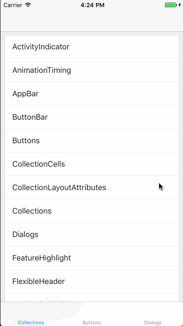
実装としては、Material Componentsが提供するMDCCollectionViewController(UICollectionViewControllerのサブクラス)を使用します。
実装方法はいくつかありますが、今回はStoryboardとコードを併用して「Collections」コンポーネントをアプリで表示させてみました。
Storyboardの設定
Storyboard上で以下の設定を行います。
- Collection View Controllerの設定
- StoryboardにCollection View Controllerを配置
- 対応するクラスを設定する
- 例:ViewController
- Collection View Controller内のCellの設定
- Cell のIDに「cell」を指定
- 対応するクラスとして「MDCCollectionViewTextCell」を設定する
ViewControllerの実装
Storyboard上に配置したCollection View Controllerに対応するクラスを実装します。
ViewControllerをMDCCollectionViewControllerのサブクラスにし、UICollectionViewDataSourceなどのメソッドを実装します。
import UIKit
import MaterialComponents.MaterialCollections

class ViewController: MDCCollectionViewController {
    let components = ["ActivityIndicator", "AnimationTiming", "AppBar", "ButtonBar", "Buttons", "CollectionCells", "CollectionLayoutAttributes", "Collections", "Dialogs", "FeatureHighlight", "FlexibleHeader", "HeaderStackView", "Ink"]

    override func viewDidLoad() {
        super.viewDidLoad()

        styler.cellStyle = .card
    }
}

// MARK: UICollectionViewDataSource
extension ViewController {
    override func collectionView(_ collectionView: UICollectionView, numberOfItemsInSection section: Int) -> Int {
        return components.count
    }

    override func collectionView(_ collectionView: UICollectionView, cellForItemAt indexPath: IndexPath) -> UICollectionViewCell {
        let cell = collectionView.dequeueReusableCell(withReuseIdentifier: "cell", for: indexPath) as! MDCCollectionViewTextCell
        cell.textLabel?.text = components[indexPath.item]
        return cell
    }
}
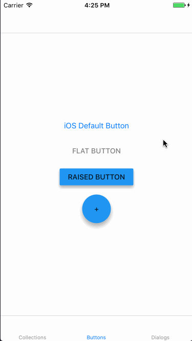
Buttons
このコンポーネントを使用すると、Material Designのスタイリングが適用されたボタンを作成できます。
Material Designの各ボタンタイプに対応するクラスが用意されています。
- Floating action button
- MDCFlatButton
- Raised button
- MDCRaisedButton
- Flat button
- MDCFloatingButton
クラスの使い分けによって、ボタンのタイプを選択できます。
各ボタンのクラスはUIButtonを継承しているので、基本的な扱い方はUIButtonと同じです。
let flatButton = MDCFlatButton()
flatButton.customTitleColor = UIColor.gray
flatButton.setTitle("Flat Button", for: .normal)
flatButton.sizeToFit()
flatButton.addTarget(self, action: #selector(SecondViewController.flatButtonDidTap), for: .touchUpInside)
stackView.addArrangedSubview(flatButton)

let raisedButton = MDCRaisedButton()
raisedButton.setElevation(4, for: .normal)
raisedButton.setTitle("Raised Button", for: .normal)
raisedButton.sizeToFit()
raisedButton.addTarget(self, action: #selector(SecondViewController.raisedButtonDidTap), for: .touchUpInside)
stackView.addArrangedSubview(raisedButton)

let floatingButton = MDCFloatingButton()
floatingButton.setTitle("+", for: .normal)
floatingButton.sizeToFit()
floatingButton.addTarget(self, action: #selector(SecondViewController.floatingButtonDidTap), for: .touchUpInside)
stackView.addArrangedSubview(floatingButton)
上記実装の動作結果は以下のようになりました。1番上のボタンは単なるUIButtonです。
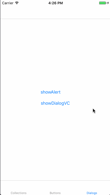
Dialogs
このコンポーネントを使用すると、Material Designのスタイリングが適用されたダイアログを作成できます。
Alert Controller
このコンポーネントはユーザーの承認を必要とする場合などに使用します。
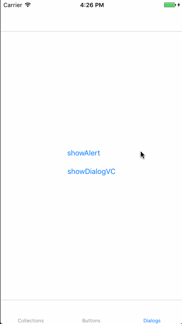
実装としてはMDCAlertControllerを使用します。UIAlertControllerと同じように扱えます。
@IBAction func showAlertButtonDidTap(_ sender: Any) {
    let alertController = MDCAlertController(title: "title", message: "This is MDCAlertController")
    let action = MDCAlertAction(title:"OK") { (action) in print("OK") }
    alertController.addAction(action)

    present(alertController, animated: true, completion: nil)
}
Transition Controller
ダイアログ表示時のトランジションだけをMaterial Componentsのクラスに任せるには、MDCDialogTransitionControllerを使用します。
class ThirdViewController: UIViewController {
    // トランジションのコントローラー
    let dialogTransitionController = MDCDialogTransitionController()

    var contentViewController: DialogContentViewController!

    // ...

    @IBAction func showDialogVCButtonDidTap(_ sender: Any) {
        // ダイアログの中身を管理するViewControllerを作成
        contentViewController = self.storyboard?.instantiateViewController(withIdentifier: "dialogViewController") as! DialogContentViewController

        // トランジションを設定
        contentViewController.modalPresentationStyle = .custom
        contentViewController.transitioningDelegate = dialogTransitionController

        present(contentViewController!, animated: true, completion: nil)
    }
}
上記実装の動作結果は以下のようになりました。青い部分がcontentViewControllerのviewです。
さいごに
本記事では、iOSアプリ向けの「Material Components for iOS」のドキュメントやデモの内容、iOSアプリでの使用方法などを紹介しました。
今回は一部のコンポーネントだけを触ってみただけなので、今後、他のコンポーネントも触ってみようと思います!
