
The Story of Creating an Employment Benefits and Results Page for a Recruitment Site with Claude # gpt-4-turbo-2024-04-09
This page has been translated by machine translation. View original
Introduction
We have added a "Salary Data" page to the Classmethod recruitment site. It's a page that provides transparent information such as average annual income and salary data by job type and age group for those considering changing jobs.
https://careers.classmethod.jp/feature/salary/
This time, I used Claude to create this page, so I'd like to share the process.
Why Publish Salary Data
When considering a job change, compensation level is one of the important decision factors. However, many companies only provide vague expressions such as "compensation based on experience and ability." In some cases, only 2-3 model cases based on age or years of employment are presented.
Our company decided to publish actual salary data based on real employee information under the belief that "honestly disclosing information to job seekers (morality) will reduce hiring mismatches and lead to company growth (economic benefit)."
In a rush. In other words, this is where generative AI comes in.
But this was my first time working with the recruitment site's admin screen. I was nervous. Because in the past, if I made even a small mistake in the prompt, I could never return to the normal route... But it went well without worrying about such issues, so I wanted to document it. My goal is reproducibility!
Production Process with Claude
For this project, I did all the work using claude.ai (in the browser). Since it doesn't always fully comprehend existing source code, the source itself was very long, and at some point the response became too long and resulted in an error. But this actually worked out well because it created downloadable HTML files each time, which allowed me to quickly recover whenever I gave a prompt that might have broken the page.
In the next blog, I plan to introduce the process of creating using VS Code with a WordPress template placed locally for comparison, so please refer to that as well. Incidentally, I recommend the local approach.
1. Checking the Original Data
What I had on hand was salary data and text (in Markdown format) that had been handed over as public information:
- Company-wide summary (average annual income, median)
- Year-by-year trends
- Breakdowns by job type, age group, gender, and years of employment
- Annual income by grade (position)
- Career path comparison (specialist vs manager)
- Frequently asked questions (Q&A) - 58 questions
And the page design proposal and 7 types of graph images for publication.
2. Generating HTML/CSS
I gave Claude the data from step 1 and had it generate HTML + CSS that could be pasted into WordPress.
Actual prompt
Please format the content of the attached markdown into HTML. Since I'll be pasting it into the WordPress admin screen, please extract only the content in HTML + CSS format. Also, please replace the graph images with appropriate URLs.
By clearly communicating the purpose (pasting into WordPress) and format (HTML+CSS), I got output in a ready-to-use format.
With the foundation in place, let's incorporate the design proposal.
Actual prompt
Please modify the page design based on the current recruitment site's style and the attached images.
With this, the basic page structure was complete.
3. Layout and Design Fine-tuning
This ended up being the longest exchange. Since we had a design proposal this time, I gave instructions for layout improvements while checking for accuracy. I tried to verbalize my feedback as much as possible while sharing screenshots as needed.
Actual prompt
Based on the attached HTML, please make the following changes:
* The tables are hard to read, so please change them from 2 columns to 1 column.
* Some parts are not responsive, so please adjust them.
* Please center-align the annual table image.
* Text size seems small in some places, so please set the minimum size to 16px. However, notes can be 14px.
* Please identify any negative expressions and provide suggestions for positive alternatives.
Company-wide summary: Please include headings according to the md file.
Areas with graphs: Please align the start position of the right column with the left text start position. Text stretching across one row makes it difficult to read.
Annual income increase with grade promotion: Please review as it doesn't match the layout in the attached image.
Average profile by career: No need to emphasize the Director
The income breakdown image is img_graph17.png
Other examples of adjustment exchanges:
- "The table and graph positions are reversed. Please place the table on the left and the graph on the right as shown in the attached image"
- "For headings, instead of coloring the text, please add a yellow underline marker like on the recruitment site (URL provided)"
- "The accent color is different from the existing one, so please change it to the site's blue color (#00B8D4)"
The tip is that it's more efficient to give instructions together at the beginning, but as things get more detailed, it's better to make one change at a time, as sometimes other issues can break the page.
4. Responsive Design
I checked the display on smartphones and fixed several issues.
Problems discovered:
- Buttons overflowing
- Tables requiring too much horizontal scrolling, making them hard to read
- Too much space between sections
- Incorrect content order when rearranged into a single column
Actual prompt
As shown in the attached image, there's too much space at the top and bottom on mobile, please adjust
Here's my review of the responsive design:
* Buttons: they're overflowing.
* I want to hide some graphs, so please create CSS for this. For example, the age group graph. The flow becomes strange when made responsive.
Even with simple instructions, Claude appropriately adjusted the spacing of each element.
5. Matching the Tone with the Existing Site
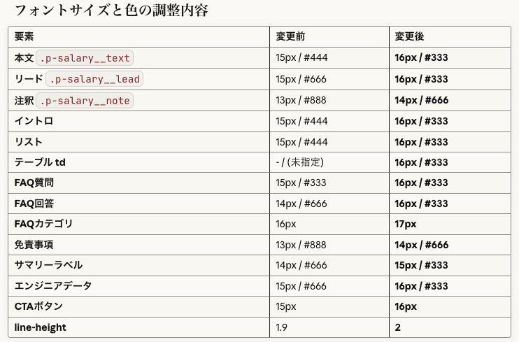
After comparing with other pages, there were comments that "the font size is small" and "the color is too light and hard to read," so I provided a URL to an existing page and requested adjustments.
Actual prompt
Compared to other pages, the font size is small and the color is too light, making it hard to read.
Can you adjust it with reference to this page?
https://careers.classmethod.jp/feature/merit/
Just by providing the URL, Claude referred to the relevant page and matched the font size and colors. It was also helpful that it summarized the changes.
6. Adding a Fixed Table of Contents Panel
At point 5, although we had already published the page, I was concerned about its length, so I decided to add a fixed table of contents panel in the bottom right.
Actual prompt
I'd like to add a "Try a casual interview" button somewhere. Since the page is long, could we have a fixed table of contents display on the bottom right or somewhere?
[Attached image]
It looks good, but it's overlapping with existing buttons, so please adjust. Also, I want to use the site's blue color.
Also, please hide the table of contents on mobile
The site's blue is
#00A2F7. Also, the button text is wrapping to a new line, please adjust that
Claude provided a really nice solution to my vague prompt. Thank you, Claude...
Well, of course this is a standard feature that should be included! These are called non-functional requirements, and if an uninformed person asks an unfriendly development company, they'll end up with something that doesn't consider these at all... that's how the world works.
However, Claude voluntarily incorporated appropriate implementation (click to open/close, with animation). What a kind world.
7. Consulting on Wording
I also consulted Claude not just about code, but also about adjusting the Q&A wording.
Actual prompt:
I'd like to discuss wording.

> Q. Are interviews conducted online?
> A. First interviews are conducted online. For second and subsequent interviews, there will definitely be one face-to-face meeting offline.

I'm told that second and subsequent interviews are often online too, so we can't say "definitely". Could you provide alternative wording?
Claude proposed multiple options, and I communicated additional requests to refine them.
We basically want to meet, so I'd like to base it on option C. Option A has a slightly different nuance
In this way, the ideas are optimized to match the intent through this back-and-forth process. That's the complete flow.
Tips for Using Claude
What Worked Well
-
Giving feedback with screenshots
- Being able to show "this is overflowing" or "use this color" with visual feedback
-
Providing existing page URLs to match styles
- Being able to match the tone of existing sites with "please adjust based on this page"
-
Progressing with version management
- Step-by-step improvement from v1 → v2 → ... → v11
-
Consulting on wording, not just HTML/CSS
- Using it as a sounding board for copywriting, such as Q&A wording adjustments
-
No discrepancies between MD file text and numbers
- As a precaution, I had another AI tool check the MD file against site captures, but there were zero differences.
Points of Caution
-
Essential to check compatibility with WordPress
- Sometimes layouts work locally but break when pasted into WordPress
-
Be aware of missing
<style>tags- There were cases where
<style>tags disappeared during editing, breaking the entire layout
- There were cases where
-
Conflicts with existing CSS
- It's good to use page-specific prefixes (like
p-salary__) to avoid conflicts with the site's CSS (this time Claude handled it well, but I've experienced conflicts in other situations)
- It's good to use page-specific prefixes (like
Prompt Analysis: What Worked Well
Looking back at the prompts used in this session, I'll analyze what worked well and what didn't. I've summarized the key points so that even those without engineering experience can reproduce these results.
◎ Particularly Effective Prompts
1. Initial Request Specifying Purpose and Format
Please format the content of the attached markdown into HTML.
Since I'll be pasting it into WordPress, please provide it in HTML+CSS format.
Please replace graph images with appropriate URLs
Why it's good:
- Clear input (attached markdown) and output (HTML+CSS)
- Communicating the purpose (WordPress) results in output in an appropriate format
- Supplementary information (graph image URLs) adjusts expectations
Key point: Communicating "what," "what for," and "in what format" results in immediately usable output.
2. Style Specification by Simply Providing a Reference URL
https://careers.classmethod.jp/feature/merit/
Please adjust the font size and colors with reference to this
Why it's good:
- Showing an "example" is more accurate than explaining in words
- Limiting the adjustment scope (font size, colors)
Key point: For design instructions, "like this site" is the most powerful approach.
3. Communicating Current State and Issues Together for Wording Consultation
I'd like to discuss wording.

Q. Are interviews conducted online?
A. First interviews are conducted online. For second and subsequent interviews, there will definitely be one face-to-face meeting offline.

I'm told that second and subsequent interviews are often online too, so we can't say "definitely". Could you provide alternative wording?
Why it's good:
- Presenting the current wording
- Clearly explaining what the problem is ("definitely" can't be stated)
- Sharing background information (reality is that online is common)
Key point: The combination of "current state" + "problem" + "background" yields precise suggestions.
○ Good Prompts with Room for Improvement
4. Screenshot + Modification Instructions
[Screenshot attached]
It looks good, but it's overlapping with existing buttons, so please adjust.
Also, I want to use the site's blue color
What worked well:
- Visually showing the problem
- Starting with positive feedback ("looks good") before requesting changes
Room for improvement:
- It wasn't clear what "site's blue" meant, requiring an additional question
Better prompt:
[Screenshot attached]
It looks good, but please make two adjustments:
1. It's overlapping with existing buttons (bottom right of image), please move it up
2. Change the color to the site's blue (#00A2F7)
5. Retracting Trial and Error
Actually, I think the button looks better as one line. Could you revert it?
Not a problem but:
It would have been more efficient to ask for multiple options upfront.
Better approach:
I'm considering button text options.
Please create the following two versions for comparison:
A: "Try a casual interview" (1 line)
B: "Casual interview" "Try it" (2 lines)
△ Prompts That Should Have Been Improved
6. Vague Problem Reporting
The appearance is severely broken
Issues:
- Unclear where it was checked (local? WordPress? preview?)
- Unclear how it's broken
Actual flow:
Claude asked a question → Additional information provided → Resolution (took one extra back-and-forth)
Better prompt:
The appearance broke when I pasted it into WordPress.
It's also broken in Claude's preview.
[Screenshot attached]
Templates for People Without Engineering Experience
Based on this experience, here are ready-to-use prompt templates.
When Requesting HTML Generation
[Attach file]

Please create an HTML page based on this data.

Purpose: [Paste into WordPress / Attach to email / Internal sharing]
Design: [Simple / Reference URL: https://...]
Special considerations: [Mobile compatibility / Print compatibility / etc.]
When Requesting Design Modifications
[Attach screenshot]

Please make the following modifications:
1. [Specific modification point]
2. [Specific modification point]

Reference: [Reference URL or color code]
When Reporting a Problem
I've encountered a problem.

Environment: [Local / WordPress / Claude preview]
Symptom: [What's broken and how]
Expectation: [How it should look]

[Attach screenshot]
When Discussing Wording
I'd like to discuss wording.

Current:
[Current wording]

Issue:
[What's the problem, why change it]

Desired nuance:
[What impression you want to convey]
Learned Best Practices
| Point | Description |
|---|---|
| Use screenshots | More accurate than words |
| Provide reference URLs | Vastly faster than explaining from scratch |
| Communicate purpose | Results in output in appropriate format |
| Start with positive feedback | Beginning with "It looks good, but" makes collaboration smoother |
| Share background information | Communicating "why" leads to better suggestions |
| Request multiple options upfront | If undecided, request in a format for comparison |
| Version management | Step-by-step improvement with v1, v2... reduces rework |
Structure of the Completed Page
The page was published with the following structure:
- Introduction
- To those considering applying
- Company-wide summary (average ¥9.41 million, median ¥9.11 million)
- By location (work location)
- By gender
- By years of employment (tenure)
- By job type
- By age group
- By position (grade)
- Transparency of salary structure
- Career paths
- In conclusion
- Q&A (58 questions)
Conclusion
By utilizing Claude, I was able to progress seamlessly from data organization to HTML generation, responsive design, and wording adjustments.
In particular, "making modification requests while showing screenshots" was extremely efficient for design adjustments. A significant benefit is that marketing personnel can lead work that would traditionally require back-and-forth with designers and engineers.
Publishing salary data is the first step toward increased transparency in recruitment. I hope this page serves as a useful reference for those considering a job change.