I tried Impeccable, which improves AI-like quality

This page has been translated by machine translation. View original
Introduction
I'm Fumiko from the Mach Team.
Recently, I've been using Claude Code for code implementation in my work as a Product Manager and Designer.
In that context, I was assigned to remove the "AI feel" from the AI-generated LP for "Growth Pack for LINE."
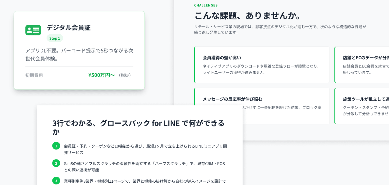
AI-generated LPs have a high level of completeness and are attractive for being built at incredible speed by conventional standards, but if you look closely, they have a certain "AI-generated feel" applied to them.
- Bullet points starting with ①②③
- Duplicate explanations
- Sections that pop up without transitioning
- Card grids everywhere
- Gradients everywhere
- Drop shadows everywhere……
Since going through these one by one visually and giving instructions to AI would be quite tedious,
I decided to verify whether I could improve things using a Skill called "Impeccable."
Conclusion
A division of labor where Impeccable handles mechanically detectable parts and humans handle brand- and intent-related parts turned out to work well for me.
| Item | What I Found |
|---|---|
| What audit improved | Numerically measurable issues (contrast ratio, image delivery size, token consistency) |
| Different axis caught by polish/bolder | Decorative anti-patterns (side-stripe border, blur glow), typography hierarchy, hero-metric template breakdown |
| What no command caught | Brand consistency, proper nouns, information organization, intent behind emphasis |
| Impeccable diagnostic score (out of 20) | 13 points → 18 points after fixes |
| Division of labor | A two-stage workflow of rough cutting mechanically with audit / polish / bolder, then adding intent by human, is practical |
In addition to audit, I separately tested the fix-oriented commands /impeccable polish (finishing touches) and /impeccable bolder (strengthening subdued designs), and found that each catches different types of problems.
Details are described later.
In the end, the LP was polished to its current state at https://lp.growthpackforline.classmethod.net/.
What is Impeccable
Impeccable is an OSS Skill (Apache 2.0 license) published by Paul Bakaus, extended from Anthropic's official frontend-design skill.
It can be added to Claude Code after the fact, and its content is divided into three main layers.
| Layer | Contents |
|---|---|
| Guideline injection | Continuously loads design knowledge across 7 areas including typography, color, spacing, and motion into the AI |
| Commands (23 types) | Allows commands like /impeccable audit (quality check), /impeccable bolder (strengthen subdued design), /impeccable polish (final adjustment before shipping) |
| Anti-pattern detection | Automatically checks 27 rules via CLI or browser extension. Can be run without LLM or API key |
In this verification, I used three commands: /impeccable audit, /impeccable polish, and /impeccable bolder.
audit is equivalent to an "inspection" or "diagnosis" — it reads the current state of the page and returns only a score and observations without modifying any code.
polish and bolder are commands that actually make corrections: polish handles finishing touches (fine adjustments), while bolder handles strengthening subdued designs (rebuilding typography and layout).
I first ran audit on the entire top page to understand its state, then manually instructed Claude Code on which issues to adopt.
Afterward, I separately tested polish and bolder on the pre-manual-fix state to see what each one catches.
Within audit, it reads the implementation of the target page and scores it from five perspectives.
| Perspective | What It Examines |
|---|---|
| Accessibility | Contrast ratio, focus state, aria attributes |
| Performance | Image size, unnecessary bundles, repaint cost |
| Responsive | Breakpoint failures |
| Theming | Design token consistency, scattered inline hex values |
| Anti-Patterns | Common AI-generated templates (10-card grids, gradient text, glassmorphism) |
The score is out of 20, with each perspective scored on a 1–4 scale.
What audit improved
Items that could be mechanically fixed based on /impeccable audit findings.
1. Insufficient contrast for green text
Impeccable checks the contrast ratio between text and background against the WCAG AA standard (4.5:1).
The link color text-line-green #06C755 for "See details →" was 2.4:1 against a white background, and the price display "Initial cost ¥XX 万" text-line-green-dark #05A847 was 3.3:1 against white — both falling below AA.
I instructed that the link color be changed to the same blue-based #2D8DE0 used on Classmethod's corporate site, and that prices be reverted to a dark color.
2. Missing sizes attribute on images
Impeccable flags cases where the sizes attribute is not specified on Next.js <Image> components, indicating that oversized images may be delivered.
Feature icons were using <Image fill /> without sizes, meaning images with a default 100vw assumption were being delivered despite the actual display size being 44x44px.
This was resolved by adding sizes="44px".
3. Scattered design tokens
Impeccable flags places where defined design tokens are bypassed with inline hex values.
Inline hex values like text-[#4B5563] were scattered throughout, bypassing the defined token muted-foreground.
I instructed that all occurrences be replaced with muted-foreground.
4. Anti-pattern detection
Impeccable explicitly detects anti-patterns commonly found in AI-generated content.
As a result, "Identical card grid (10 identical templates in a row)" was detected.
Whether to fix it was a judgment call.
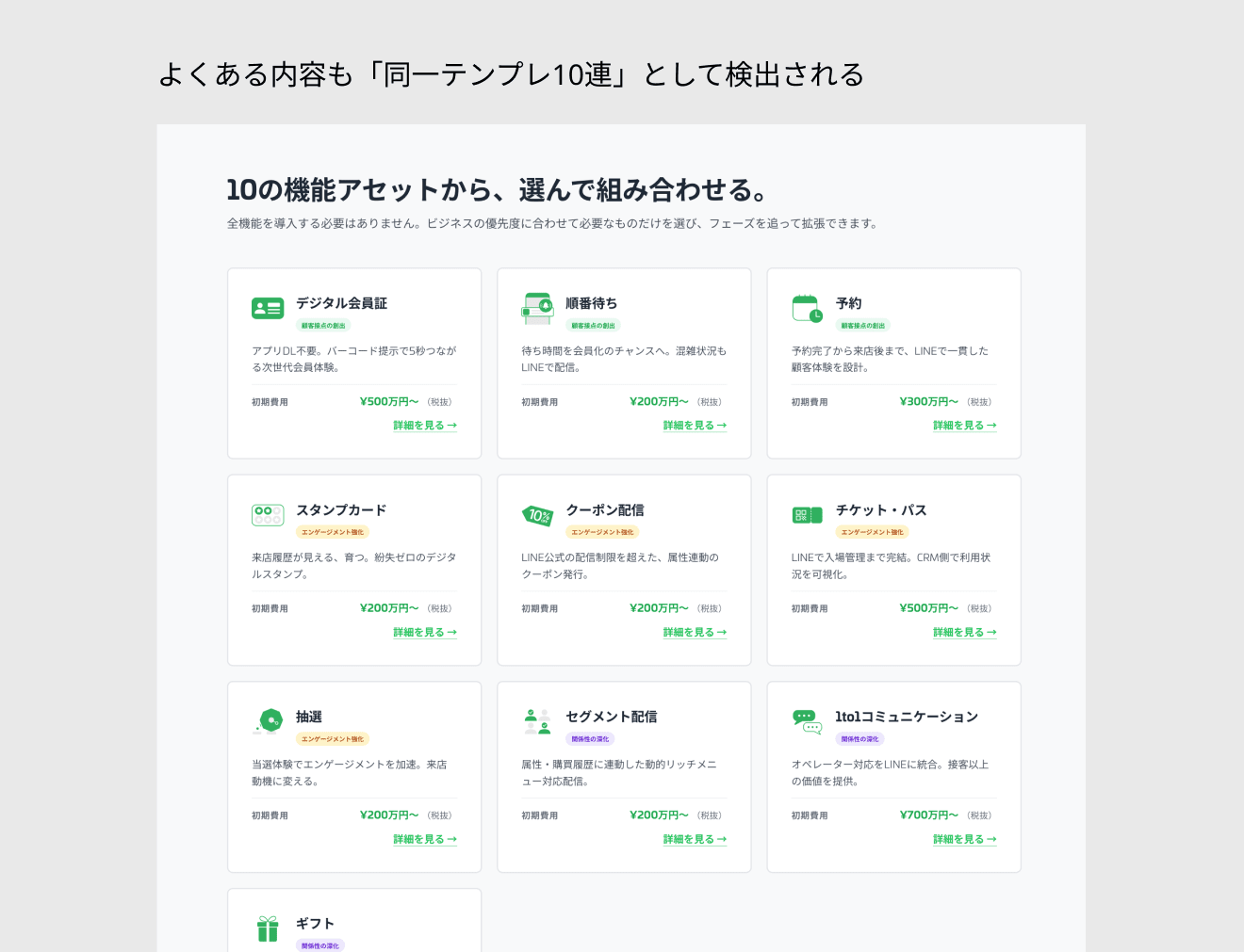
Since this section has the purpose of showing 10 features in a list as sales material, I judged that breaking the structure would lose the design intent, so I chose not to fix it as indicated.
Different-axis problems caught by polish/bolder
After audit, I also tested /impeccable polish and /impeccable bolder on the state before any manual fixes.
These caught problems on a different axis from audit.
Visually, the text became more prominent and font sizes increased.
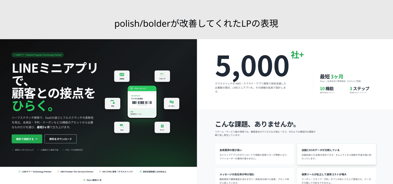
Items caught by polish
- Replaced 6 instances of green text with insufficient contrast with
#05A847 - Removed side-stripe border (a left-edge stripe decoration, strongly prohibited by Impeccable)
- Removed 2 instances of decorative blur glow in the hero section
- Added
sizesattribute tonext/image - Added
prefers-reduced-motionsupport to globals.css
Items caught by bolder
- Deleted all 9 consecutive English kicker labels (CHALLENGES, WHY GROWTHPACK, FEATURES, etc.)
- Promoted the POSITIONING heading "Between SaaS and scratch." to the page's largest typography
- Deconstructed the STATS section's hero-metric template (4-column equal cards) and rebuilt it as an editorial layout with large numbers and sub-statistics
The STATS deconstruction by bolder was addressing the same section as the "Card layout adjustment" described later, but with a different approach.
However, items fixed manually — including custom font selection, logo replacement, certification badges, and emphasis expressions on the SaaS comparison card — were not targeted by polish/bolder either.
I feel that brand consistency, proper nouns, and information organization remain in the domain of human judgment.
Things Impeccable didn't catch, which I manually instructed
From here I'll describe items that Impeccable didn't catch but that I noticed myself and asked Claude Code to fix additionally, listed from site-wide issues down to the top page in top-to-bottom order.
Some items (step badges) were partially flagged by Impeccable, but the decision to unify them across the entire page was made by me.
1. Align fonts with Classmethod's corporate site
On AI-generated LPs, Western fonts are automatically selected from Google Fonts.
When placed alongside Classmethod's corporate site, it didn't feel like a "Classmethod" product.
I instructed it to load the Adobe Fonts univia-pro used on that site via <link> and add it to the front of --font-sans.
2. Replace icons and placeholders
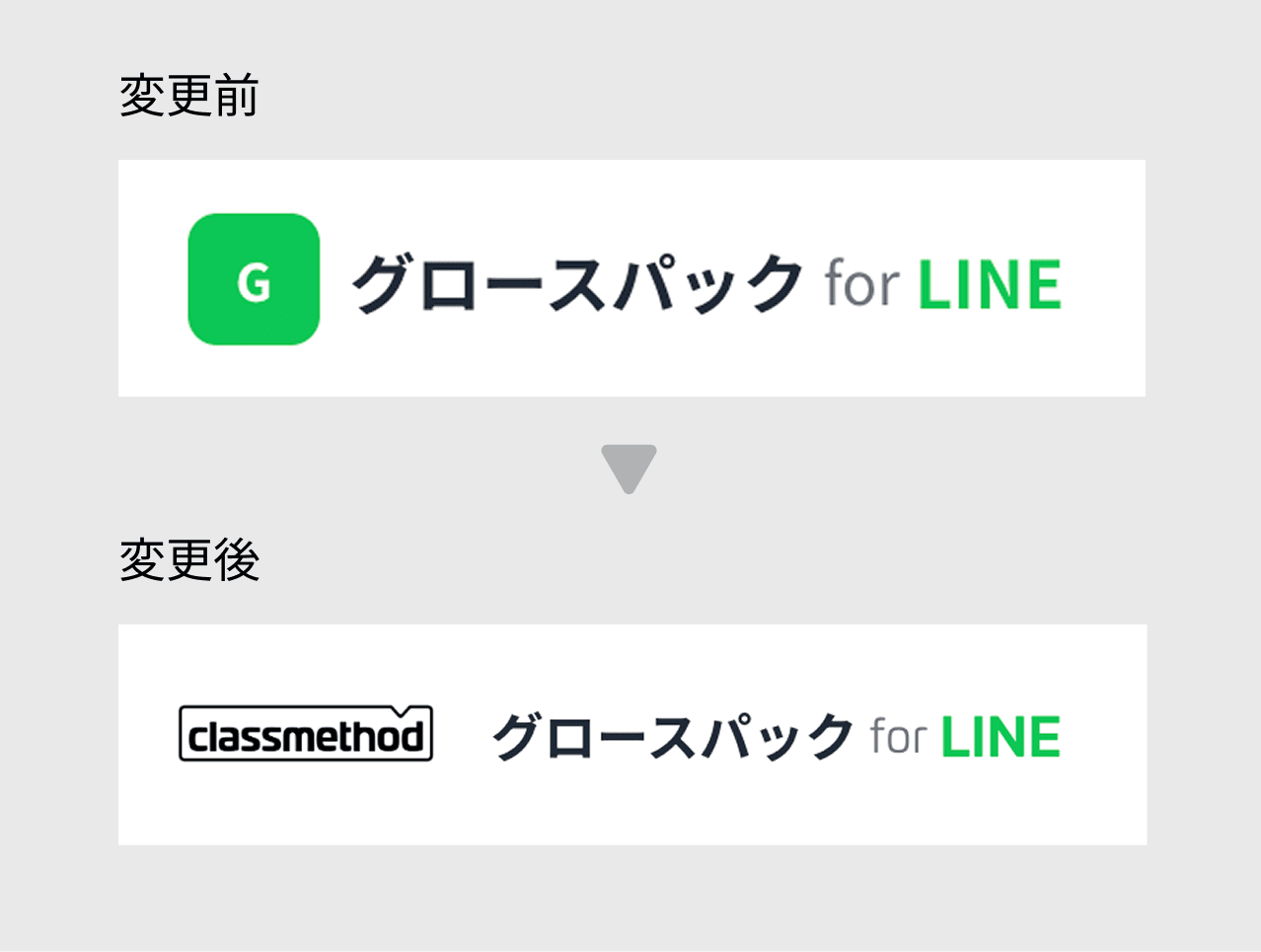
Logos and icons can end up filled with generic placeholders like a "G" mark if not specified.
I instructed it to replace them with the correct logos and service names.
3. Align link colors with Classmethod's corporate site
On AI-generated LPs, unless specified, the necessary contrast ratio and underline (a visual distinction that identifies a link without relying on color alone) tend not to be applied to links, and a color matching the overall tone is typically chosen.
The relevant guidelines are WCAG 1.4.1 Use of Color and WCAG 1.4.3 Contrast (Minimum).
I instructed it to incorporate the corporate site's link color #2D8DE0 and create new --link / --link-hover tokens.
4. Mobile responsiveness for header/footer
The layout tends to be desktop-first, and viewing on a phone can result in broken header navigation and footer.
The header navigation remained horizontal and the footer was also multi-column and PC-oriented.
I instructed it to redesign the header/footer for all pages for mobile (hamburger menu, vertical layout).
5. Replace symbols with appropriate icons
I've noticed a tendency to line up symbols like "・" or emoji at the start of items.
Items were listed with bullet separator "・LINEヤフー Partner Program Technology Partner."
Taking inspiration from the Award icon used for AWS Premier Tier Services Partner, I instructed it to change the format to an icon + "LINEヤフー Partner Program Technology Partner Certified."
6. Card layout adjustment
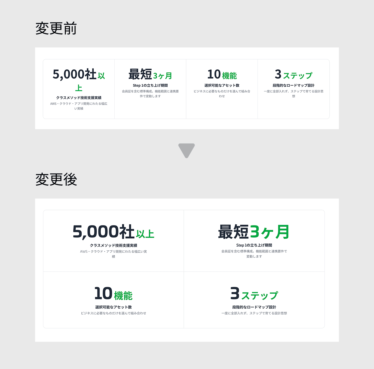
Hero metrics (large number cards) are often used, but the relationship between card width and internal elements may not be fully refined.
In this case, "5,000" was breaking across lines, so I instructed it to specify a minimum card width to keep the number on one line (bolder's proposal was to rebuild the entire section into an editorial layout with large numbers and sub-statistics — a different approach).
7. Remove unnecessary drop shadows
AI-generated LPs tend to apply drop shadows and borders to many elements as decoration.
I instructed it to remove drop shadows from items that don't need to stand out.
8. Remove redundant step badges
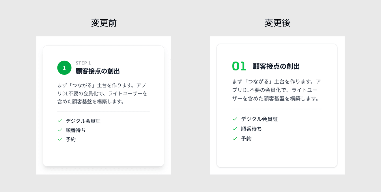
Sometimes "Step 1: 〇〇" is placed next to ① creating a redundant expression.
Impeccable flagged this, but since there was no action to unify it across the entire page, I gave the instruction to remove it myself.
9. Raise the position and size of category labels
Classification labels for categories and steps can end up smaller and less prominent than headings or body text.
Step labels indicating 3 phases were placed small beneath the icon and heading.
Since the first thing we want to convey in the LP is the phase structure, I instructed that the step labels be moved to the upper left of the card and the font size be increased by two levels.
10. Add hover feedback
Even when the static appearance is clean, mouse hover interactions often aren't differentiated.
I instructed it to create different changes for elements with and without navigation targets.
11. Clean up emphasis on the SaaS comparison card
The "RECOMMENDED" plan in the SaaS comparison card had three layers of emphasis: drop shadow, green border, and green label.
Since the border alone is sufficient to stand out, I instructed it to remove the drop shadow.
12. Make sales copy visually prominent
Even when copy is generated, visual decisions to make sales pitch points stand out are not included.
"Your first consultation is free." in the footer was buried at the same weight as other text.
I instructed it to bold that line alone so it catches the eye.
Summary
| Item | Result |
|---|---|
| Problems caught mechanically by audit | Contrast, image delivery, scattered tokens, anti-patterns |
| Different axis caught by polish/bolder | Decorative anti-patterns (side-stripe border, blur glow), typography hierarchy, hero-metric template breakdown |
| Problems fixed by human judgment | Brand consistency, proper nouns, information organization, visual priority, interaction, emphasis |
| Impeccable diagnostic score (out of 20) | 13 points → 18 points after fixes |
| Scope of verification | 3 commands: /impeccable audit / polish / bolder |
| What I learned | Commands are strong at rough cutting, humans are strong at adding intent |
When removing the "AI feel" from an AI-generated LP, combining Impeccable's automatic scoring and corrections with visual judgment steps worked efficiently.
Trying to automate everything leads to sections that stop functioning as an LP, and doing everything manually takes too long.
By using the three commands audit / polish / bolder in different situations, a clear division emerged: decorative anti-patterns and typography hierarchy can be fixed mechanically, while things requiring intent like brand consistency and proper nouns are left to human judgment.
In the end, the LP was polished to its current state at https://lp.growthpackforline.classmethod.net/.
Verification Environment
| Item | Details |
|---|---|
| Framework | Next.js 16.0.10 (App Router, Turbopack) |
| Styling | Tailwind CSS v4 |
| Claude Code | Opus 4.7 |
| Skill | Impeccable v2.1.9 |
| Target | Top page of Growth Pack for LINE |
Verification Time
| Command | Time |
|---|---|
/impeccable audit |
Approx. 2m 53s |
/impeccable polish |
Approx. 19m 50s |
/impeccable bolder |
Approx. 6m 56s |
| Total | Approx. 33m |
polish took roughly twice as long as expected because it ran 13 consecutive Edits internally.
audit and bolder completed within expected timeframes.
Thank you for reading to the end.