
Using Excalidraw MCP to make Claude Code draw cute architecture diagrams
This page has been translated by machine translation. View original
Introduction
Hello everyone, I'm Akaike.
Previously, I introduced a tool called Excalidraw in the following article.
Since then, I've come to like Excalidraw's hand-drawn loose style,
and I've been occasionally using it to create blog diagrams and LT materials.
However, times change.
Recently, as MCP servers have become more widely used, I discovered something called Excalidraw MCP.
With this, you can generate those cute diagrams just by giving instructions to Claude Code.
So in this article,
I'll try using Excalidraw MCP to have Claude Code create cute diagrams for me.
What is Excalidraw MCP?
Excalidraw MCP is a feature that allows AI to directly control Excalidraw through MCP (Model Context Protocol).
You can simply instruct Claude Code or other tools to "draw a diagram like this," and it will automatically generate Excalidraw's cute hand-drawn style diagrams.
Currently, several implementations are available, but I'll introduce the most notable ones.
Official: excalidraw/excalidraw-mcp
This is an MCP server provided by the official Excalidraw team.
The advantage is that it can be easily used from the web or desktop version of Claude, but it currently can't be used with Claude Code.
Community version: yctimlin/mcp_excalidraw
This is an MCP server developed by the community, equipped with multiple tools.
Its biggest strength is that it can be used with Claude Code, making iterative adjustments much easier.
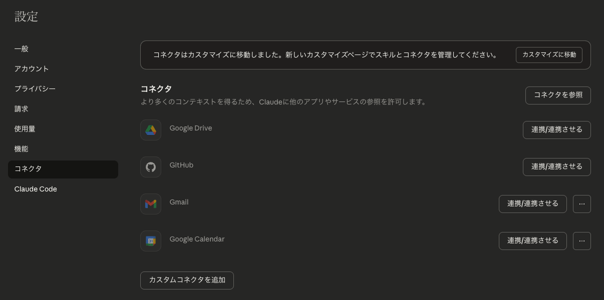
Setup
Method 1: Official Version - Using Claude's Custom Connector
The easiest way is to use the custom connector feature in Claude (web or desktop version).
This is recommended for those who want to try it out quickly as it doesn't require local installation.
Access Claude and open the connectors from settings.
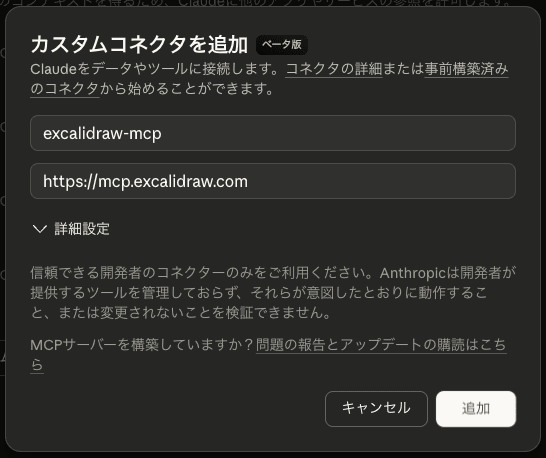
Click "Add custom connector."
Here, specify the tool name and URL.
- Name: Any name
- Remote MCP Server URL: https://mcp.excalidraw.com
After adding, you can confirm it's enabled from the chat connector.
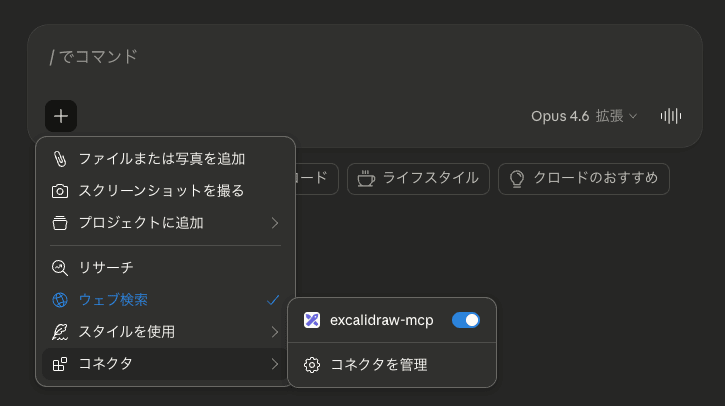
In this state, if you give instructions like "draw a diagram," an Excalidraw diagram will be generated via streaming.
It's convenient that you can open and edit directly in the web version of Excalidraw using "Open in Excalidraw," or make modifications directly in Claude with "Edit."
What's also interesting is that you can see it being drawn live, giving you a real sense of hand-drawing.
The GIF in the README explains this well, so please take a look if you're interested.
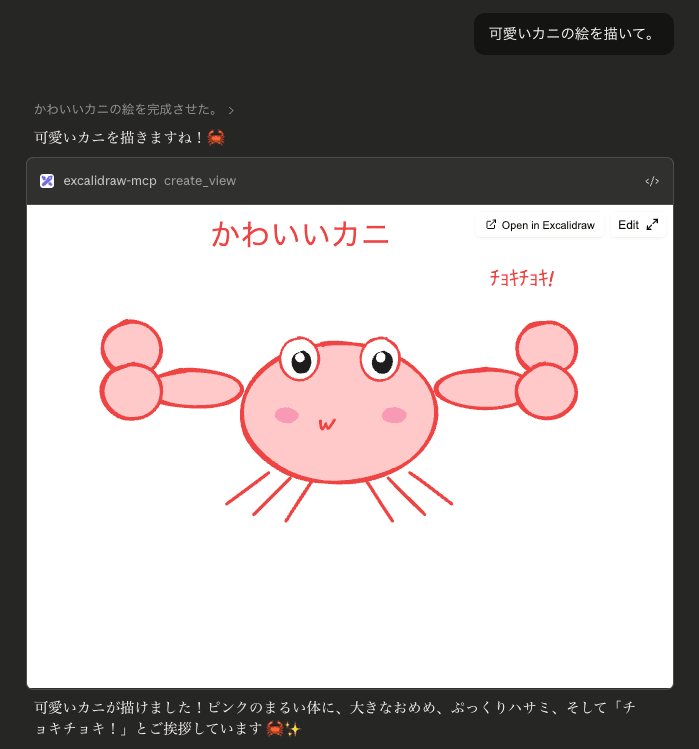
By the way, you can request anything that can be drawn in Excalidraw,
so you can even have it draw illustrations like this.
Method 2: Community Version - Using yctimlin/mcp_excalidraw
If you want to use it with Claude Code, you'll need the community version yctimlin/mcp_excalidraw.
There are two setup methods: cloning and building the repository, or using Docker. For simplicity, we'll use the Docker version here.
Starting the Canvas Server
First, start the canvas server.
docker run -d -p 3000:3000 --name mcp-excalidraw-canvas \
  ghcr.io/yctimlin/mcp_excalidraw-canvas:latest
When you access http://localhost:3000 in your browser, the Excalidraw canvas will be displayed.
Content drawn by Claude Code will be reflected here in real-time.
Registering with Claude Code
Register the MCP server with Claude Code.
claude mcp add excalidraw --scope user \
  -- docker run -i --rm \
  -e EXPRESS_SERVER_URL=http://host.docker.internal:3000 \
  -e ENABLE_CANVAS_SYNC=true \
  ghcr.io/yctimlin/mcp_excalidraw:latest
After registering, check with claude mcp list to confirm it appears.
% claude mcp list
Checking MCP server health...

excalidraw: docker run -i --rm -e EXPRESS_SERVER_URL=http://host.docker.internal:3000 -e ENABLE_CANVAS_SYNC=true ghcr.io/yctimlin/mcp_excalidraw:latest - ✓ Connected
Generated by Claude Code
Now let's have Claude Code draw diagrams using the community version MCP (yctimlin/mcp_excalidraw).
I tried four different patterns.
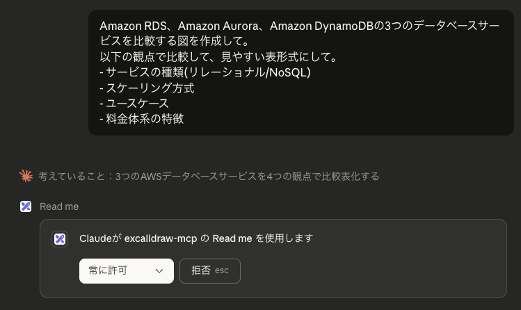
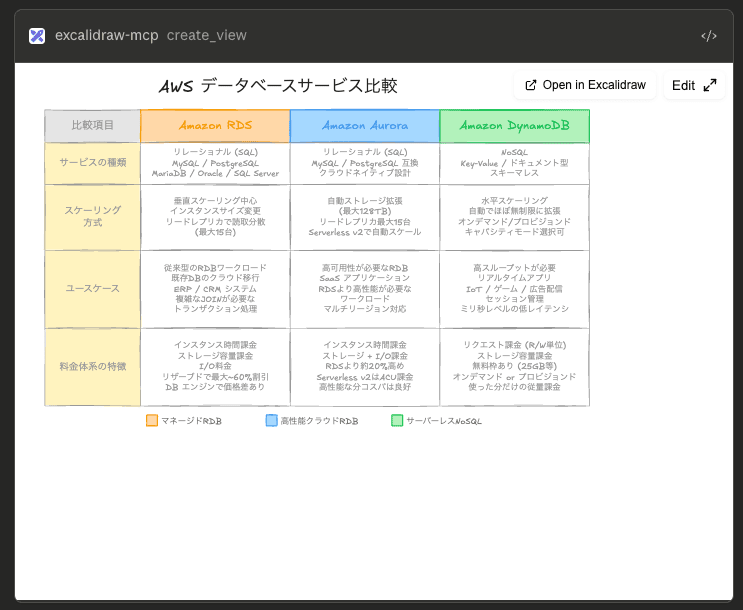
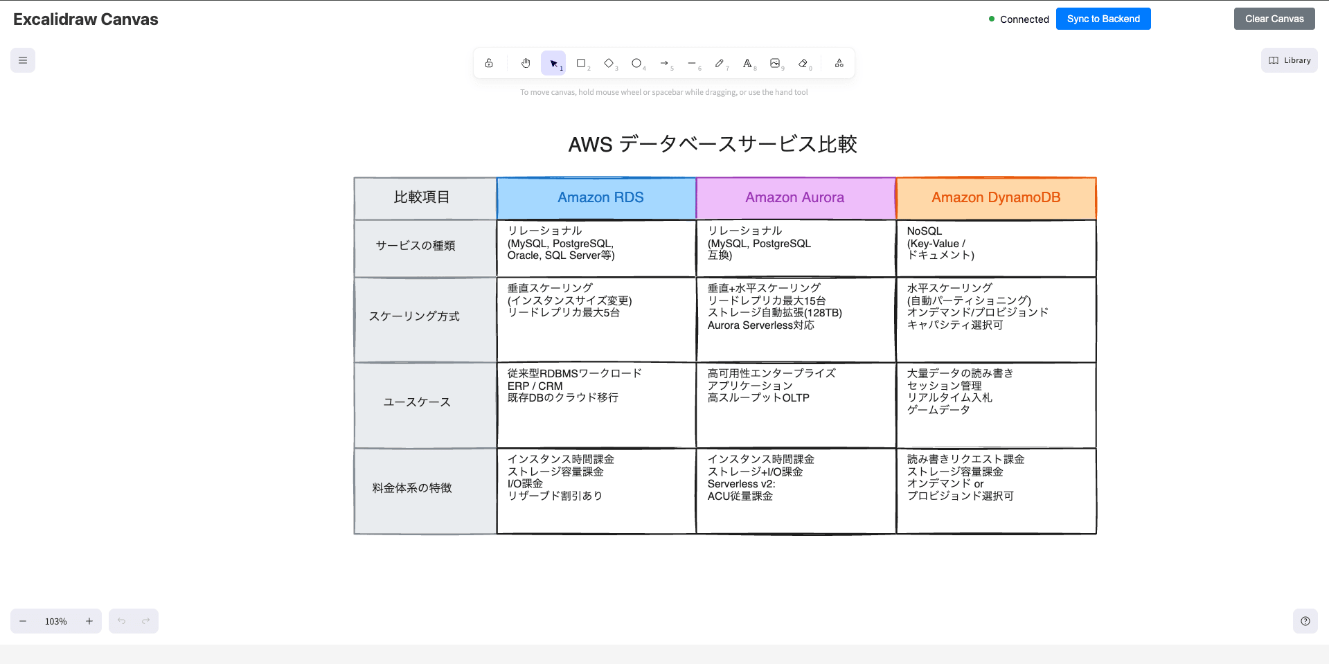
Example 1: AWS Service Comparison Chart
First, let's create a service comparison chart with text.
Prompt 1:
Create a diagram comparing the three database services: Amazon RDS, Amazon Aurora, and Amazon DynamoDB.
Compare them based on the following aspects in an easy-to-read table format:
- Service type (Relational/NoSQL)
- Scaling method
- Use cases
- Pricing characteristics
Result 1:
Prompt 2:
Please add ElastiCache as well.
Result 2:
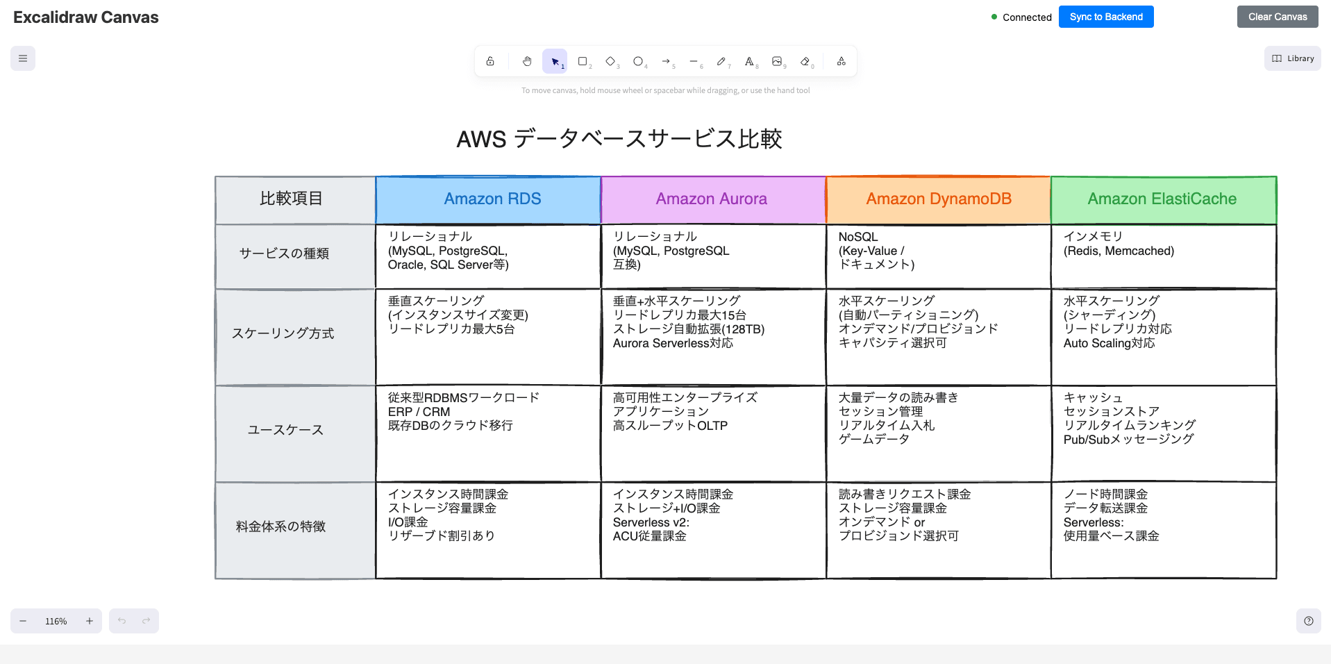
With just the simple phrase "Please add ElastiCache as well," the column was added without any issues.
Example 2: AWS System Architecture Diagram
Next, let's describe an architecture in text and have it generate a diagram.
Prompt 1:
Create a diagram for the following AWS configuration:

- CloudFront as the entry point
- Load balancing with ALB
- Containers running on ECS Fargate in 2 AZs
- Backend DB is Aurora PostgreSQL (multi-AZ)
- VPC with public and private subnets
- NAT Gateway placed in public subnet
- Use AWS icons and make it in the cute Excalidraw style
Result 1:
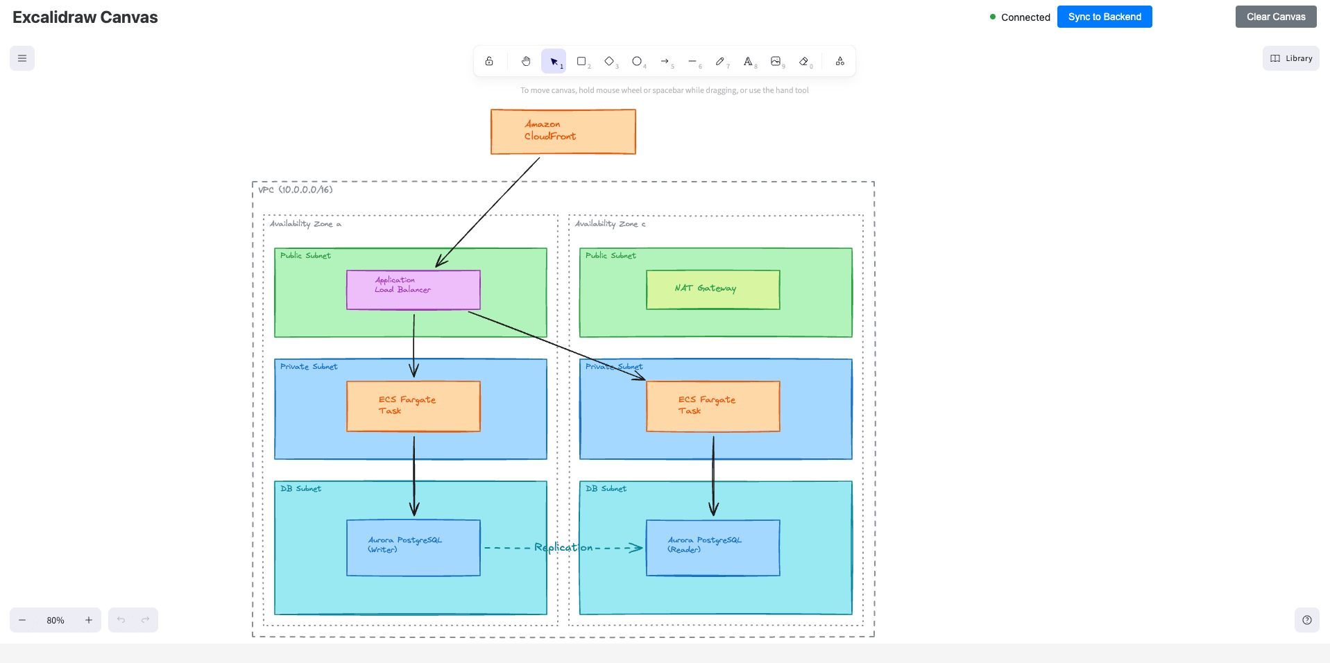
It worked, but without AWS icons, it's a bit difficult to understand.
So let's add a library to use the icons.
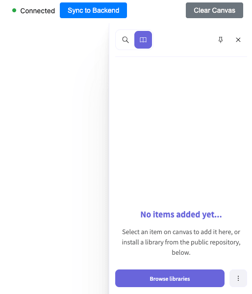
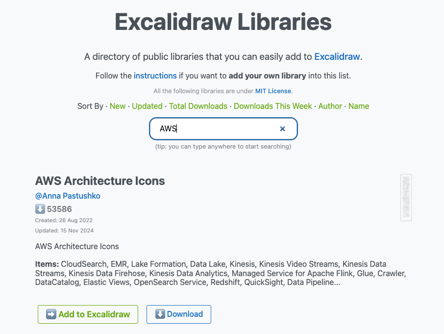
Open the Library on the right side of the canvas and click "Browse libraries."
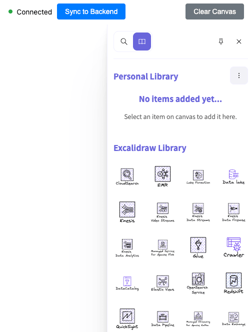
Download the AWS library,
Then open the Library on the right side of the canvas and drag and drop the downloaded file to add it.
Note that the added library doesn't seem to be recognized by Claude Code as an MCP,
so I added the icons I want to use to the canvas and then requested a revision.
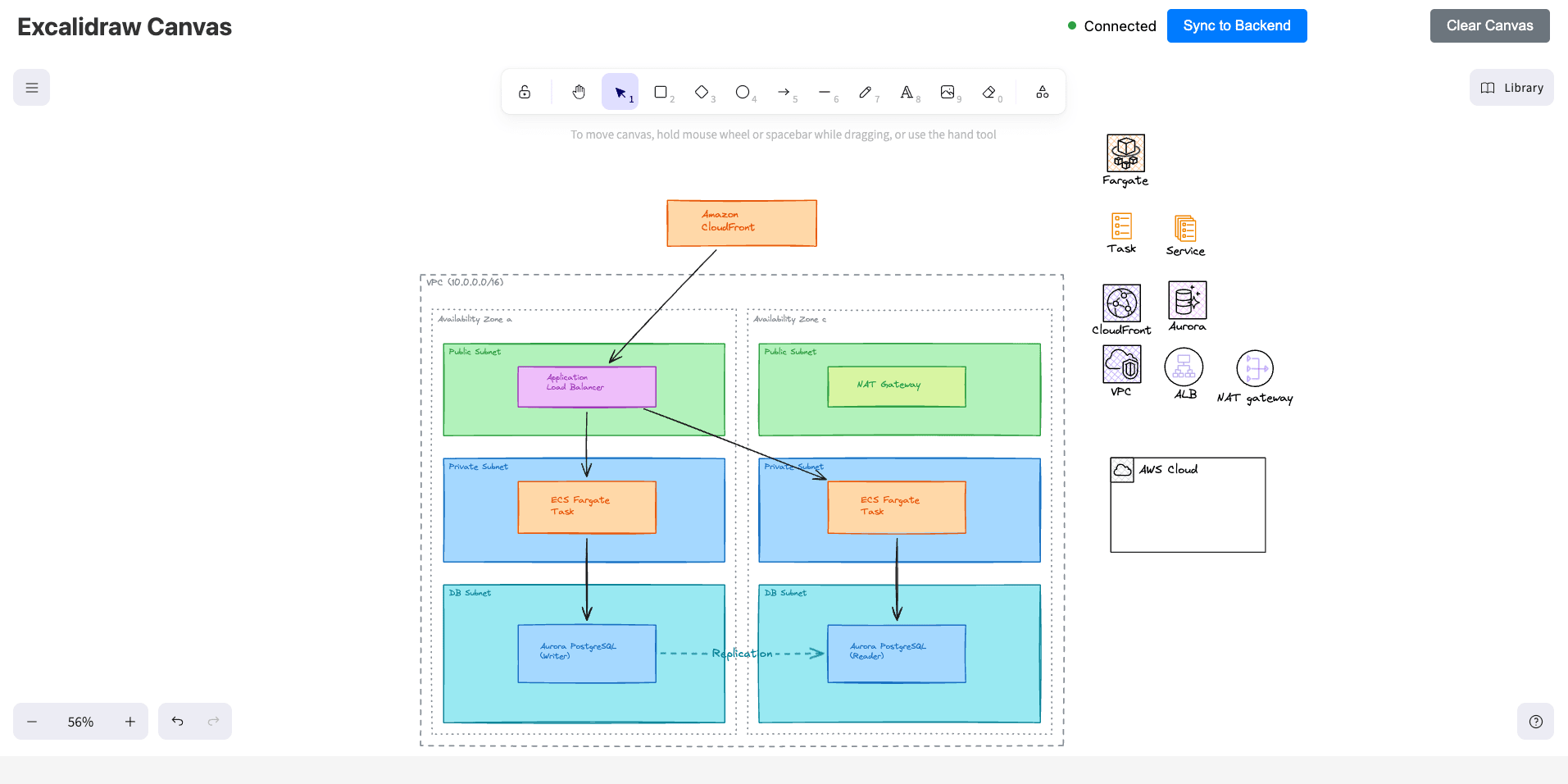
Prompt 2:
I've added AWS icons on the right side of the diagram.
Please replace the existing AWS services in the diagram with these icons.
Result 2:
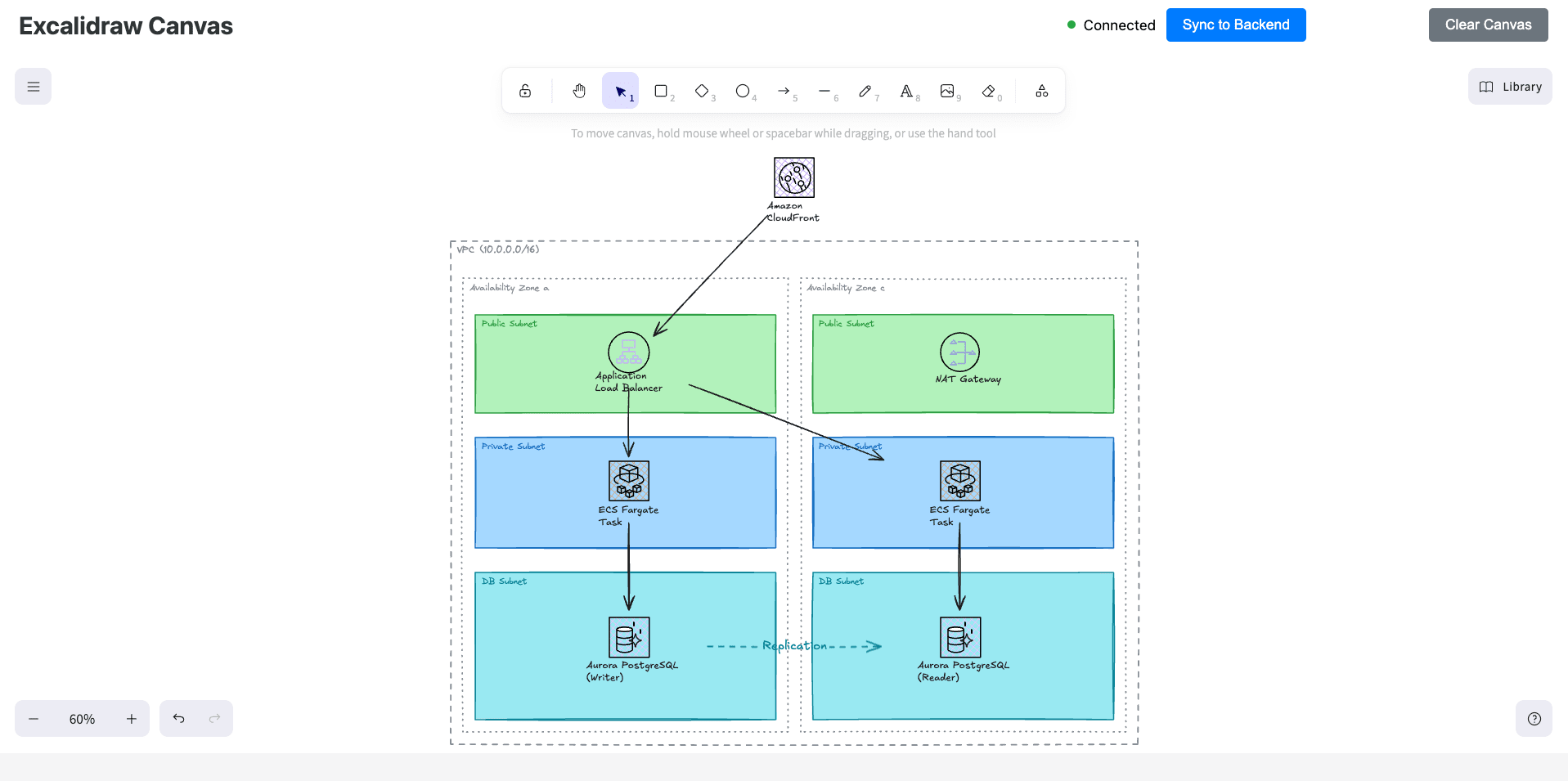
In the end, it replaced them without any issues, but considering the manual effort of placing icons, it's a bit cumbersome...
Example 3: Sequence Diagram
The third example is a sequence diagram.
These are frequently used in design documents and reviews, but manually drawing them can be tedious, especially with arrow placement.
Prompt:
Create the following sequence diagram:

E-commerce order processing sequence diagram:
1. User sends order request from browser
2. API server requests token verification from authentication service
3. Authentication service returns OK
4. API server requests inventory check from inventory service
5. Inventory service queries the DB for stock quantity
6. DB returns stock quantity
7. Inventory service returns inventory OK
8. API server requests payment processing from payment service
9. Payment service returns payment completion
10. API server returns order completion to user
Result:
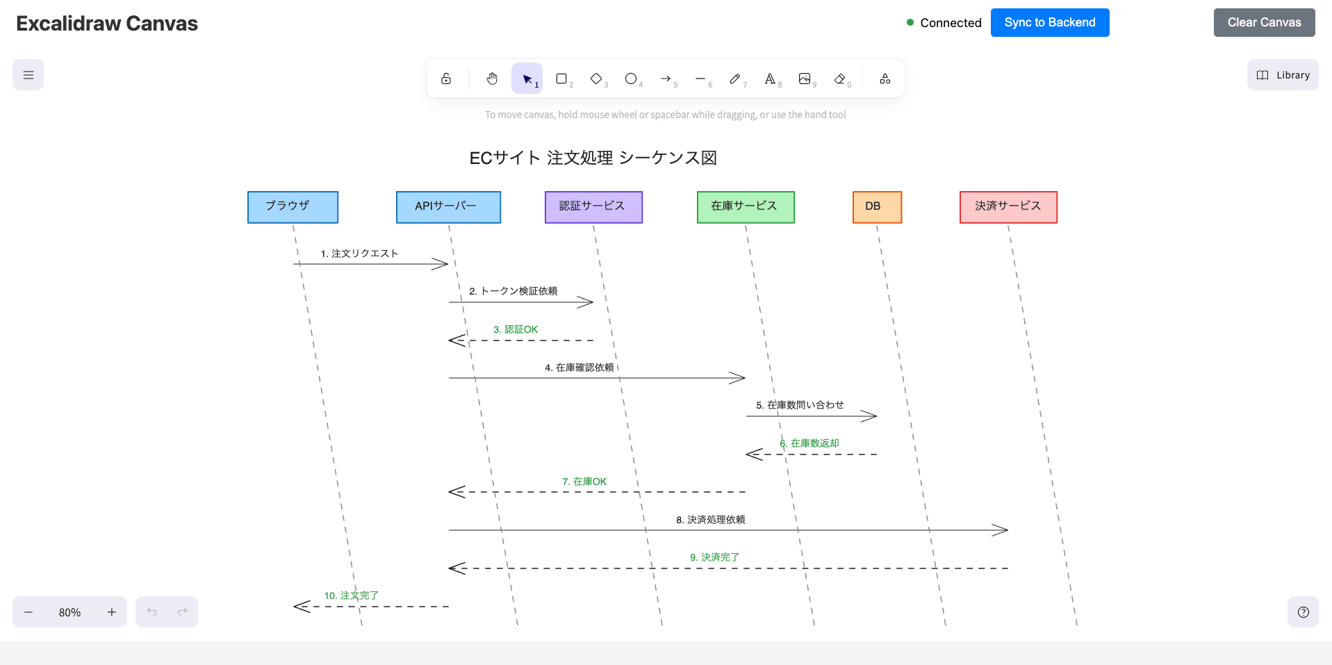
The vertical lines are diagonal, but otherwise, it looks generally fine.
Example 4: CI/CD Pipeline Diagram
Finally, a CI/CD pipeline diagram.
These are often used for team sharing and onboarding materials.
Prompt:
Create a flow diagram for the following CI/CD pipeline.
Notifications are sent to Slack in case of failure.
Draw it from left to right to show the pipeline flow:

1. Developer pushes to GitHub
2. GitHub Actions is triggered
3. The following steps are executed in order:
   - Code checkout
   - Install dependencies
   - Run unit tests
   - Lint check
   - Build Docker image
   - Push to container registry
4. Deploy to staging environment
5. Run E2E tests
6. Wait for approval (manual approval)
7. Deploy to production environment
Result:
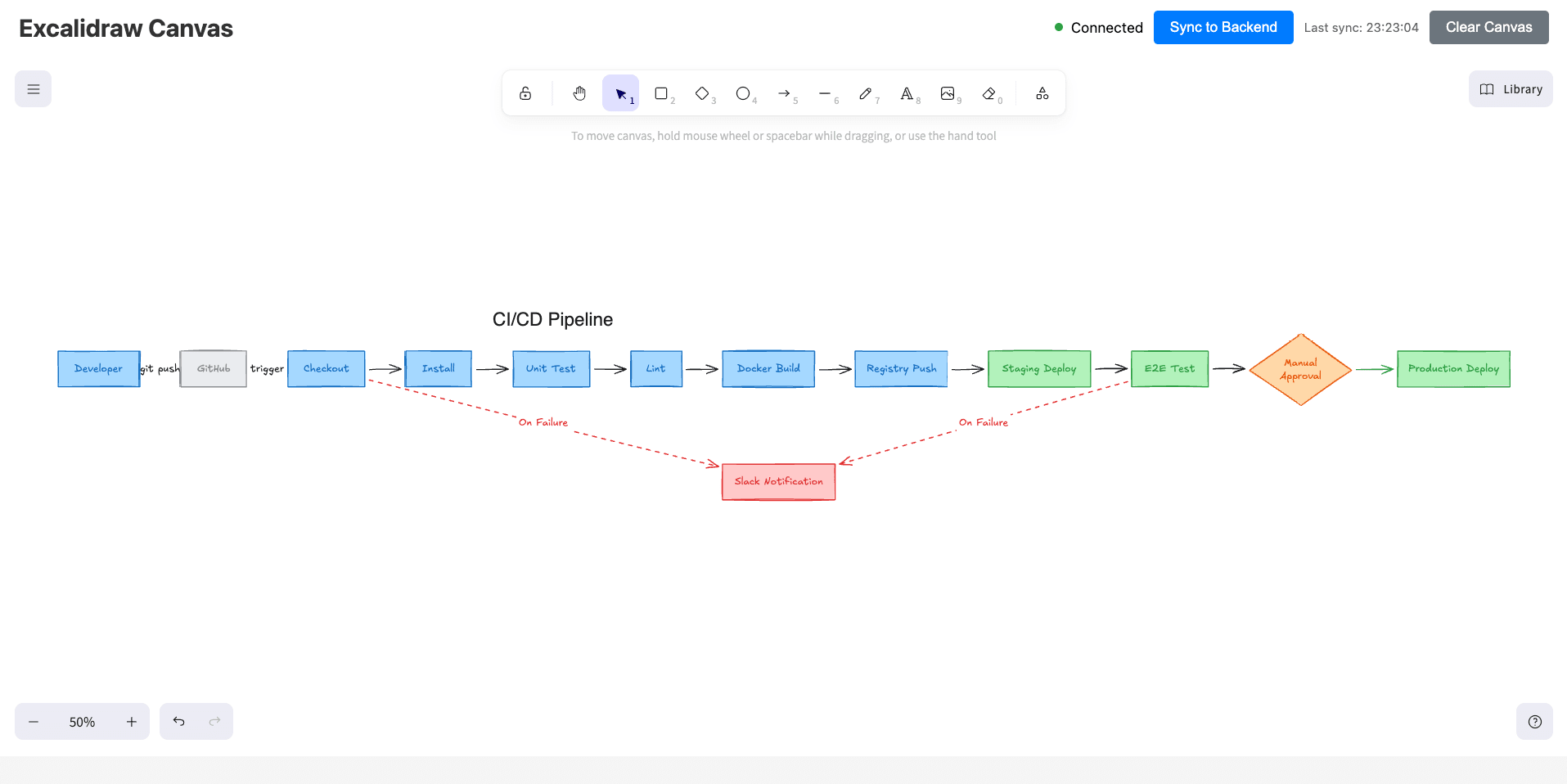
It's a bit difficult to see because it's stretched horizontally, but
the manual approval is drawn in diamond shape, and the Slack notifications for failures are expressed with red dotted lines, forming a decent flow diagram.
Conclusion
That was my experience using Excalidraw MCP to have Claude Code create cute diagrams.
It's been a few months since my previous article about manually drawing cute diagrams, and I'm amazed that Claude Code can now draw them too...
There still seems to be a need for manual corrections like layout adjustments and icon placement, but it's pretty good as a starting point.
Please give it a try!