How Much Can Apps Control the Vertical Bar on the iPhone Duo?

This page has been translated by machine translation. View original
Introduction
Previously, I summarized the APIs added in the iOS 27.1 SDK for iPhone Duo.
This time, I'll take a deeper look at the APIs that adjust the "vertical bar," the system bar that is arranged vertically along the side of the screen. I checked in the simulator what the four APIs can and cannot do.
Test environment
- Xcode 27.2
- iOS 27.2 iPhone Duo simulator
What is the vertical bar?
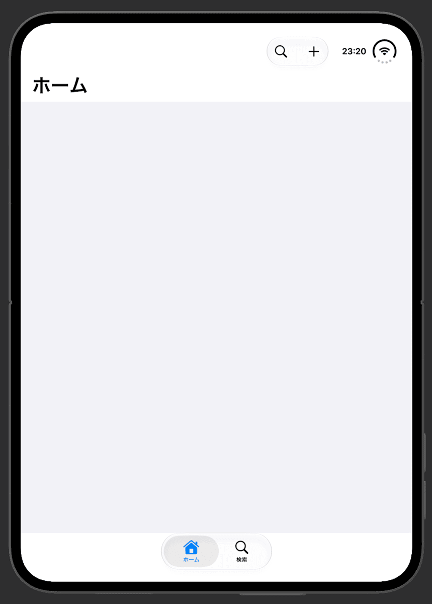
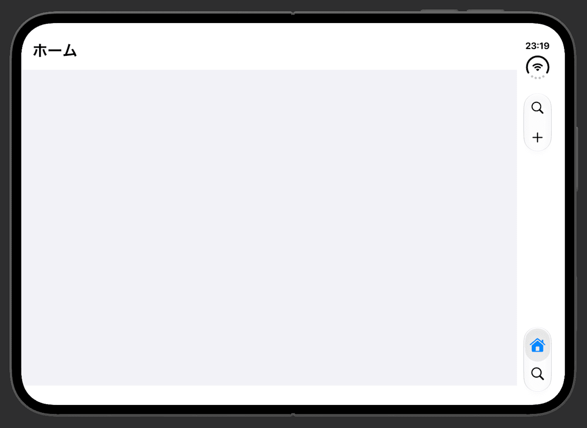
On iPhone Duo, the navigation bar, toolbar, and tab bar are arranged vertically along either the left or right edge of the screen. This layout appears when using the outer display, or the opened inner display in landscape orientation. When opened and used in portrait orientation, it returns to the horizontal bars at the top and bottom, the same as on a conventional iPhone.
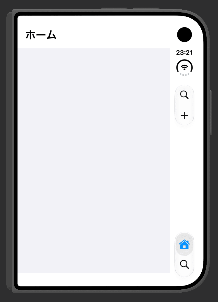
Closed
Opened, landscape
Opened, portrait
If you use standard bars such as NavigationStack, .toolbar, and TabView, your app is placed in the vertical bar without doing anything. The added APIs are for adjusting that behavior.
Here is the conclusion first.
| What you can do | API |
|---|---|
| Stop using the vertical bar and return to the horizontal bar | toolbarVerticalBehavior(_:) |
| Decide whether to prioritize the tab bar or the toolbar items when they don't all fit in the vertical bar | toolbarVerticalCompressionBehavior(_:) |
| Decide, for each toolbar item, whether to place it in the vertical bar or the horizontal bar | axisBehavior(_:) |
| Read which side, left or right, the vertical bar is on | toolbarVerticalEdge |
Conversely, the app cannot force the use of the vertical bar, nor specify whether the vertical bar is placed on the left or right.
toolbarVerticalBehavior
func toolbarVerticalBehavior(_ behavior: ToolbarVerticalBehavior) -> some View
Decides whether to use the vertical bar. There are two values.
.automatic(default): The system decides.disabled: Does not use the vertical bar and displays the horizontal bar
TabView {
    Tab("ホーム", systemImage: "house") {
        NavigationStack { HomeView() }
    }
}
.toolbarVerticalBehavior(.disabled)
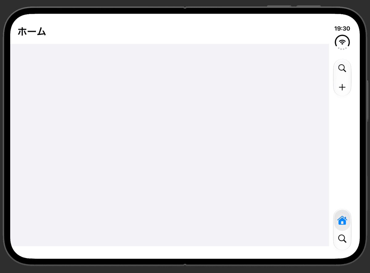
.automatic
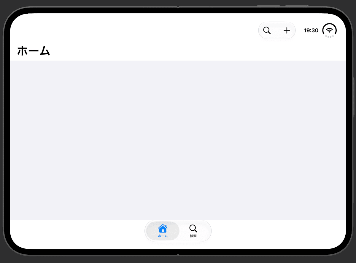
.disabled
The Tech Talks session says most apps are well suited to the vertical bar. Disabling it is for exceptional screens, and two examples are given.
- A screen like a calculator, which doesn't scroll and has its controls gathered at the bottom. With a horizontal bar, the content can spread across the full width
- A sheet whose toolbar has only a close button. A single button takes up a whole vertical column at the edge as a bar, so a horizontal bar lets the content use more space
toolbarVerticalCompressionBehavior
func toolbarVerticalCompressionBehavior(_ behavior: ToolbarVerticalCompressionBehavior) -> some View
The vertical bar holds both the tab bar and the toolbar items together, so when there are many items they no longer fit. This decides which one to prioritize in that case. There are three values.
.automatic(default): Leave it to the system.prefersToolbarItems: Prioritizes keeping the toolbar items.prefersTabBar: Prioritizes keeping the tab bar
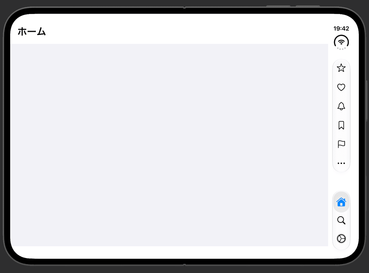
Following the sample in the official documentation, I attached it to the screen inside a tab and tried it. I placed three tabs and eight toolbar items to create a state where they don't all fit in the vertical bar.
TabView {
    Tab("ホーム", systemImage: "house") {
        NavigationStack {
            HomeView()
                .toolbar { ... }
                .toolbarVerticalCompressionBehavior(.prefersToolbarItems)
        }
    }
}
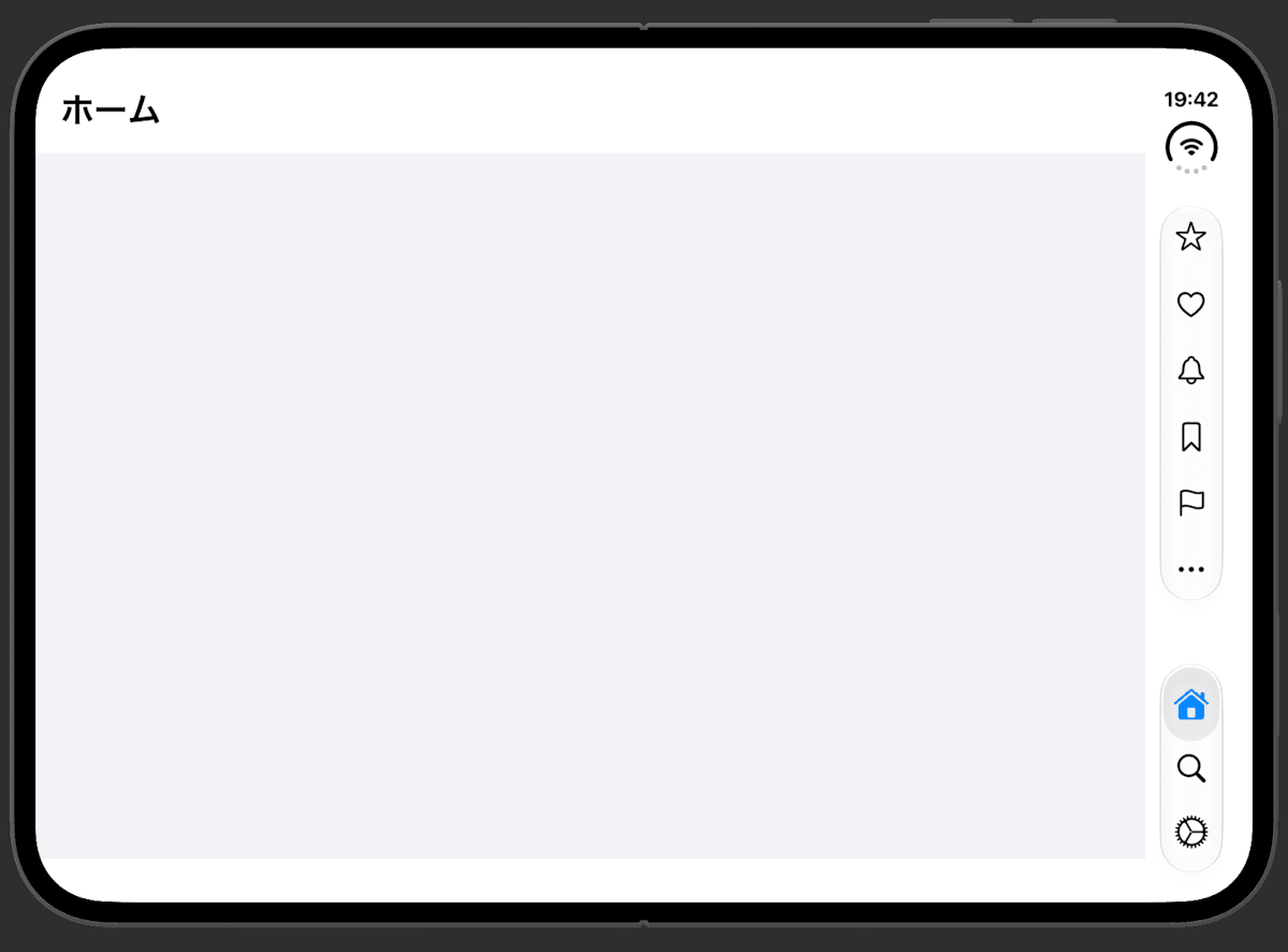
.automatic
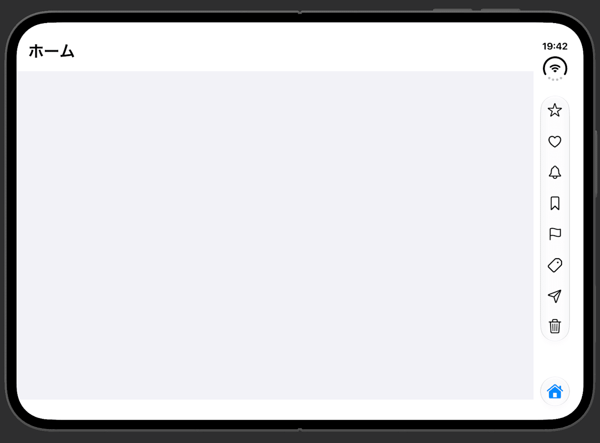
.prefersToolbarItems
.prefersTabBar
The way they shrink is as follows.
- When the toolbar items shrink, the items that don't fit are collected into a "…" icon
- When the tab bar shrinks, only the icon of the selected tab is displayed. Tapping it shows all the tabs, and you can navigate from there
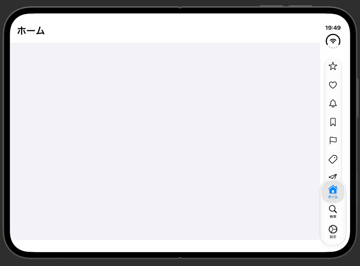
After tapping the shrunken tab bar
.automatic and .prefersTabBar produced the same display. As explained in the Tech Talks session, by default on iOS the toolbar items are collected into "…" and the tab bar remains. When you actually want to change the behavior, the one to use is .prefersToolbarItems.
axisBehavior
func axisBehavior(_ behavior: ToolbarItemAxisBehavior) -> some ToolbarContent
Attach it to a ToolbarItem to decide whether it goes in the vertical bar or the horizontal bar. There are three values.
.automatic(default): The system decides.horizontalOnly: Appears only in the horizontal bar.verticalPreferred: Appears in both. When both exist, the vertical bar is preferred
I attached each of the three values to an item and lined them up.
.toolbar {
    ToolbarItem(placement: .topBarTrailing) {
        Button("お気に入り", systemImage: "star") {}
    }
    .axisBehavior(.automatic)

    ToolbarItem(placement: .topBarTrailing) {
        Button("いいね", systemImage: "heart") {}
    }
    .axisBehavior(.horizontalOnly)

    ToolbarItem(placement: .topBarTrailing) {
        Button("テキスト") {}
    }
    .axisBehavior(.verticalPreferred)
}
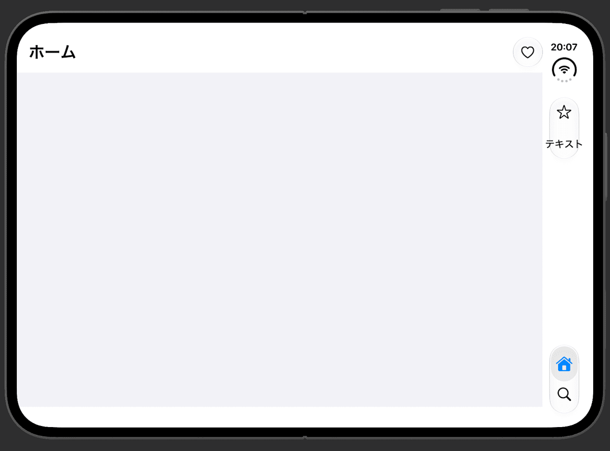
| Item | axisBehavior | Where it appeared |
|---|---|---|
| Favorite (icon) | .automatic |
Vertical bar |
| Like (icon) | .horizontalOnly |
Horizontal bar at the top |
| Text | .verticalPreferred |
Vertical bar |
The icon with .horizontalOnly appeared in the horizontal bar at the top.
The text with .verticalPreferred appeared in the vertical bar. It is placed in horizontal writing as is, so it overflowed the width of the bar.
The Tech Talks session introduces an example of using .horizontalOnly for a button that is normally an icon but switches to text such as "Done" during editing. Since text doesn't fit in the vertical bar, it is placed in the horizontal bar from the start. .verticalPreferred is described as being for custom Views built so that they don't break when placed in the vertical bar.
toolbarVerticalEdge
@Environment(\.toolbarVerticalEdge) private var edge // HorizontalEdge?
Reads which side, left or right, the vertical bar is on. It is read-only, and there is no way for the app to specify the position.
.leading: Left side.trailing: Right sidenil: Devices or situations where no vertical bar is placed
I read the value in each state. I set the device state, opened the screen, and logged the first value returned.
.onChange(of: edge, initial: true) { _, new in
    print("toolbarVerticalEdge: \(String(describing: new))")
}
| State | toolbarVerticalEdge |
|---|---|
| Closed | trailing |
| Opened, landscape | trailing |
| Opened, landscape (rotated the other way) | trailing |
| Opened, portrait | nil |
Screen with toolbarVerticalBehavior(.disabled) (opened, landscape) |
nil |
| iPhone 18 (landscape) | nil |
According to the official documentation, it is used to place custom UI such as your own bars on the same side as the system bar. In the sample, a custom palette is moved toward the side of the vertical bar.
FloatingToolPalette()
    .frame(maxWidth: .infinity,
           alignment: edge == .trailing ? .trailing : .leading)
Summary
- The vertical bar is supported automatically if you use standard bars. You cannot force it or specify the left/right position
toolbarVerticalBehavior(.disabled)returns to the horizontal bar. Use it only for exceptional screens- When items don't fit in the vertical bar, by default the toolbar items are collected into "…". If you want to prioritize displaying the toolbar items, attach
toolbarVerticalCompressionBehavior(.prefersToolbarItems) axisBehaviorlets you choose which bar each item goes in. Be careful: attaching.verticalPreferredto text makes it overflow- The position of the vertical bar can be read with
toolbarVerticalEdge