![I tried the new blocks of Slack Block Kit [Data Edition]](https://images.ctfassets.net/ct0aopd36mqt/wp-thumbnail-b803788be81ed4dff8256a1a01d1f2c2/dbdb94b4897959aa969f4bcc4a9330db/slack-eyecatch.jpg?w=3840&fm=webp)
I tried the new blocks of Slack Block Kit [Data Edition]

This page has been translated by machine translation. View original
Since 2026, new blocks have been added one after another to Slack's Block Kit. In this series, we will introduce these new blocks while actually trying them out.
- Part 1: Data Edition (this article)
- Part 2: General Display Edition
- Part 3: Agent Edition
- Part 4: Streaming Edition
- Part 5: Validation & CI Edition
For this first installment, we'll use the data table block and data visualization block to convert aggregated results into tables and charts and post them to a channel.
For the basics of Block Kit, please refer to the following article.
Overview of the Two Blocks
The data table block is a table block added on May 20, 2026 that supports pagination, sorting, and filtering[1].
Previously, to display a table in Slack, you had to manually align columns using mrkdwn code blocks or use the table block[^2]. However, neither of these allowed for interactive operations. With the data table block, you can sort columns and paginate without complex configuration.
The data visualization block is a chart block added on June 16, 2026 that supports four chart types: pie / bar / area / line[2].
Until now, the standard approach for charts was to have the app generate an image using matplotlib or similar tools and upload it via the files.upload API. With the data visualization block, you simply pass JSON to the blocks parameter of chat.postMessage, and rendering is handled by the Slack client. This means no image generation code and no upload round trips are needed. How convenient!
data table block Specifications[3]
| Item | Details |
|---|---|
| Number of rows | Minimum 2 including header, maximum 201 |
| Number of columns | Minimum 1, maximum 20. All rows must have the same number of elements |
| Cell types | 3 types: rich_text / raw_text / raw_number |
| Header | The first row is the header. rich_text cannot be used in header cells |
caption |
Required. Used as the value of the HTML caption element |
page_size |
1–100. Defaults to 5 if omitted |
| Character limit | 20,000 characters total across all cells per table and per entire message. Split the message if exceeded |
Note that sorting is alphabetical by default, but numeric sorting applies only when all cells in a column are raw_number. The key point is to send numeric columns in aggregated results as raw_number rather than strings.
data visualization block Specifications[4]
| Item | Details |
|---|---|
| Chart types | 4 types: pie / bar / area / line |
| Number of blocks | Up to 2 blocks per message |
title |
Required. Maximum 50 characters |
| pie | Minimum 1, maximum 12 segments. value must be greater than 0 and is rendered as a proportion of the total of all segments |
| bar / area / line | Minimum 1, maximum 12 series, axis_config is required. Maximum 20 data points per series |
| Label character limits | Each element of segment label, series name, data point label, and axis_config.categories is up to 20 characters. x_label and y_label are up to 50 characters |
Runtime validation rules specify that all data point label values must match one of the axis_config.categories, series cannot omit data points corresponding to categories, and series names must not be duplicated.
Trying It Out
We'll use hypothetical data showing the number of inquiries over the past 5 weeks, broken down by Web and app channels. This time, instead of building an app, we'll validate by pasting JSON into the Block Kit Builder.
For details on Block Kit Builder, please refer to the following article.
data table block
{
  "blocks": [
    {
      "type": "data_table",
      "caption": "週次問い合わせ件数",
      "page_size": 3,
      "rows": [
        [
          { "type": "raw_text", "text": "週" },
          { "type": "raw_text", "text": "Web" },
          { "type": "raw_text", "text": "アプリ" }
        ],
        [
          { "type": "raw_text", "text": "6/29 週" },
          { "type": "raw_number", "value": 42, "text": "42" },
          { "type": "raw_number", "value": 31, "text": "31" }
        ],
        [
          { "type": "raw_text", "text": "7/6 週" },
          { "type": "raw_number", "value": 55, "text": "55" },
          { "type": "raw_number", "value": 28, "text": "28" }
        ],
        [
          { "type": "raw_text", "text": "7/13 週" },
          { "type": "raw_number", "value": 38, "text": "38" },
          { "type": "raw_number", "value": 45, "text": "45" }
        ],
        [
          { "type": "raw_text", "text": "7/20 週" },
          { "type": "raw_number", "value": 61, "text": "61" },
          { "type": "raw_number", "value": 39, "text": "39" }
        ],
        [
          { "type": "raw_text", "text": "7/27 週" },
          { "type": "raw_number", "value": 47, "text": "47" },
          { "type": "raw_number", "value": 52, "text": "52" }
        ]
      ]
    }
  ]
}
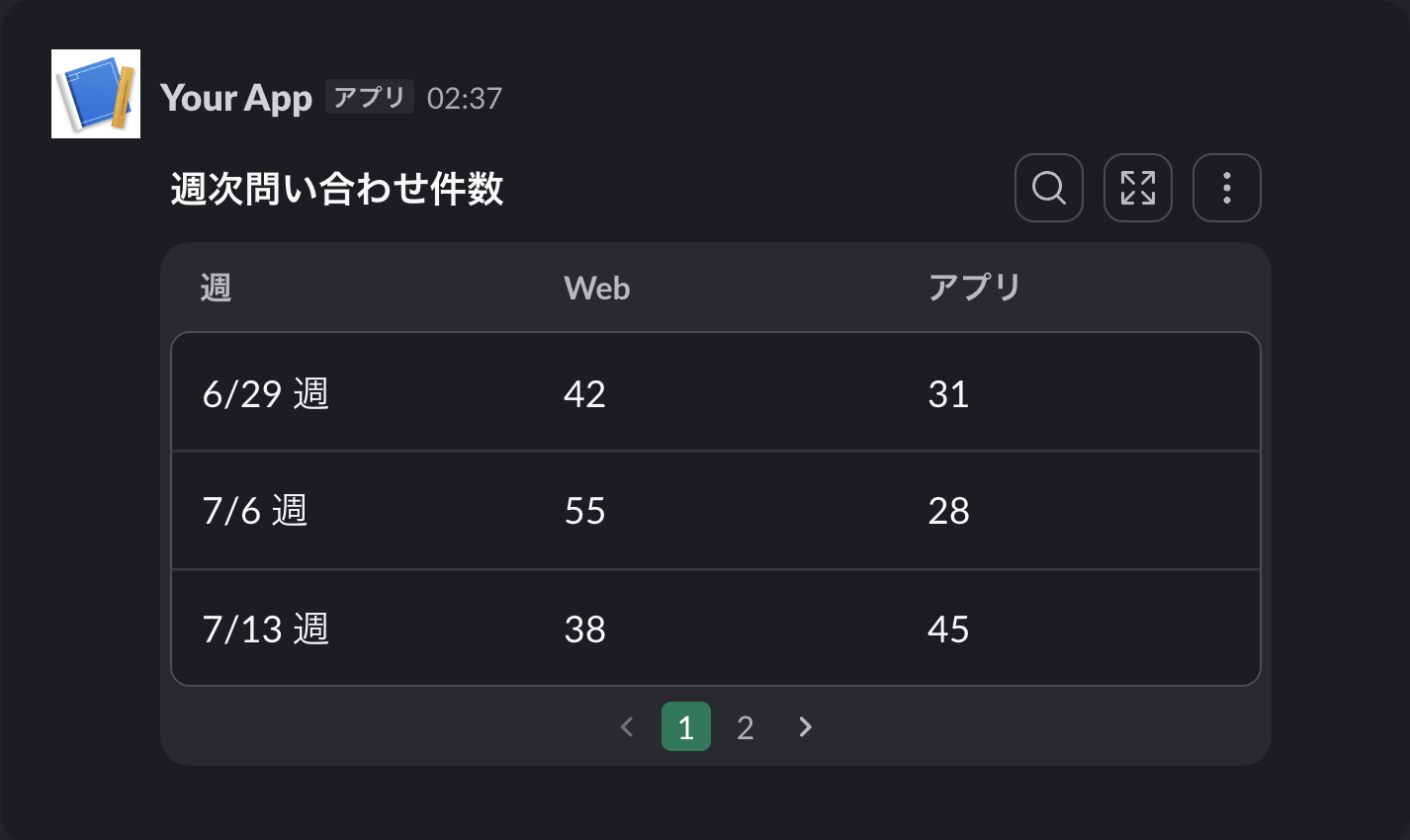
Clicking a column header sorts the table. Also, since page_size is set to 3, the 5 rows of data are split across 2 pages, and a pagination UI is displayed. When omitted, the default is 5 rows per page.
data visualization block
Let's turn the same data into a line chart.
{
  "blocks": [
    {
      "type": "data_visualization",
      "title": "問い合わせ件数の推移",
      "chart": {
        "type": "line",
        "series": [
          {
            "name": "Web",
            "data": [
              { "label": "6/29 週", "value": 42 },
              { "label": "7/6 週", "value": 55 },
              { "label": "7/13 週", "value": 38 },
              { "label": "7/20 週", "value": 61 },
              { "label": "7/27 週", "value": 47 }
            ]
          },
          {
            "name": "アプリ",
            "data": [
              { "label": "6/29 週", "value": 31 },
              { "label": "7/6 週", "value": 28 },
              { "label": "7/13 週", "value": 45 },
              { "label": "7/20 週", "value": 39 },
              { "label": "7/27 週", "value": 52 }
            ]
          }
        ],
        "axis_config": {
          "categories": ["6/29 週", "7/6 週", "7/13 週", "7/20 週", "7/27 週"],
          "x_label": "週",
          "y_label": "件数"
        }
      }
    }
  ]
}
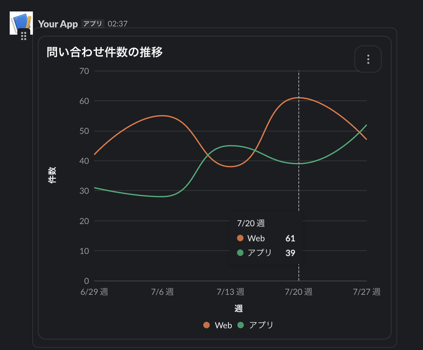
Hovering over the chart displays the number of inquiries for that week in a tooltip.
Differences from the Existing table block
Let me summarize the schema-level differences between the table block mentioned in the overview and the data table block.
| Item | table block | data table block |
|---|---|---|
| Sorting | None | Available |
| Pagination | None | Available. Row count specified with page_size |
| Column formatting | Alignment and wrapping specified via column_settings |
None |
| Character limit | 10,000 characters | 20,000 characters |
caption |
None | Required |
Since the data table block does not have column_settings, you'll need to use the table block when column formatting such as right-alignment is required.
Summary
By leveraging the data table block and data visualization block, you can easily display sortable tables and charts in Slack simply by assembling your aggregated results into JSON.
If you have any periodic report apps that already use tables or charts, why not consider migrating to these new blocks?
In the next installment, Part 2, we'll try out general display blocks. Stay tuned!