What is UI? ⑧ ~The Relationship Between Basic Accessibility and Usable Design~
This page has been translated by machine translation. View original
"This button is too small and hard to press..."
"This text is too light and difficult to read..."
Have you had experiences like these?
These might be issues related to "accessibility" in design. When you hear "accessibility," you might think it's about special considerations for people with disabilities or the elderly.
But in reality, it's a fundamental aspect of creating designs that are usable by as many people as possible. The topics of "color," "text," and "layout" that I've covered in previous articles are all connected to accessibility.
In this article, I'll explain "accessibility" in a friendly way from a UI design perspective, just like in previous articles.
What is Accessibility in UI?
Accessibility means "ease of approach" or "ease of use," referring to the ability of various people to access information and services regardless of disabilities, age, or usage environment.
Source: W3C Web Accessibility Initiative
https://www.w3.org/WAI/fundamentals/accessibility-intro/
For example, the following situations can happen to anyone:
- ☀️ Looking at your smartphone under strong sunlight outdoors → 👁️ Screen is hard to see
- 🤕 Injured and can only use one hand → 👆️ Difficult to operate
- 🚃 Watching videos in places where sound can't be played → 👂️ Can't hear audio
These "usability challenges" are categorized into 3 types:
| Type | Description | Examples |
|---|---|---|
| Permanent | Persistent barriers | Visual impairments, hearing impairments, etc. |
| Temporary | Barriers lasting for a period | Broken bones, after eye surgery, etc. |
| Situational | Barriers in specific situations | Sunlight, noise, one hand occupied, etc. |
Source: Microsoft Design - Inclusive:
https://inclusive.microsoft.design/
In other words, design that considers accessibility improves the experience for all users in various situations, not just those with disabilities. It should be seen as "quality of UI itself" rather than "special accommodation."
Removing "Visibility" Barriers (Color and Contrast)
As mentioned in the article about color (Part 3), information should never be conveyed by color alone. Users with color vision deficiencies or those using monochrome displays may not be able to distinguish differences in color.
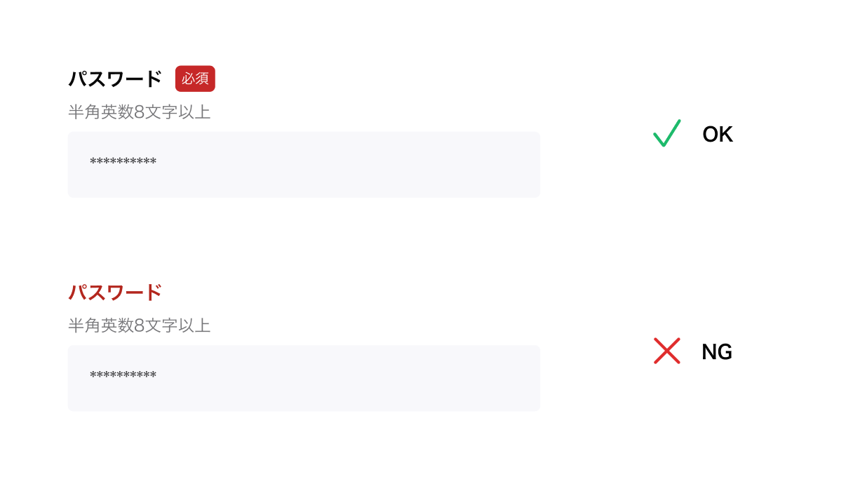
✅ OK
Using text such as "※Required" or icons in addition to color.
❌ NG
Indicating required fields with "red text" only.
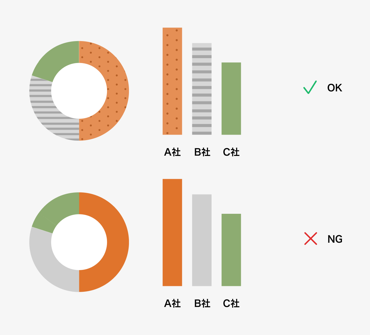
✅ OK
Adding labels to graphs or differentiating with patterns.
❌ NG
Distinguishing graph items by color alone.
Also, low contrast between text and background makes content very difficult to read for people with low vision or users viewing screens outdoors. It's important to ensure sufficient contrast ratio according to guidelines (like WCAG) – at least 4.5:1 for normal text and 3:1 for large text.
Structure that Supports "Clarity" (Markup and Assistive Technologies)
As explained in the typography article (Part 5), not only "appearance" but also the underlying "structure" is important in design.
Users with visual impairments obtain information using screen readers. In such cases, simply making text visually larger doesn't help if it's not properly designated as a "Heading" in the system structure.
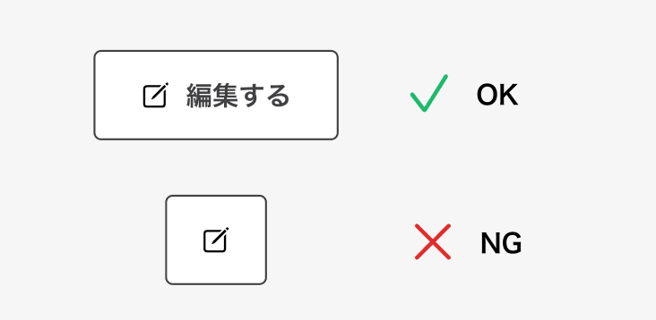
✅ OK
Set appropriate alternative text (labels) for icons so functions like "Search," "Close," or "Edit" are clearly understood.
❌ NG
Icon buttons without labels, where screen readers only say "button."
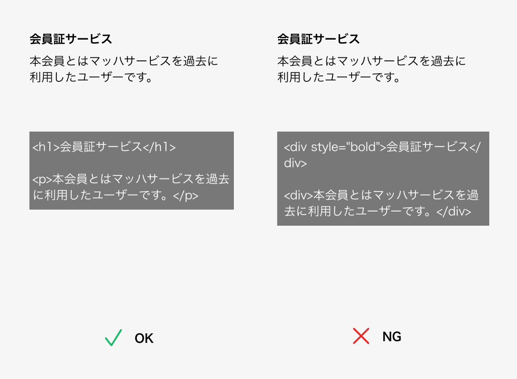
✅ OK
Implement with correct HTML structure so information order is clear even without visual cues.
❌ NG
Using bold formatting instead of proper heading tags (H1, H2...).
Size that Guarantees "Ease of Pressing" (Operability)
The "touch area" mentioned in the whitespace article (Part 6) and the web vs. app differences article (Part 7) is also part of physical accessibility. Small buttons can cause significant stress for users who have difficulty with fingertip operations or those using devices on moving trains.
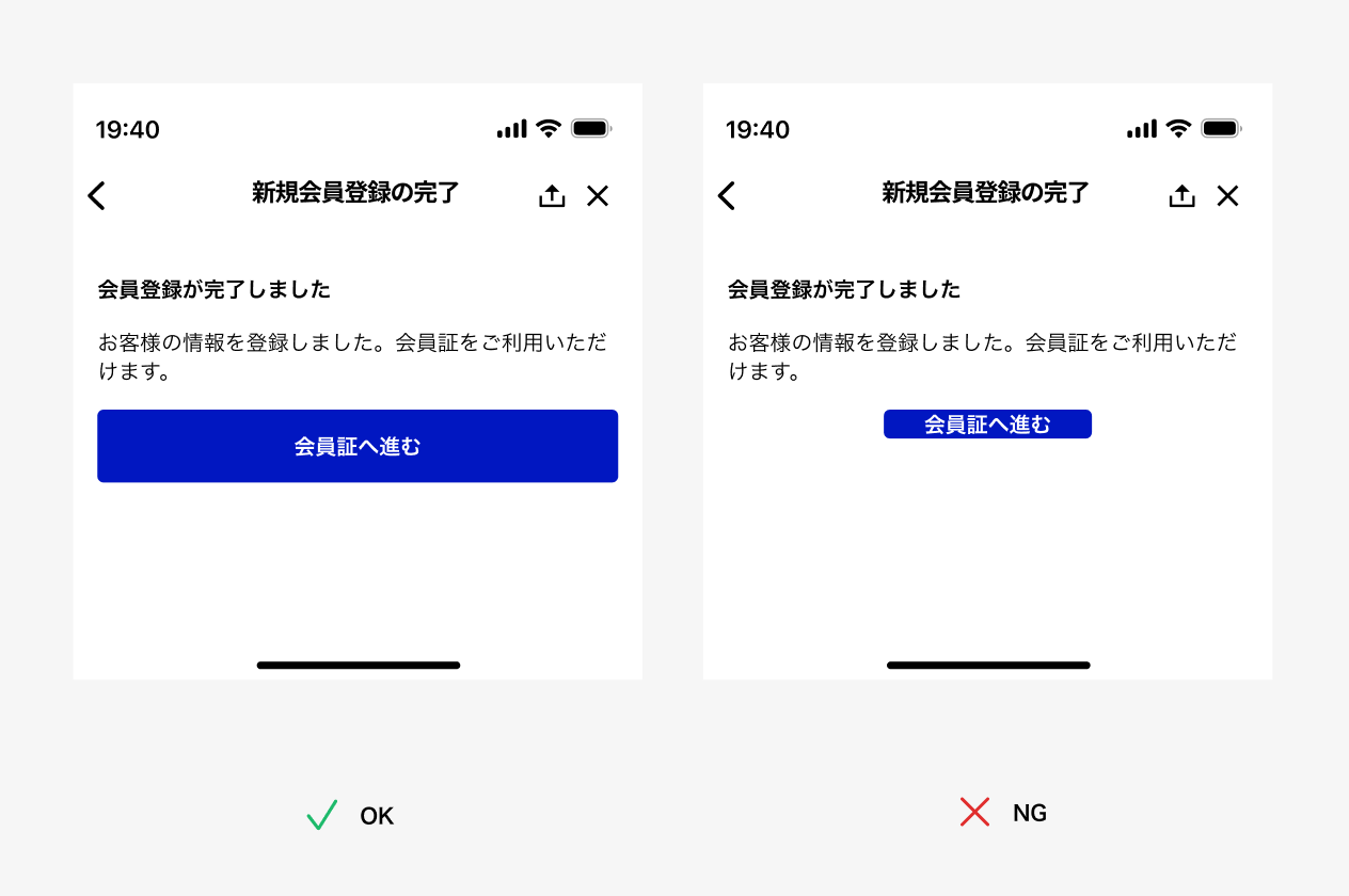
✅ OK
Follow OS guidelines, ensuring sizes of at least 44pt (iOS) or 48dp (Android).
❌ NG
Buttons so small they're hidden by a finger.
Conclusion
Accessibility in UI design isn't about compromising appearance but about ensuring information reaches more people.
- Don't rely solely on "color" for information; supplement with text and icons
- Create proper structure and labels with screen reader users in mind
- Ensure sizes and spacing that everyone can use easily (button heights of at least 44pt/48dp, etc.)
- Accessibility leads to "usability for everyone"
When designing, we tend to use "our own environment" as the standard. However, we might all experience reduced vision as we age or find ourselves unable to use one hand due to injury. Thinking this way, accessibility becomes relevant to everyone.
While achieving perfect accessibility from the start may be difficult, simply designing with the understanding that "various people might use this" will definitely improve UI quality.
Reference: Web Accessibility Introduction Guidebook (Digital Agency)
https://www.digital.go.jp/resources/introduction-to-web-accessibility-guidebook