In iOS 27, the safeAreaBar effect had changed to the equivalent of hard, so I investigated and fixed it.

This page has been translated by machine translation. View original
I built my personal iOS app "NSEasyConnect" with Xcode 27 (iOS 27 SDK) and noticed that the appearance around the buttons at the bottom of the screen had changed compared to iOS 26. No changes were made to the app's code whatsoever — the difference arose simply from switching the SDK used for building.
| iOS 26.5 | iOS 27.0 |
|---|---|
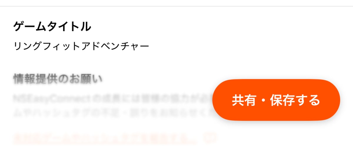 |
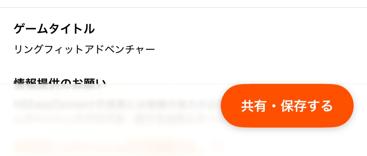 |
This article summarizes the cause of this change and how to address it.
Test Environment
- MacBook Pro (Apple M1 Pro, 32GB memory)
- macOS 26.6.2 (25G83)
- Xcode 27.0 (27A266a)
- iPhone 17 Pro Max Simulator
- iOS 26.5 / iOS 27.0
Behavior Before the Fix
In my app, buttons are placed at the bottom of the screen on the share/save screen and the game database update screen. Since iOS 26, I've been using safeAreaBar(edge:alignment:spacing:content:) so that the appearance takes on a Liquid Glass look when scrollable content slides underneath the buttons.
To achieve a similar appearance on iOS 18 and earlier as on iOS 26 and later, I have a compatibility View extension called safeAreaBarCompat. The iOS 18 and earlier implementation is outside the scope of this article and will be omitted.
public extension View {
    @ViewBuilder
    func safeAreaBarCompat(
        edge: VerticalEdge,
        showsDivider: Bool = true,
        @ViewBuilder content: () -> some View,
    ) -> some View {
        if #available(iOS 26.0, macOS 26.0, *) {
            safeAreaBar(edge: edge, content: content)
        } else {
            // Fall back to safeAreaInset for iOS 18 and earlier
            // ...
        }
    }
}
From here on, I'll be looking at a minimal test app I prepared for reproduction rather than NSEasyConnect itself. I built a screen using safeAreaBar with Xcode 27 (iOS 27 SDK) and displayed it on iOS 26.5 and iOS 27.0 simulators. All screenshots from this point are from this test app.
| iOS 26.5 (default) | iOS 27.0 (default) |
|---|---|
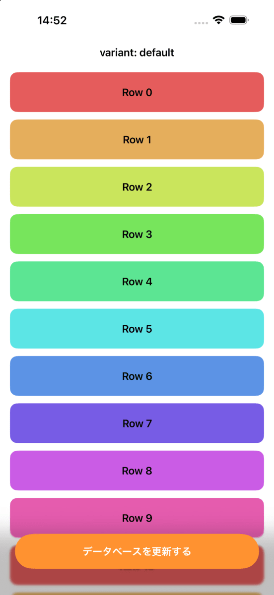 |
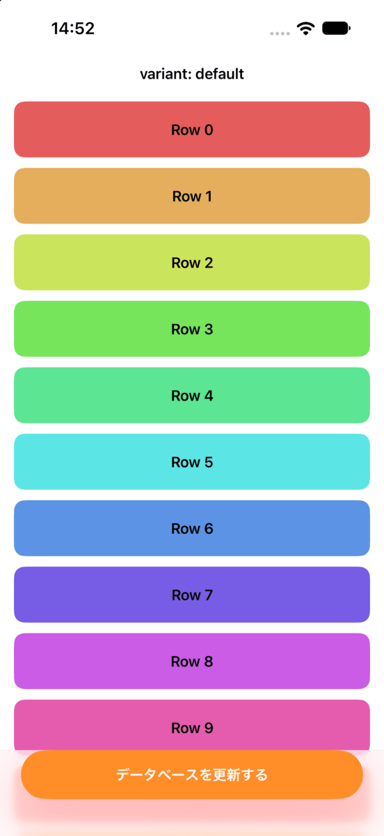 |
The same issue as in the NSEasyConnect introduction has been reproduced. On iOS 26.5, content that slides under the buttons fades out smoothly with a gradient. On iOS 27.0, however, a sharp boundary line appears slightly above the buttons, and the area below is filled in like frosted glass.
Scroll Edge Effect and the Default Style
Before explaining the cause, let me review the mechanism that determines this appearance.
The blur applied at the boundary between scrollable content and fixed controls such as toolbars or safeAreaBar is called the scroll edge effect, and its style is represented by ScrollEdgeEffectStyle. Three styles are available:
automatic: The system decides the stylehard: Creates a nearly opaque, clearly defined linear boundarysoft: Creates a subtle, blurred boundary
What's important here is how automatic is handled. The documentation states that automatic is set by default and the system decides which style to apply based on the platform and context. hard and soft are for developers to specify explicitly when the automatically chosen style doesn't suit the content.
In other words, it's more accurate to understand that the iOS 26 default was not soft, but rather that the resolved result of automatic was equivalent to soft.
Cause
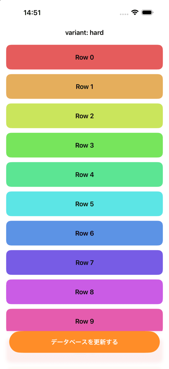
When building with the iOS 27 SDK, the style that automatic resolves to for the scroll edge effect on safeAreaBar has changed to the equivalent of hard. Running an app built with Xcode 26.6 (iOS 26 SDK) on iOS 27.0 had no effect.
In this test, the effect on iOS 26.5 was nearly identical to specifying scrollEdgeEffectStyle(.hard, for: .bottom).
| iOS 26.5 (.hard specified) |
|---|
 |
Regarding release notes, I checked both iOS & iPadOS 27 Release Notes and Xcode 27 Release Notes, but found no relevant description.
Fix
By explicitly specifying .soft with scrollEdgeEffectStyle(_:for:), you can opt out of the system's automatic determination and get a smooth gradient similar to iOS 26, even on iOS 27.
ScrollView {
    // ...
}
.scrollEdgeEffectStyle(.soft, for: .bottom)
.safeAreaBar(edge: .bottom) {
    // Button at the bottom of the screen
}
scrollEdgeEffectStyle(_:for:) doesn't have to be applied directly to a ScrollView or List — it can be applied to an outer view wrapping them. I made the following change to the safeAreaBarCompat mentioned earlier.
public extension View {
    @ViewBuilder
    func safeAreaBarCompat(
        edge: VerticalEdge,
        showsDivider: Bool = true,
        @ViewBuilder content: () -> some View,
    ) -> some View {
        if #available(iOS 26.0, macOS 26.0, *) {
            // Because the resolved result of automatic changed to the equivalent of hard in iOS 27, explicitly specify soft for consistency
            scrollEdgeEffectStyle(.soft, for: edge == .top ? .top : .bottom)
                .safeAreaBar(edge: edge, content: content)
        } else {
            // Fall back to safeAreaInset for iOS 18 and earlier
            // ...
        }
    }
}
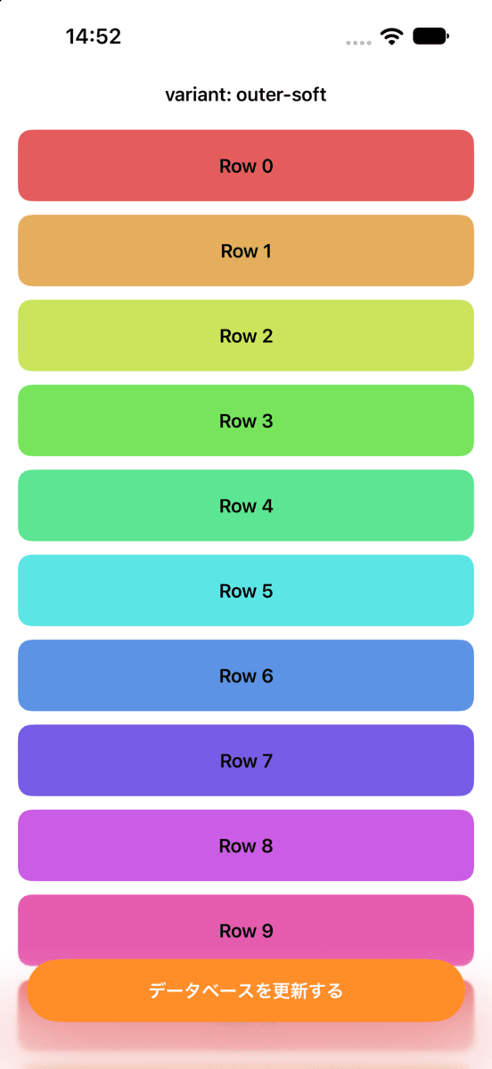
Since scrollEdgeEffectStyle(_:for:) is an iOS 26 and later API, no additional #available check is needed. However, as shown below, the appearance when specifying .soft is not strictly identical between iOS 26 and iOS 27.
| iOS 26.5 (.soft) | iOS 27.0 (.soft) |
|---|---|
|
 |
If the effect itself is not needed, you can use scrollEdgeEffectHidden(_:for:) to remove the effect for the specified edge.
What Was Not Tested
This investigation only covered the bottom edge (.bottom) of safeAreaBar. Whether the same change occurs on the top edge (.top), toolbars, or plain ScrollView edges without safeAreaBar has not been tested. Also, all testing was conducted on simulators.
Summary
It's inconvenient when the appearance changes just from switching SDKs, but the impact is small since it can be addressed with a single line of scrollEdgeEffectStyle(.soft, for:).
Although there is no mention in the release notes, automatic is a style that is explicitly documented as "decided by the system." The fact that its resolved result changes between OS versions is within the bounds of the specification. Furthermore, the approach of changing behavior only when built with the iOS 27 SDK is Apple's established method for changing behavior without breaking existing apps. Taking all this into account, it's reasonable to consider this an intentional change.
By the same token, as long as you leave automatic in place, similar changes could occur in future OS versions as well. It's safer to explicitly specify the style for areas where you want the appearance to be fixed. When building with Xcode 27, it's worth taking a look at the appearance around safeAreaBar once.