![[Update] I tried out the new feature in Amazon Quick that automatically generates BI screens from images and prompts](https://images.ctfassets.net/ct0aopd36mqt/2x7muHjvW69fxuVNSKWZHp/b37e05a972fc8125e9214abd764928fa/amazon-quick.png?w=3840&fm=webp)
[Update] I tried out the new feature in Amazon Quick that automatically generates BI screens from images and prompts

This page has been translated by machine translation. View original
This is Ishikawa from the Cloud Business Headquarters. Generate Sheet, which generates a single sheet in an existing analysis, and a feature to create an analysis from a dashboard image have been added to Amazon Quick, so I tried both. This is a practical and incredibly useful update.
The Two Features: "Generate Sheet" and "Generate Analysis from an Image"
Amazon Quick already has Generate Analysis, which generates multi-sheet analyses all at once from natural language prompts. This update provides Generate Analysis in two ways.
The first, Generate Sheet, is a feature that generates a single sheet within an open analysis. You can add a sheet to an existing analysis without recreating the entire analysis.
The second is a feature that generates an analysis by attaching a dashboard image to a prompt. It targets dashboard images from BI tools other than Amazon Quick, and recreates them as editable analyses within the scope supported by Amazon Quick.
Both are intended for Author Pro users on Enterprise subscriptions at the time of announcement. Authors will also receive promotional access as part of Amazon Quick Enterprise until December 2026, unless access is restricted by the organization.
The two features differ in where they are launched and the maximum length of prompts that can be entered.
According to the official documentation, Generate Sheet adds a sheet with "visuals selected to match the data, filter controls, and calculated fields such as year-over-year and month-over-month comparisons." The purpose of this verification is to confirm how far this actually goes.
Regarding generation from an image, it is stated that Amazon Quick reads the image and builds sheets and visuals supported by Amazon Quick.
Trying It Out
Prerequisites
- Amazon Quick Enterprise Edition and at least one Author Pro user
- At least one dataset
- Verification environment: ap-northeast-1 (Tokyo) and us-east-1 (Northern Virginia)
- Dataset used for verification: Superstore order data
At the time of writing, these two features only have a console UI, and all verification was performed through console operations.
The Generate Button Does Not Appear in the Tokyo Region
First, in the Tokyo region, I opened an existing analysis and pressed the + on the sheet tab. According to the documentation procedure, the new sheet dialog that opens here should show Interactive Sheet and Generate.
However, only [Cancel] and [Add] were displayed, with no Generate. So I switched regions to check. I switched the region to Northern Virginia from the user dropdown, and repeated the same operation with the Japanese UI.
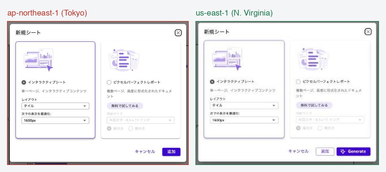
The left is the Tokyo region, the right is Northern Virginia. Both have the Japanese UI and show the same new sheet dialog. The Tokyo region has only [Cancel] and [Add], while the Virginia region has [Cancel] and [Add] plus [Generate].
The What's New page states "generally available in all AWS Regions where Amazon Quick is available," but as of the time of writing, the entry point for Generate Sheet could not be confirmed in the Tokyo region. The subsequent verification will proceed in Northern Virginia.
Note that the [Add image] button was displayed on the Generate analysis screen in the Tokyo region as well. It appears that even within the same update, the situation differs by feature.
Trying Generate Sheet with a Japanese Prompt
Selecting Generate opens the Create a sheet screen.
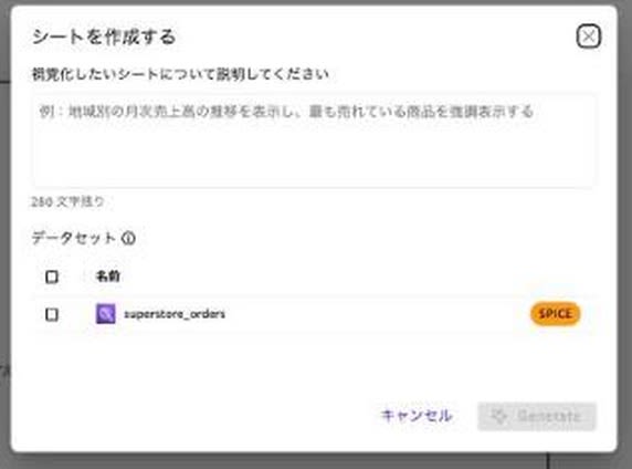
The heading reads "Describe the sheet you want to visualize," and the input field contains a placeholder: "Example: Show monthly sales trends by region and highlight the best-selling products."
The "280 characters remaining" below the input field is the prompt limit for this dialog. This is considerably shorter than the 1,400 characters for Generate Analysis mentioned later, so you need to write with focused requirements.
The Dataset section below lists only the datasets included in the open analysis. In this case, there is only one: superstore_orders. Other datasets in the account cannot be selected. The Generate button in the lower right cannot be pressed until both the prompt and dataset are filled in.
I entered the following prompt for this test.
A sheet to analyze sales and profit by category and sub-category. Include KPIs for sales and profit, monthly sales trends, sales composition by category, and a profit margin ranking by sub-category. Also add calculated fields for year-over-year comparisons, and filter controls for region and segment.
After entering the prompt and pressing [Generate], a [Generating sheet] tab appears next to the sheet tabs, and you can still operate other sheets in the analysis while it generates. Generation took a few minutes.
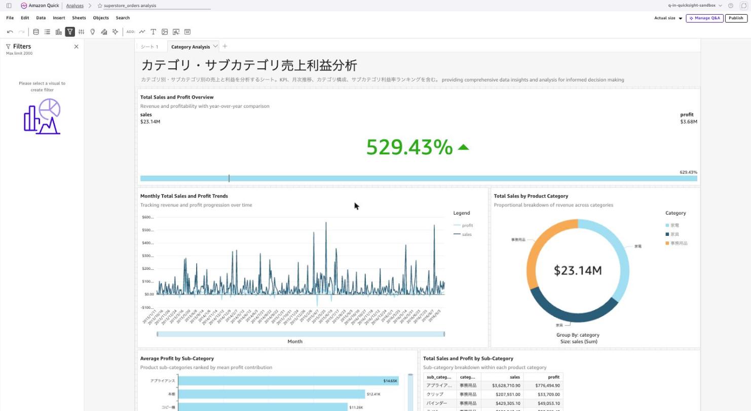
The completed sheet was named "カテゴリ・サブカテゴリ売上利益分析" (Category/Sub-Category Sales and Profit Analysis), and the sheet name was also in Japanese from the Japanese prompt. There are 5 visuals.
- Total Sales and Profit Overview (KPI)
- Monthly Total Sales and Profit Trends (line)
- Total Sales by Product Category (donut)
- Average Profit by Sub-Category (horizontal bar)
- Total Sales and Profit by Sub-Category (table)
While the sheet name was in Japanese, the titles and descriptions of each visual were in English. The description below the sheet was also mixed Japanese and English: "カテゴリ別・サブカテゴリ別の売上と利益を分析するシート。KPI、月次推移、カテゴリ構成、サブカテゴリ利益率ランキングを含む。 providing comprehensive data insights and analysis for informed decision making."
Note the 529.43% KPI at the top of the image. The visual's description reads "Revenue and profitability with year-over-year comparison," claiming a year-over-year comparison, but as you can see from sales $23.14M on the left and profit $3.68M on the right side, it is actually a comparison of sales versus profit. Opening the left pane revealed that profit was set as the target value.
The Average Profit by Sub-Category in the lower left also has a Y-axis title of Profit Margin, but the plotted values such as $14.65K are average profit as a monetary amount. The Monthly Total Sales and Profit Trends in the center also has "monthly" in the title, but dates are lined up on the X-axis.
Here, I checked the two items specified in the prompt: filter controls and calculated fields. I opened the filter panel to check, but there were 0 sheet-level filters. I also checked the field list in the data panel, but it was the same original columns from the dataset, with no calculated fields added.
Trying Generate Sheet with an English Prompt
To determine whether the Japanese prompt was the cause, I generated again with an English prompt against the same analysis. Filter controls and calculated fields were explicitly specified this time.
Sales and profit by category and sub-category. Include KPIs for sales and profit, monthly sales trend, category mix, and sub-category profit margin ranking. Add a year-over-year growth calculated field and filter controls for region and segment.
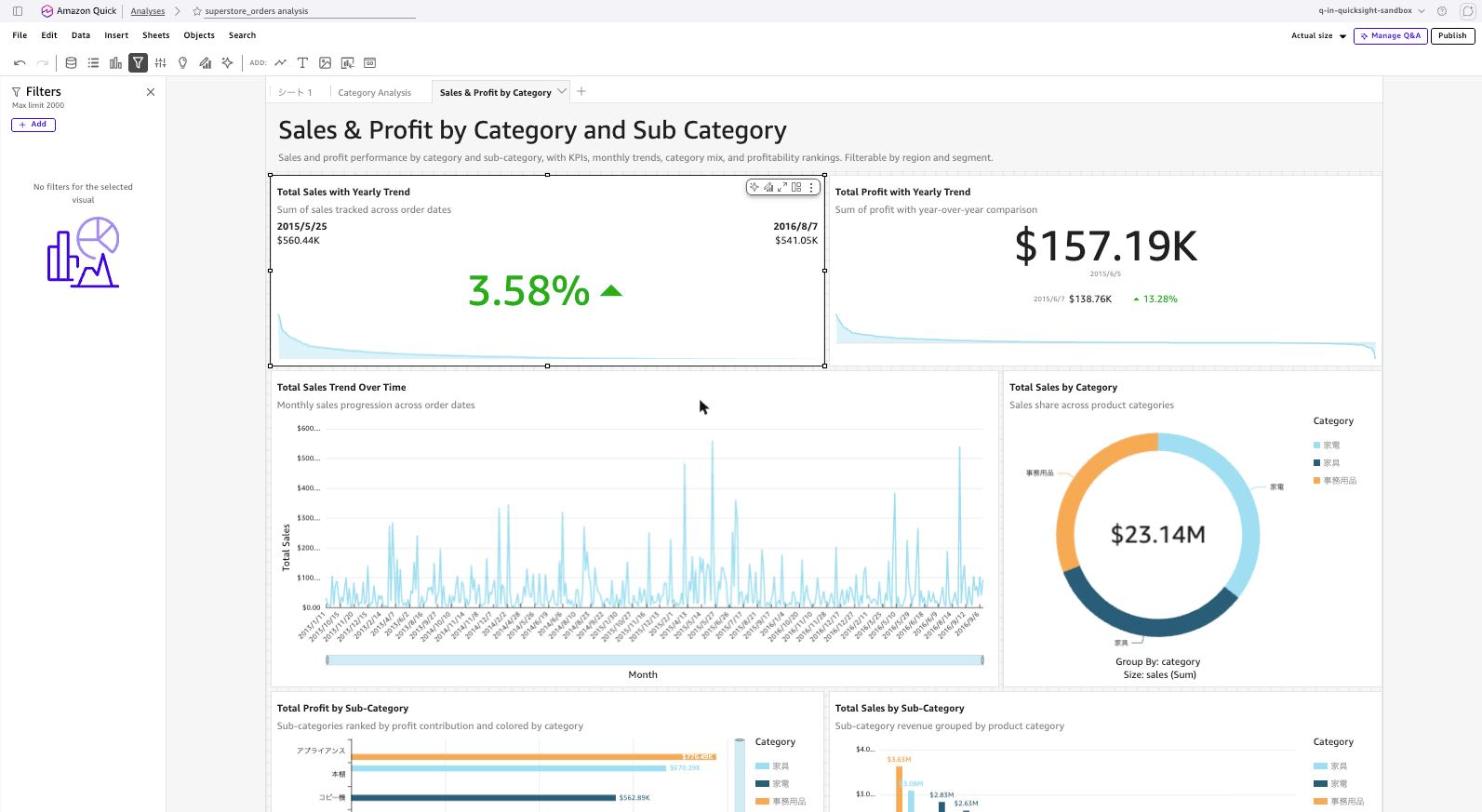
The generated sheet was "Sales & Profit by Category and Sub Category," and the number of visuals increased to 6.
- Total Sales with Yearly Trend (KPI)
- Total Profit with Yearly Trend (KPI)
- Total Sales Trend Over Time (line)
- Total Sales by Category (donut)
- Total Profit by Sub-Category (horizontal bar)
- Total Sales by Sub-Category (vertical bar)
The KPI construction was more appropriate than the Japanese version. The top two show 3.58% and 13.28% as period-to-period comparisons, with dates such as 2015/5/25 and 2016/8/7, and 2015/6/5 and 2015/6/7 attached respectively. Opening the left pane showed that order_date was set in the trend group. It is not configured to put profit into the target value as in the Japanese version.
However, filter controls and calculated fields were 0 with the English prompt as well. Despite the description beneath the title reading "Filterable by region and segment," no filter controls are placed on the sheet as shown in the image. The point about the X-axis title being Profit Margin in the lower-left Total Profit by Sub-Category while the content shows monetary values was the same as the Japanese version.
Even when the prompt language was changed, the fact that filter controls and calculated fields were not created remained the same.
Generating an Analysis from a Dashboard Image
Next, I tried generating an analysis from an image. The image used as input was built in HTML to simulate a dashboard from a BI tool other than Amazon Quick, resulting in a 1600 x 1000 pixel legacy_bi_dashboard.png (figure below).
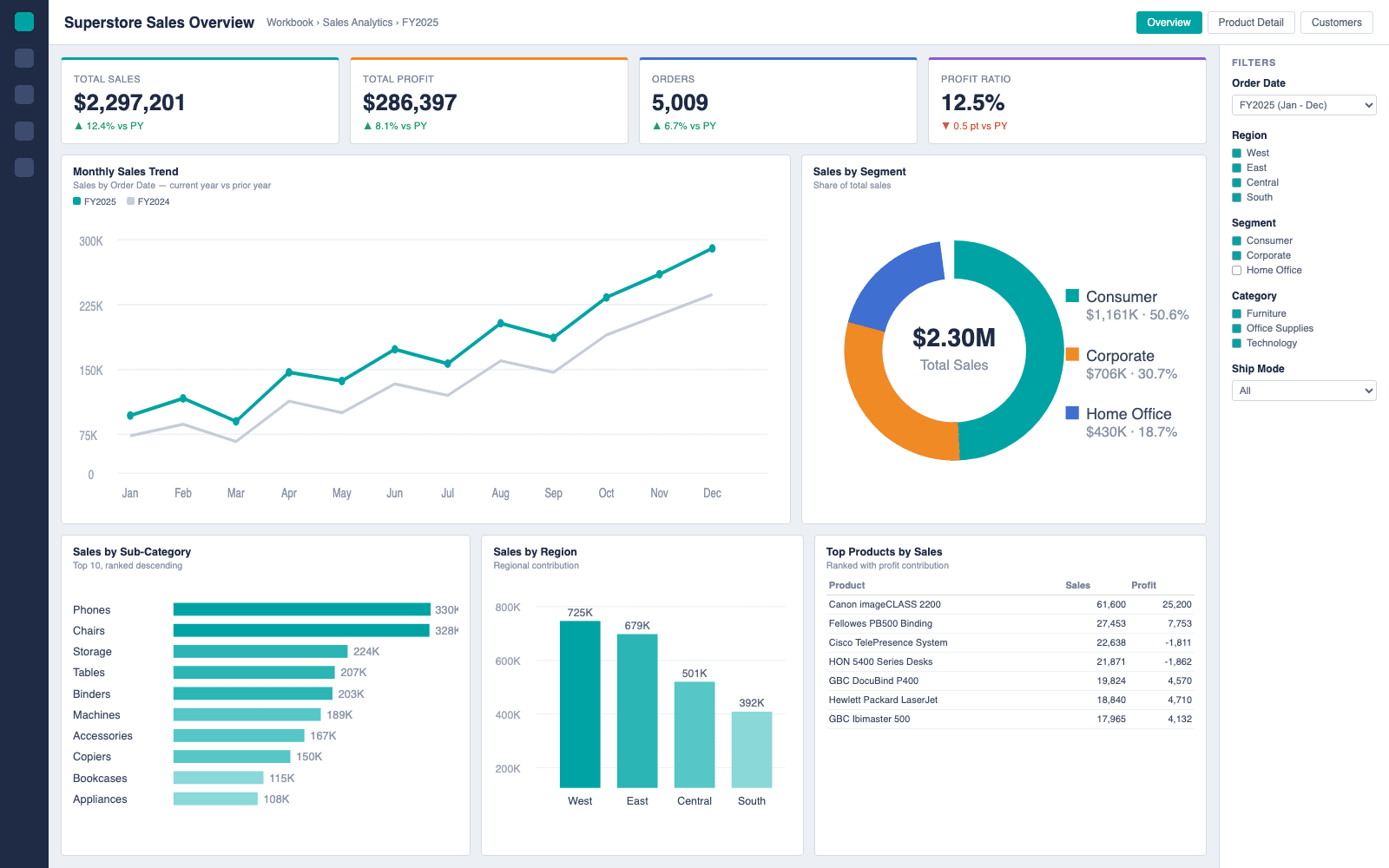
The elements included in the image are as follows.
- 4 KPIs (Total Sales, Total Profit, Orders, Profit Ratio, all with year-over-year comparisons)
- Monthly Sales Trend (2 lines: current year and previous year)
- Sales by Segment (donut)
- Sales by Sub-Category (horizontal bar, top 10)
- Sales by Region (vertical bar)
- Top Products by Sales (table)
- 5 filter panels on the right (Order Date, Region, Segment, Category, Ship Mode)
- 3 tabs in the upper right (Overview, Product Detail, Customers)
A title "Superstore Sales Overview" is placed in the upper left. How this title is handled later is the highlight.
Selecting Generate analysis from the analysis list opens the Visualize your data with AI screen.

Below the input field, [+ Add data] and [Add image] are arranged side by side. Selecting the image from [Add image] attaches a chip labeled legacy_bi_dashboard.png next to it.
At the bottom of the screen it reads: "Generate Analysis uses AI to create multi-sheet analyses with calculated fields, filter controls, and multi-dataset support. Generated analyses should be reviewed before publishing." The creation of calculated fields and filter controls, as well as the need to review before publishing, are explicitly stated on this screen.
I selected the Superstore order data for the dataset, and kept the prompt minimal since I wanted to see what would be read from the image.
Recreate the attached dashboard image as closely as possible using this dataset. Keep the same KPIs, charts and filter controls as the image.

During generation, progress is displayed in stages. The 9 steps observed were as follows. There are dedicated steps for Generating calculated fields and Generating filters. For Generate Sheet, there was no display of processing equivalent to these.
"Superstore Sales Overview" is the exact title from the upper left of the original image. The title was read from the image. Note that Preview analysis outline was selected instead of Generate analysis, but within the polling range, the screen for editing the plan was not displayed, and generation proceeded to completion.
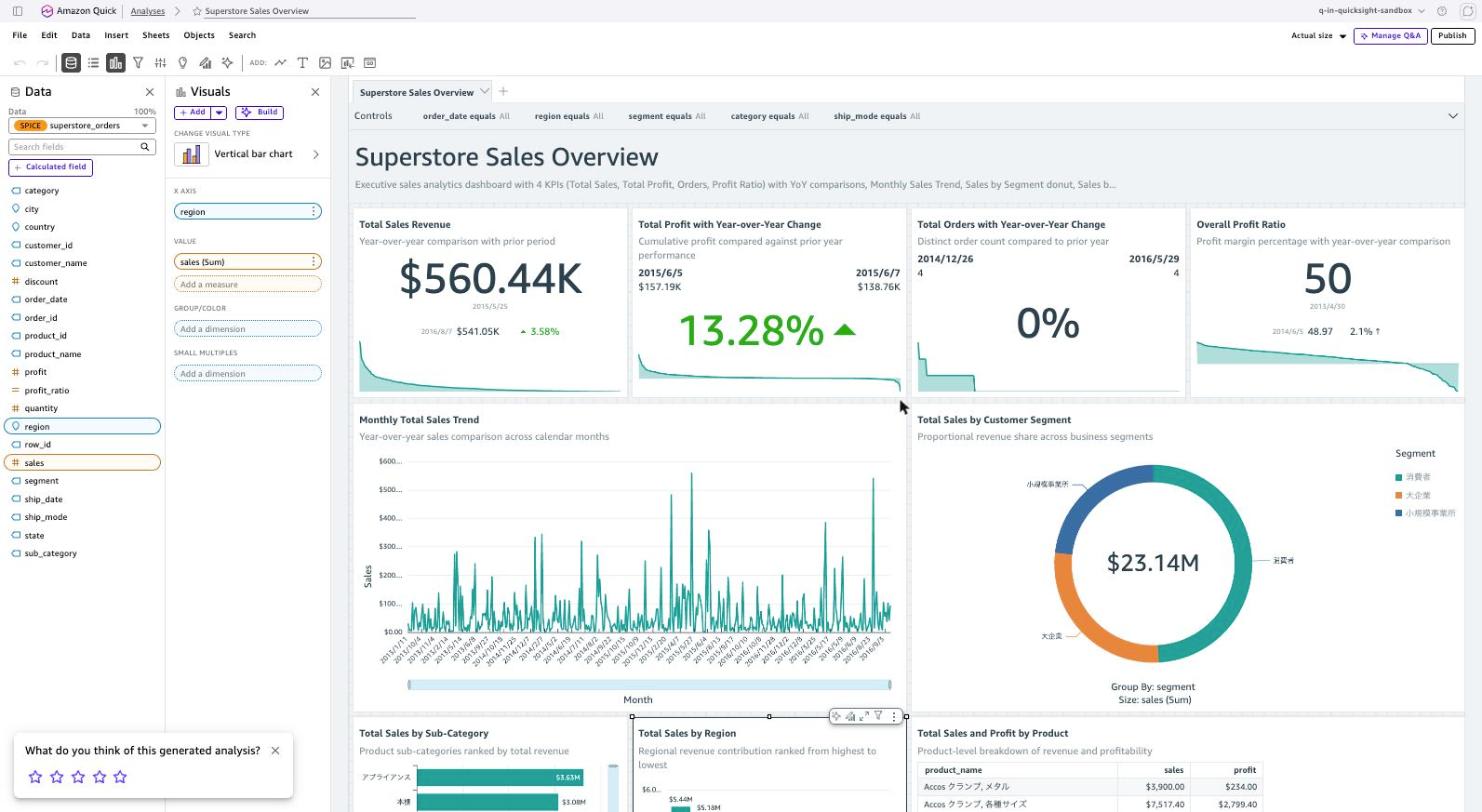
The generated analysis was named "Superstore Sales Overview" and had 9 visuals. The correspondence with the original image is as follows.
| Original image element | Generated analysis |
|---|---|
| TOTAL SALES (KPI with YoY) | Total Sales Revenue |
| TOTAL PROFIT (KPI with YoY) | Total Profit with Year-over-Year Change |
| ORDERS (KPI with YoY) | Total Orders with Year-over-Year Change |
| PROFIT RATIO (KPI with YoY) | Overall Profit Ratio |
| Monthly Sales Trend (2 lines) | Monthly Total Sales Trend (1 line) |
| Sales by Segment (donut) | Total Sales by Customer Segment (donut) |
| Sales by Sub-Category (horizontal bar) | Total Sales by Sub-Category (horizontal bar) |
| Sales by Region (vertical bar) | Total Sales by Region (vertical bar) |
| Top Products by Sales (table) | Total Sales and Profit by Product (table) |
| 5 filters | 5 controls |
| 3 tabs | 1 sheet |
An unfamiliar field called profit_ratio has appeared in the field list in the left pane. It was not in the original 20 columns.
Let me zoom in on the top of the sheet.

The Controls row has five items: order_date equals All, region equals All, segment equals All, category equals All, and ship_mode equals All. These roughly correspond to all five of Order Date, Region, Segment, Category, and Ship Mode placed in the filter panel of the original image.
The title is "Superstore Sales Overview," using the title from the original image as-is. The description below reads: "Executive sales analytics dashboard with 4 KPIs (Total Sales, Total Profit, Orders, Profit Ratio) with YoY comparisons, Monthly Sales Trend, Sales by Segment donut, Sales b..." with the names of the 4 KPIs from the original image listed verbatim.
I opened [Edit] from the menu for the calculated field profit_ratio mentioned earlier and checked its definition.
/*
Profit margin as a percentage of total sales.
*/
ifelse(sum(sales) = 0, NULL, sum(profit) / sum(sales) * 100)
This means it took a metric that did not exist in the dataset from the PROFIT RATIO KPI in the original image and created it as a calculated field. The implementation is commendable, with a branch to avoid division by zero and a comment explaining the content.
On the other hand, there were also aspects that were not reproduced. The three tabs in the original image were consolidated into one sheet, and the tab structure was not created. The Monthly Sales Trend was drawn with two lines for the current and previous year, but what was generated was a single line.
Care was also needed regarding the actual values. While the donut shows $23.14M as the total sales for all periods, the Total Sales Revenue KPI in the upper left shows $560.44K. The KPI is configured to compare periods separated by a trend group, which differs in meaning from the all-period total that the KPI in the original image showed.
Analysis
Testing both features against the same dataset revealed differences in the generated analyses (visuals).
| Item | Generate Sheet | Generate Analysis from Image |
|---|---|---|
| Entry point | + in sheet tab within analysis | Generate analysis from analysis list |
| Prompt limit | 280 characters | 1,400 characters |
| Output unit | 1 sheet | 1 analysis |
| Dataset | Only those included in the analysis | Select from within the account |
| Number of generated visuals | 5–6 | 9 |
| Filter controls | 0 | 5 |
| Calculated fields | 0 | 1 (profit_ratio) |
| Tokyo region | No entry point as of verification date | Add image button is displayed |
The official documentation states that Generate Sheet adds a sheet containing filter controls and calculated fields such as year-over-year comparisons. In this test, neither Japanese nor English prompts, nor even explicit specification, resulted in any filter controls or calculated fields. Since this cannot be judged from a single generation, it would be wise to verify these two points when using the feature.
In contrast, for generation from an image, dedicated steps called Generating calculated fields and Generating filters ran, and 5 controls and 1 calculated field were actually created. Even within the same generative BI, the processing flow itself appears to differ depending on whether the input is an image or text.
Let me also summarize what was and was not reproduced in the generation from an image.
What was reproduced
- Dashboard title
- Metric selection for 4 KPIs
- Visual types (donut, horizontal bar, vertical bar, line, table)
- 5 target columns for filters
- Calculated field creation for a metric not present in the dataset
What was not reproduced
- Tab structure (3 tabs consolidated into 1 sheet)
- Year-over-year comparison with 2 lines (generated as 1 line)
- KPI aggregation scope (period comparison rather than all-period total)
While "what you want to see" as depicted in the image is being read, the parts corresponding to "how to segment and display it" are being dropped. For the use case of creating a starting point when migrating a dashboard built in another BI tool to Amazon Quick, the work of manually arranging visuals can be skipped. However, since aggregation definitions cannot be used as-is, a step to check the settings of each visual after generation is still necessary.
A note on prompt language as well. A sheet was generated even with a Japanese prompt, and the sheet name was also in Japanese. However, within the scope of this test, the English prompt yielded a more appropriate KPI construction. The Japanese version described "year-over-year comparison" in the description text while putting profit into the target value, creating a discrepancy between the visual's intent and its settings.
Regarding regions, the Generate Sheet button was not present in the Tokyo region as of the time of writing. This differs from the What's New description, but is likely due to how the deployment is progressing. If you try in the Tokyo region and cannot find Generate, you can narrow it down by checking in Northern Virginia.
Points I hope to see improved in the future are as follows.
- Generation of filter controls and calculated fields in Generate Sheet
- Multi-sheet generation from tab structures within images
- Reading of series configurations like year-over-year comparisons within images
- Rollout of Generate Sheet to the Tokyo region
- Japanese language support for visual titles and descriptions
In Closing
I tried Generate Sheet and generation from an image in Amazon Quick.
Generate Sheet is practical in that it allows you to add a sheet without recreating the entire analysis. The prompt limit is 280 characters, and you can only select from datasets included in the analysis. Since filter controls and calculated fields were not generated in this test, it is realistic to treat it as a tool for creating a rough template of visuals.
Generation from an image produced more in-depth results than expected. It reproduced the dashboard image's title, KPIs, visual types, and filter target columns, and created metrics not present in the dataset as calculated fields. In situations where you want to recreate a dashboard built in another BI tool in Amazon Quick, the first steps can be skipped.
Neither feature produces results that can be published as-is, and a process to verify aggregation definitions and visual settings is necessary. Amazon Quick itself encourages reviewing before publishing on the generation screen.
If you have an Enterprise subscription and an environment with at least one Author Pro user, you can try this without any additional configuration. Authors are also eligible for promotional access until December 2026. If you cannot find Generate in the Tokyo region, try switching regions to check.