I tried customizing the appearance and functionality of DevRev's PLuG chat

This page has been translated by machine translation. View original
Hello, I'm Subaru.
In my previous article (Trying to Embed DevRev's PLuG Widget into a Website), I tried embedding the PLuG widget in an HTML file and displaying it on Vercel. This time, I'll comprehensively go through the various customization options available in the PLuG chat settings screen in the DevRev console. You can change themes, add tabs, localize welcome messages to Japanese, and more — all without touching a single line of code, just through the console.
Introduction
PLuG is DevRev's customer support chat widget that you embed into websites or web applications. By displaying a chat button in the corner of the screen, users can send inquiries to the support team right from where they are, without leaving the page. It's useful when you want to "set up a chat support entry point on your own service or site" or "create a system where users can quickly get help when they're stuck." It belongs to the same category as Zendesk's Web Widget or Intercom's chat bubble.
The PLuG chat settings screen has four main tabs.
- Settings: Basic information such as app ID and language settings
- Style Settings: Theme and accent color
- Tabs: Tabs displayed within the widget (Home / Conversations / Tickets / Help)
- Layout: Widget layout including title and welcome message
A real-time preview is always displayed on the right side of the screen, so there's no need to redeploy every time you make a change. This time, we'll review the settings and adjust them directly in the console.
Prerequisites and Verification Environment
To follow the steps in this article, the following environment and permissions are required.
- A DevRev account must already be set up
- You must be logged in as a user with Admin or equivalent permissions
Practice
From the DevRev console, navigate to Settings > PLuG & Portal > PLuG Chat.
Settings
First, let's check the "Settings" tab.
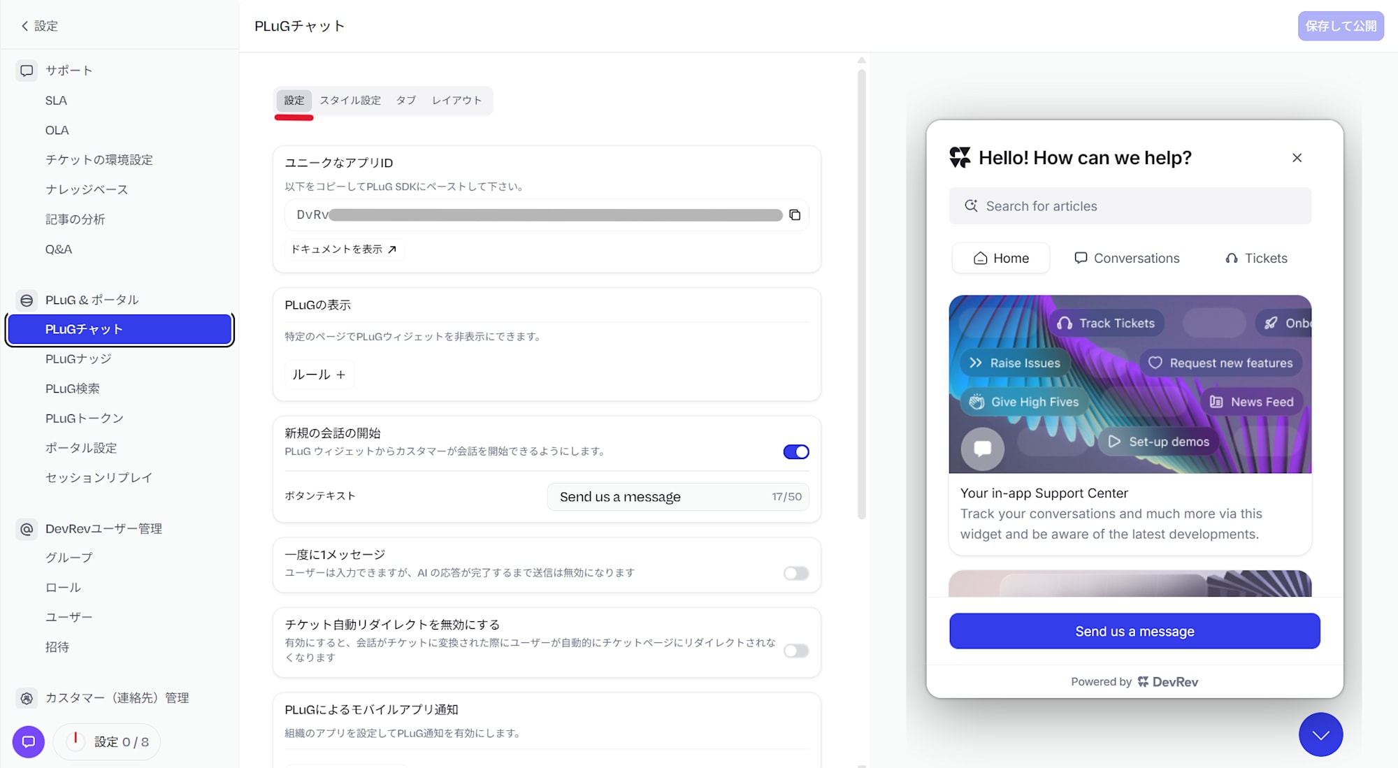
The "Unique App ID" is the ID used when embedding the widget into a website (this is what was used in the previous article). There are also the following setting items.
- PLuG Display: You can set URL rules to hide the PLuG widget on specific pages.
- Start New Conversation: You can change whether customers can start a conversation from the widget, as well as the button text.
- One Message at a Time: An option to disable user submission until the AI response is complete.
Also, while we'll check this during the final save and publish step, you can navigate to the "Playground" from within the Settings tab to verify as well.
Style Settings
The "Style Settings" tab lets you change the appearance of the widget.
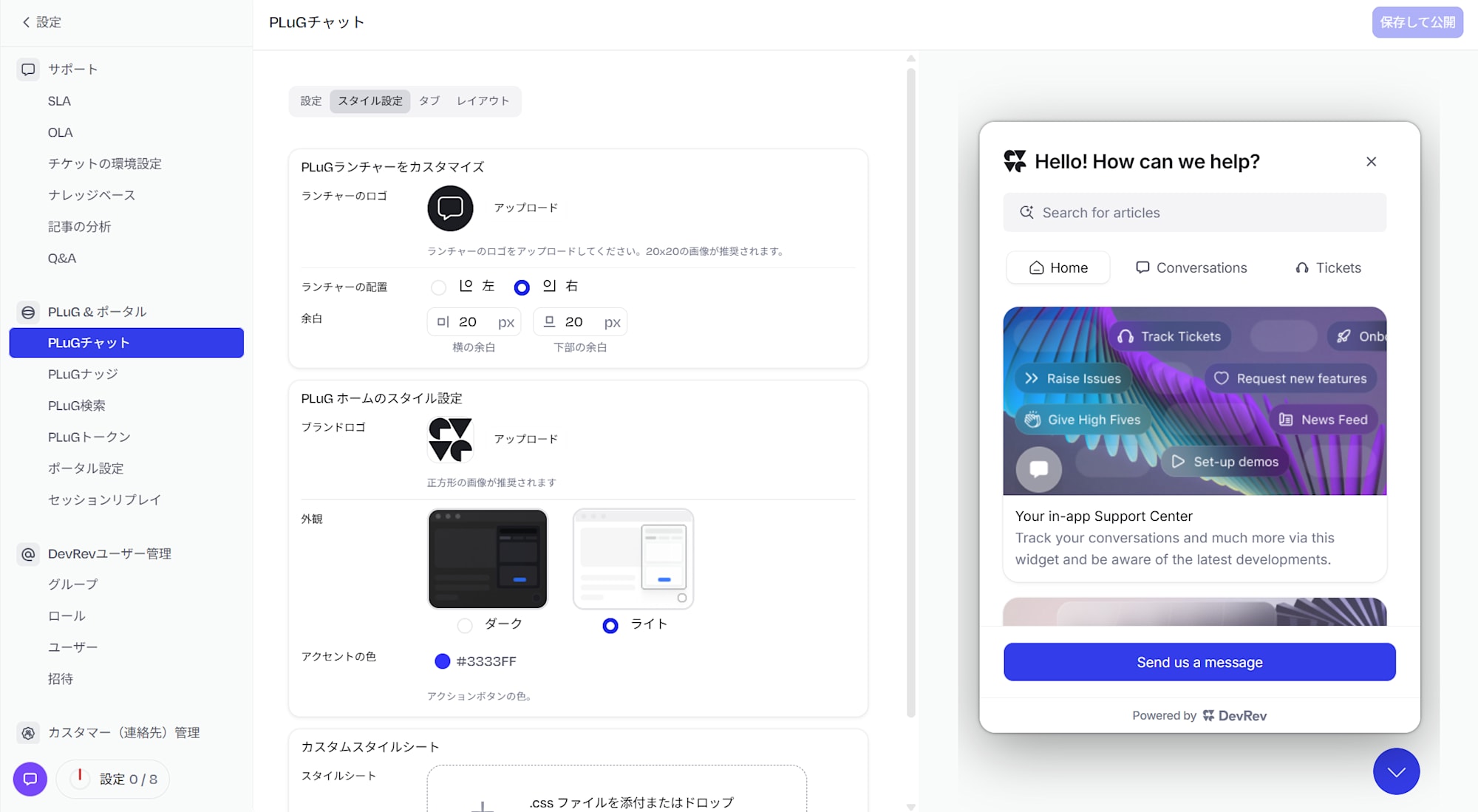
The main items you can configure are as follows.
- Launcher Logo: You can change the icon of the chat button displayed at the bottom right of the screen (default 20×20px).
- Launcher Position: You can choose whether to place the chat button on the left or right.
- Margin: You can adjust the horizontal and bottom margins around the button in px units.
- Brand Logo: You can set the logo displayed at the top of the widget.
- Appearance (Theme): You can choose from two options: light and dark.
- Accent Color: You can change the color of buttons and accent elements.
- Custom Stylesheet: You can upload a CSS file for more detailed style adjustments.
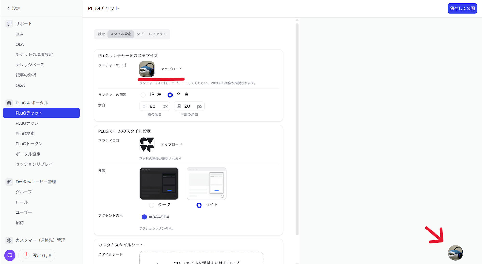
First, upload an image to "Customize PLuG Launcher" to change the launcher. You can confirm that the uploaded image is displayed as the launcher when the chat is closed.
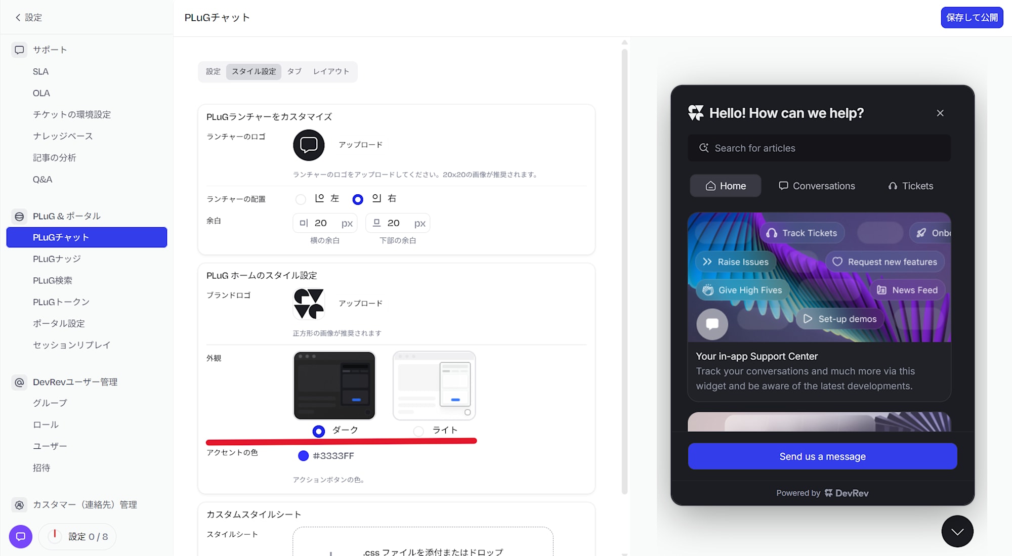
Next, I tried switching the theme to dark. The preview on the right changes to a dark background.
Next, I switched back to the light theme and changed the accent color to orange (#F46201).
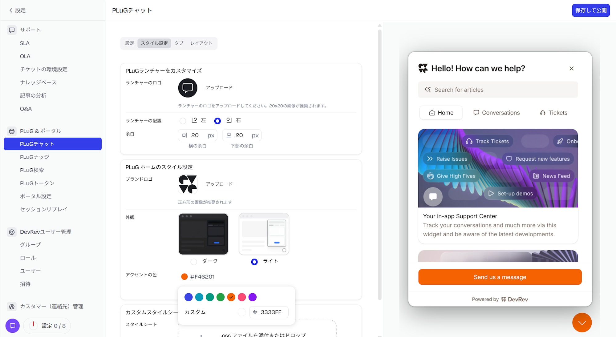
You can see that the "Send us a message" button in the preview and the launcher icon have changed to orange. Adjustments to match your company's brand colors can be completed entirely within the console.
Tabs
The "Tabs" tab allows you to toggle on and off the tabs displayed within the widget.
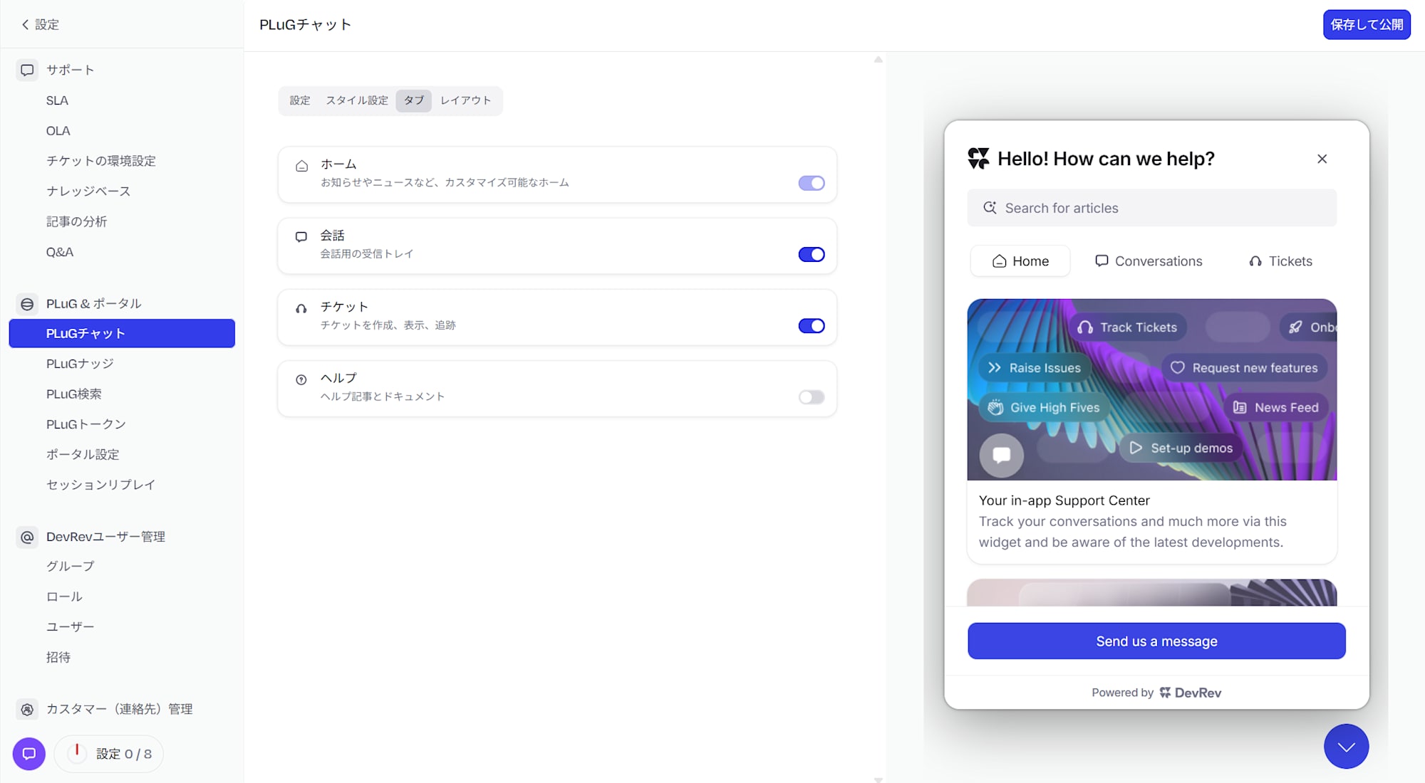
The default state is as follows.
- Home: A customizable home screen with announcements, news, etc. (always on, cannot be changed)
- Conversations: An inbox for conversations (on by default)
- Tickets: Create, view, and track tickets (on by default)
- Help: Help articles and documentation (off by default)
I tried toggling the Help tab on.
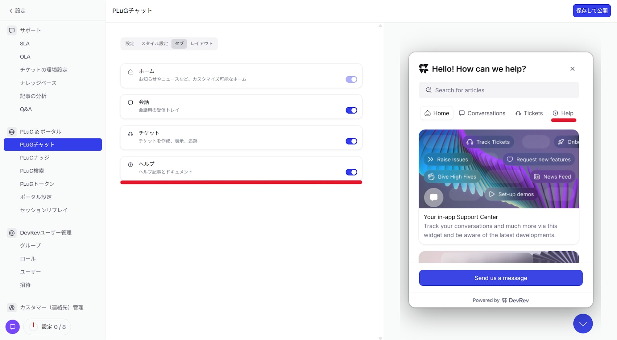
You can confirm that "Help" has been added to the tab list in the preview. If you want to show users your knowledge base or articles directly, enabling this tab is convenient.
Layout
The "Layout" tab lets you adjust the text and content within the widget.
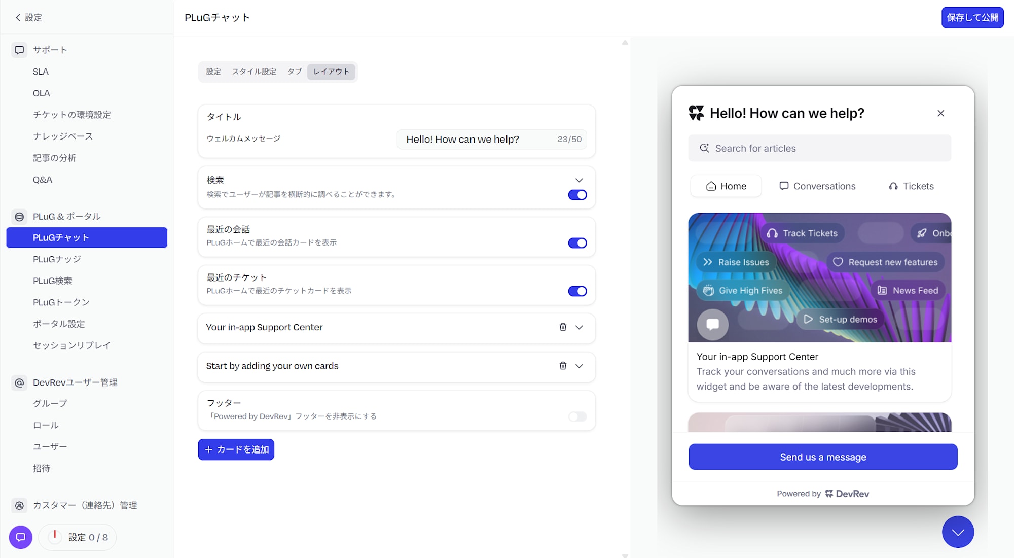
The main items you can configure are as follows.
- Title / Welcome Message: You can change the title and message displayed in the widget header (up to 50 characters)
- Search: Whether to display a search bar on the PLuG home
- Recent Conversations: Whether to display recent conversation cards on the PLuG home
- Recent Tickets: Whether to display recent ticket cards on the PLuG home
I tried changing the "Welcome Message" from the default "Hello! How can we help?" to "何かお困りですか?" (Are you having any trouble?).
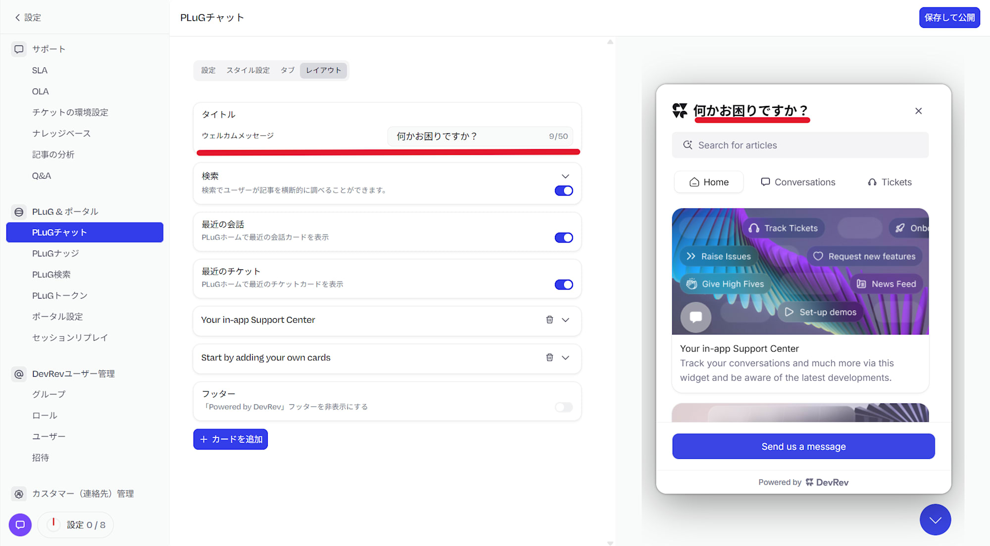
You can confirm that the header section of the preview on the right has changed to "何かお困りですか?".
Save and Publish
Once the settings are complete, click "Save and Publish" in the upper right.
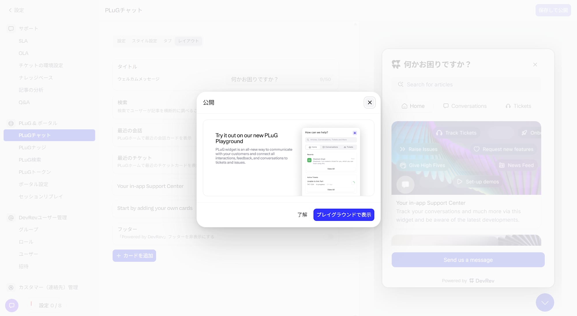
The "Publish" dialog will appear. Clicking "View in Playground" will take you to the PLuG Playground, an official preview environment.
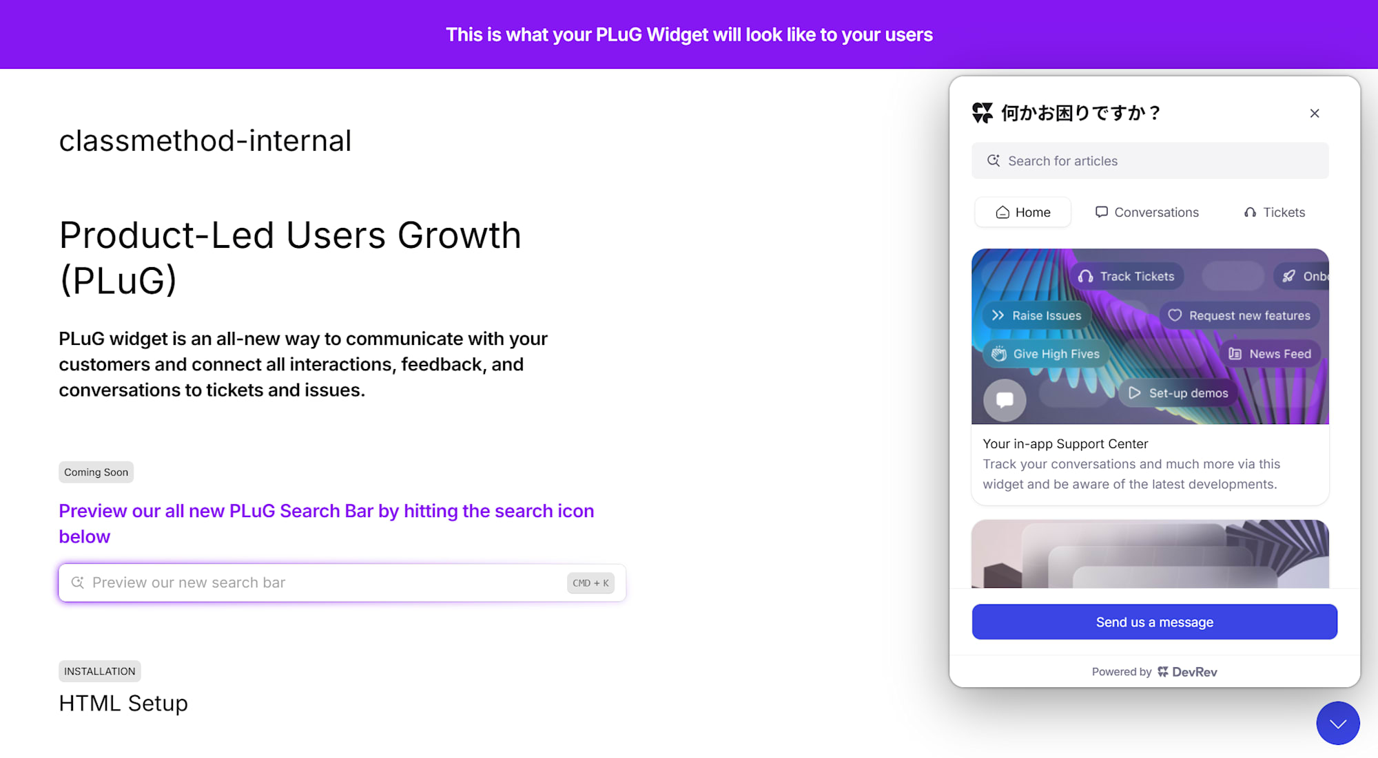
The PLuG Playground (plug-platform.devrev.ai/try-plug) is an official environment where you can check the actual appearance of the widget with your settings applied, without deploying to your own website. I was able to confirm that the customization settings configured this time were correctly reflected. (You can also check from the Playground in the "Settings" tab.)
Summary
This time, I comprehensively introduced the contents of the four tabs in DevRev's PLuG chat settings screen. In Style Settings you can adjust the theme and accent color, in Tabs you can add or remove displayed features, and in Layout you can change the welcome message — all without touching any code, adjusting the widget's appearance and functionality through the console alone. Being able to instantly verify changes in the real-time preview on the right side makes trial and error easy, which is another great benefit.
I hope this blog post will be of some help to you.