# Svelte 5で「2フェーズUX」を実装する — パラメータ入力と生成結果のプログレッシブ・ディスクロージャー Implementing "2-Phase UX" in Svelte 5 — Progressive Disclosure of Parameter Input and Generated Results

This page has been translated by machine translation. View original
Introduction
AI tool UIs share a common challenge: displaying the input form and generated results simultaneously leads to information overload on the screen.
The phase where users enter template parameters and the phase where they review streamed AI responses require different user attention. I implemented a UI that switches between these two phases using Progressive Disclosure (staged information revelation).
Prerequisites & Environment
- Svelte 5 ($state runes)
- SvelteKit
- TailwindCSS
Defining the 2 Phases
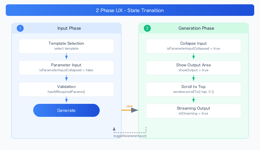
| Phase | User Action | What to Display on Screen |
|---|---|---|
| Input Phase | Template selection, parameter entry | Full input form, description text |
| Generation Phase | Review streaming results | Input summary (collapsed), generation results |
State Management
Manage the display state for each phase using Svelte 5's $state.
// Collapsed state of the parameter input
let isParameterInputCollapsed = $state(false);

// Display state of the output area
let showOutput = $state(false);

// Streaming state
let isLoading = $state(false);
let isStreaming = $state(false);
Timing of Phase Transitions
Switch from the input phase to the generation phase when the "Generate" button is pressed.
async function generateOutput() {
  if (!selectedTemplate) return;

  // Validation
  const missingRequired = Object.entries(selectedTemplate.parameters)
    .filter(([key, param]) => param.required && !parameterValues[key])
    .map(([key]) => key);

  if (missingRequired.length > 0) {
    // m is an i18n (internationalization) message function provided by SvelteKit i18n libraries (such as Paraglide).
    // m.key_name() returns the translated string for the current locale.
    // Example: m.please_fill_required() → "必須項目を入力してください" (ja) / "Please fill required fields" (en)
    error = m.please_fill_required({ fields: missingRequired.join(', ') });
    return;
  }

  // Clear output
  output = '';
  error = null;
  isLoading = true;
  isStreaming = true;

  // This is where the phase transition happens
  isParameterInputCollapsed = true;  // Collapse the input
  showOutput = true;                  // Show the output area

  // Scroll to the top of the page
  window.scrollTo({ top: 0, behavior: 'smooth' });

  // Start streaming...
}
Key decision: The collapse happens "when the generate button is clicked," not "when the first token arrives." By having the UI change the moment the button is pressed, it immediately conveys to the user that "processing has started."
Managing Scroll Position
window.scrollTo({ top: 0, behavior: 'smooth' });
When parameter input is long, users may have scrolled to the bottom of the page. If the output area is out of view after collapsing, users may feel like "nothing is happening." Using scrollTo to return to the top of the page ensures both the collapsed input summary and the output area are within the user's view.
Input Summary When Collapsed
When parameters are collapsed, it's inconvenient if you can't verify what you entered. Use $derived to dynamically generate a summary of the input values.
$derived is Svelte 5's reactive primitive for defining derived values from other reactive values. It's conceptually similar to React's useMemo, but with a key difference. With useMemo, you must manually specify a dependency array, but with $derived, the compiler analyzes reactive values read within the function and automatically tracks dependencies.
// Svelte 5 — dependencies are automatically tracked
let summary = $derived(() => parameterValues.name + selectedTemplate.title);

// React — dependency array must be specified manually (omissions cause stale value bugs)
const summary = useMemo(() => parameterValues.name + selectedTemplate.title,
  [parameterValues.name, selectedTemplate.title]);
Note that $derived is for pure calculations, while $effect is used for side effects (fetch, DOM manipulation, etc.).
| Svelte 5 | React | Purpose |
|---|---|---|
$state |
useState |
Hold values |
$derived |
useMemo |
Calculate from other values (dependencies auto-tracked) |
$effect |
useEffect |
Execute side effects |
let parameterSummary = $derived(() => {
  if (!selectedTemplate || !isParameterInputCollapsed) return '';

  const filledParams = Object.entries(parameterValues)
    // Keep only parameters that have been filled in (values that are only whitespace become empty strings after trim() and are excluded as falsy)
    .filter(([, value]) => value.trim())
    .map(([key, value]) => {
      // Truncate long text at 50 characters
      const truncatedValue = value.length > 50 ? value.slice(0, 50) + '...' : value;
      return `${key}: ${truncatedValue}`;
    })
    .slice(0, 3); // Display up to 3 parameters maximum

  if (filledParams.length === 0) {
    return m.no_parameters_set();
  }

  return filledParams.map(param => `• ${param}`).join('\n');
});
Design decisions:
- Truncate at 50 characters — Prevents the summary from taking up the screen when long emails or messages are entered
- Maximum 3 parameters — Showing all parameters defeats the purpose of collapsing
- Only show filled fields — Empty fields are not displayed
Conditional Rendering of Template Display
{#if !isParameterInputCollapsed}
  <!-- Input phase: display full parameter form -->
  <div class="space-y-6 parameter-inputs">
    {#if selectedTemplate}
      {#each Object.entries(selectedTemplate.parameters) as [paramKey, param]}
        <div class="magical-input-group">
          <label for={paramKey}>
            <span>{paramKey}</span>
            {#if param.required}
              <span class="magical-badge required-badge">{m.required()}</span>
            {/if}
          </label>
          <p>{param.description}</p>
          <!-- bind:value enables two-way binding.
               User input → automatically reflected in parameterValues[paramKey],
               Changes to parameterValues[paramKey] → automatically reflected in textarea display.
               React requires both value + onChange, but Svelte only needs bind: once. -->
          <textarea
            bind:value={parameterValues[paramKey]}
            placeholder={m.enter_parameter({ parameter: paramKey })}
            required={param.required}
            rows="4"
          ></textarea>
        </div>
      {/each}
    {/if}

    <!-- Generate button -->
    {#if selectedTemplate}
      <button onclick={generateOutput} disabled={isLoading || !hasAllRequiredParams()}>
        {#if isLoading}
          {m.generating_magic()}
        {:else}
          {m.generate_output()}
        {/if}
      </button>
    {/if}
  </div>
{/if}

<!-- Generation phase: display output -->
{#if showOutput}
  <div class="output-section">
    <OutputDisplay {output} {isLoading} {isStreaming} />
  </div>
{/if}
When isParameterInputCollapsed becomes true, the entire input form is hidden and the summary is displayed instead. When showOutput becomes true, the output area is displayed.
Collapse Toggle
Allow users to expand the collapsed section to modify their input.
function toggleParameterInput() {
  isParameterInputCollapsed = !isParameterInputCollapsed;
}
A Chevron icon is placed in the header section, toggling expand/collapse on click.
Reset on Template Change
When switching templates, reset the previous collapsed state.
function handleTemplateSelect(template: Template) {
  selectedTemplate = template;
  parameterValues = Object.keys(template.parameters).reduce((acc, key) => {
    acc[key] = '';
    return acc;
  }, {} as Record<string, string>);
  error = null;

  // Reset collapsed state
  isParameterInputCollapsed = false;
  showOutput = false;
  output = '';
}
Since leaving previous output visible when a new template is selected would cause confusion, everything is cleared.
Fine-Grained Button State Control
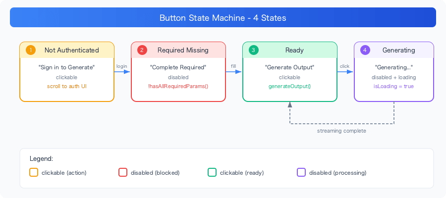
The generate button switches between 4 displays depending on authentication state and input state.
<button
  onclick={$authState.isAuthenticated ? generateOutput : handleUnauthenticatedGenerate}
  disabled={isLoading || (!$authState.isAuthenticated ? false : !hasAllRequiredParams())}
>
  {#if isLoading}
    <div class="magical-loading mr-2"></div>
    {m.generating_magic()}
  {:else if !$authState.isAuthenticated}
    {m.sign_in_to_generate()}
  {:else if !hasAllRequiredParams()}
    {m.complete_required_fields()}
  {:else}
    {m.generate_output()}
  {/if}
</button>
| State | Text | Behavior |
|---|---|---|
| Unauthenticated | "Sign in to Generate" | Scroll to authentication UI |
| Required fields missing | "Complete Required Fields" | disabled |
| Ready | "Generate Output" | Start generation |
| Generating | "Generating Magic..." | disabled + loading |
The key point is that rather than making the button disabled when unauthenticated, it is kept clickable and guides users to the authentication UI. A disabled button makes it unclear "why it can't be pressed," so the action on click explains it instead.
function handleUnauthenticatedGenerate() {
  const authSettingsElement = document.querySelector('.magical-auth-container');
  if (authSettingsElement) {
    authSettingsElement.scrollIntoView({ behavior: 'smooth', block: 'center' });

    // Temporarily highlight to draw attention
    authSettingsElement.classList.add('auth-highlight');
    setTimeout(() => {
      authSettingsElement.classList.remove('auth-highlight');
    }, 2000);
  }
}
Summary
Key implementation points for a 2-phase UX in AI tools:
| Decision | Choice | Reason |
|---|---|---|
| Collapse timing | On button click | Immediate feedback |
| Scrolling | Return to top | Ensures the output area is visible |
| Summary display | Max 3 items, 50-character limit | Preserves the meaning of collapsing |
| On template change | Full reset | Leftover previous state causes confusion |
| Unauthenticated button | Keep clickable | Communicate the reason through action |
It's a small UX pattern, but since AI tools have clearly distinct input and output phases, this pattern has a significant impact.