I tried visualizing EC2 usage costs with Amazon QuickSight for considering a Savings Plan purchase

This page has been translated by machine translation. View original
Hello. This is Kimura from the Cloud Business Division.
This time, I would like to create a dashboard that can visualize EC2 usage in a way that can be used to consider purchasing Savings Plans. Using CUR billing information, the goal is to be able to check how much cost is being incurred for each type — SP, On-demand, and Spot — on an hourly basis.
Introduction
Why Hourly Visualization is Necessary
Out of nowhere, here's a quiz. Given the following two environments where instances of the same instance type are running at on-demand pricing, which environment will have a larger discount applied when purchasing an SP?
- Environment A: EC2 usage costs continue for 1 year with a daily on-demand usage fee of 240 USD. Purchase an SP of 5 USD/h.
- Environment B: EC2 usage costs continue for 1 year with a daily on-demand usage fee of 2400 USD. Purchase an SP of 50 USD/h.
You may have already guessed from the fact that I'm posing this kind of quiz, but the correct answer is that it cannot be determined from this information alone. This is because the instance startup pattern is unknown.
It's an extreme example, but in the following pattern, even though Environment B has purchased approximately 10 times more SP than Environment A, the discount applied amount is actually larger in Environment A. This is because SP discounts are applied on an hourly basis.
- Environment A: 10 USD worth of usage spread over 24 hours
- Environment B: 2400 USD worth of usage concentrated in 1 hour
Calculating the actual amounts, the following discounts are applied by SP. For simplicity, let's say the applicable discount rate is 50%.
- Environment A: 24 hours × 5 USD = 120 USD
- Environment B: 1 hour × 50 USD = 50 USD
The following blog explains the application of SP discounts very clearly, so if you have a vague understanding of how discounts are applied, please refer to it.
To give you a better picture, I first compared in terms of discount applied amounts, but I'd also like to compare from the perspective of actual profit and loss from purchasing an SP.
Environment A: 240 USD on-demand usage per day, purchasing an SP of 5 USD/h
- When using on-demand: 240 USD/day
- After purchasing SP:
- SP commitment cost: 120 USD (5 USD/h × 24h)
- On-demand cost: 0 USD (all covered by SP)
- Total: 120 USD/day
- Net result: 240 - 120 = ▲120 USD/day (reduction)
Environment B: 2400 USD on-demand usage per day, purchasing an SP of 50 USD/h
- When using on-demand: 2400 USD/day
- After purchasing SP:
- SP commitment cost: 1200 USD (50 USD/h × 24h)
- On-demand cost: 2300 USD (portion not covered by SP)
- Total: 3,500 USD/day
- Net result: 2400 - 3500 = +1100 USD/day (increase)
While Environment A achieves a reduction of 120 USD per day, Environment B ends up with costs increasing by as much as 1100 USD.
This is because the majority of the purchased SP (23 hours' worth) goes unused, generating only wasteful commitment costs.
The above is an extreme example, but if you purchase an SP without checking hourly usage, depending on the discount rate, what you intend as cost optimization could actually result in cost increases.
To avoid such situations, it is important to understand not only "how much cost is incurred per day" but also "what startup patterns are generating usage fees" on an hourly basis.
Let me now introduce how you can visualize this.
About Visualizing Usage Patterns
In addition to customizing the dashboard using Quick Suite introduced this time, there are several other ways to visualize EC2 usage on an hourly basis, so let me introduce them. Please proceed with the method that suits your environment.
1. Cost Explorer Hourly Display
- Overview
By enabling hourly and resource-level data from the management account, you can check hourly usage in the Cost Explorer GUI.
- Advantages:
- Easy setup (enable with a few clicks from the management account)
- Intuitive operation on the AWS console
- No additional tools or services required
- Disadvantages:
- The displayable period is limited to a maximum of 14 days
- Data storage costs apply ($0.01 per 1,000 rows)
- Can only check from the prepared items
- Usage is restricted with some resellers
- Recommended for:
- Those with little variation in usage patterns where understanding only a short period (2 weeks) is sufficient
- Those who want to quickly grasp hourly usage
- Those who want to start checking immediately
2. SP Purchase Analyzer
- Overview
In the AWS Billing and Cost Management console, you can check SP purchase recommendations based on past usage patterns. AWS automatically suggests the optimal purchase amount.
- Advantages:
- AWS automatically calculates the recommended values
- Can also check utilization and coverage rates after purchase
- No additional tools or setup required
- Can immediately check the effects of SP
- Disadvantages:
- Analysis period is limited to the past 60 days
- Cannot customize or perform detailed analysis, and it is difficult to explain the basis since the details of the recommendation algorithm are unknown
- Usage is restricted with some resellers
- Recommended for:
- Those who want to reference AWS recommendations and purchase SP immediately
- Those who don't need complex analysis and simply want to know the recommended values
- Those who want to monitor utilization rates after purchase
3. Cloud Intelligence Dashboards (CUDOS)
- Overview
This is a collection of Quick dashboard templates officially provided by AWS. Based on CUR data, multiple high-performance dashboards such as CUDOS Dashboard, Cost Intelligence Dashboard, and KPI Dashboard can be deployed all at once.
-
Advantages:
- High-performance dashboards based on AWS official best practices
- Comprehensive analysis of EC2 SP application status, utilization, coverage rates, etc.
- Can analyze hourly usage patterns over long periods (as long as CUR data exists)
- Batch deployment of multiple dashboards (CUDOS, KPI, Compute Optimizer, etc.)
- Continuous updates by the community
-
Disadvantages:
- Setup is somewhat complex (requires use of cid-cmd tool, Athena/Quick configuration)
- Quick usage fees apply
- Templates are too feature-rich and difficult to use at first glance
- A certain amount of learning is required for customization
-
Recommended for:
- Those who want to build a comprehensive cost analysis environment all at once
- Those who want to perform analysis based on AWS official best practices
- Those who want to analyze overall costs including not just EC2 but other services as well
- Organizations that want to seriously advance FinOps initiatives
4. Creating a Custom Dashboard with Quick (the method introduced this time)
- Overview
This is a method of loading CUR data into Quick and creating a dashboard from scratch tailored to your own use case.
- Advantages:
- Completely free customization is possible
- Can create a simple dashboard focused only on the necessary information
- Can analyze hourly usage patterns over long periods (as long as CUR data exists)
- Design that completely matches your organization's analysis needs
- Disadvantages:
- Need to build the dashboard from scratch (setup takes time)
- Quick Suite usage fees apply
- Knowledge of Quick Suite operations is required
- Recommended for:
- Those who want a simple dashboard specialized for a specific use case
- Those who find CUDOS excessive and want to narrow down to the minimum necessary analysis items
- Those who already have knowledge of Quick Suite and want to customize
This time, I will introduce how to create a simple dashboard for considering SP purchases.
Creating the Dashboard
Now I will introduce how to create the dashboard.
Since we will be using CUR as data this time, please configure it using the following if you have not already set it up.
Preparing CUR
For details on how to configure CUR, please refer to the following article.
This article proceeds on the assumption that CUR has already been configured and data is being output to S3. The file format is assumed to be parquet as introduced in the blog above.
If you want to look further back at past data before configuration, you can perform a backfill for up to 14 months. If necessary, please refer to the following. (As of August 2026, it appears the maximum has been changed from 36 months to 14 months)
Creating an Athena Table Using Glue Crawler
Once CUR data is available, create an Athena table for querying.
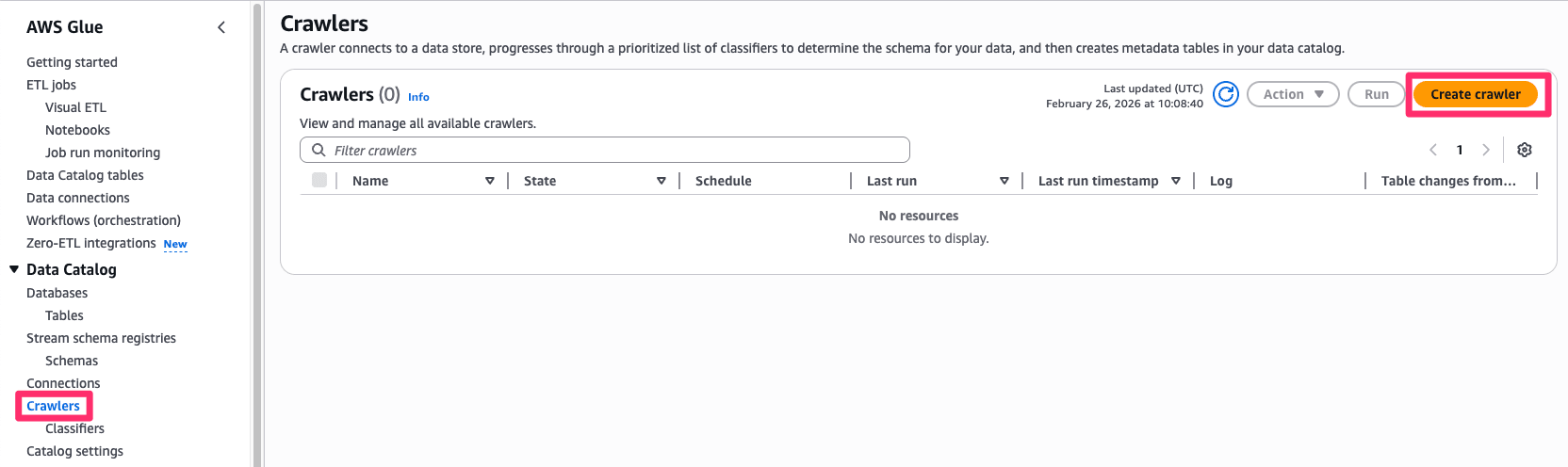
Proceed with creation from the Glue screen.
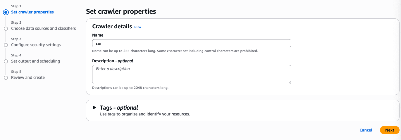
Set any name you like.
From "Add data source," select the target S3 bucket.
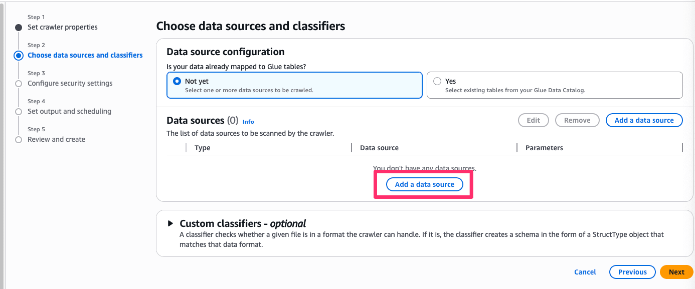
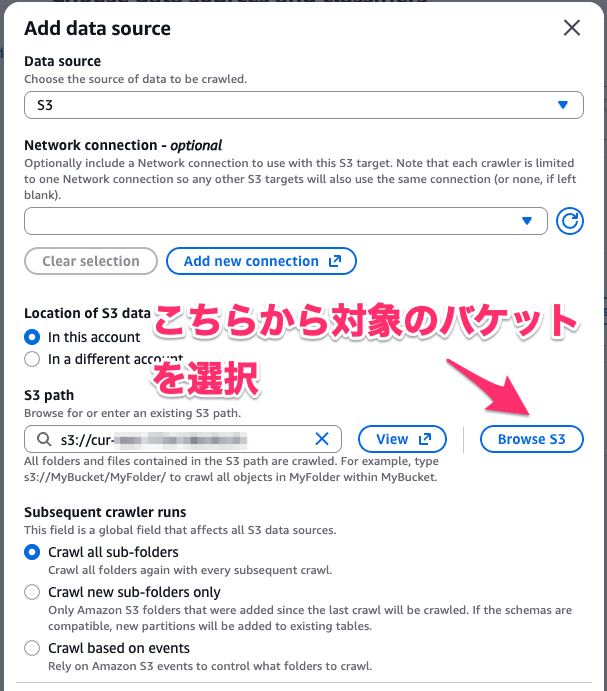
At this point, specify the folder where the CUR data is stored.

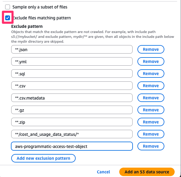
Next, set the following exclusion patterns.
**.json
**.yml
**.sql
**.csv
**.csv.metadata
**.gz
**.zip
**/cost_and_usage_data_status/*
aws-programmatic-access-test-object
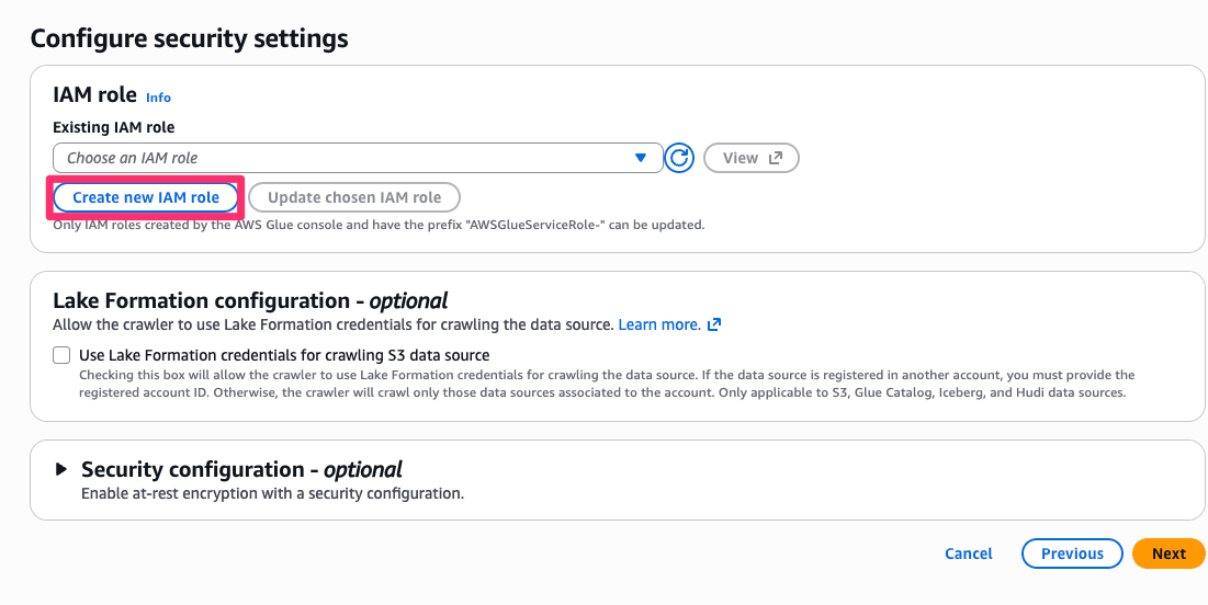
Create a new role with any name you like.
Finally, specify the database and optionally a table name, then create.
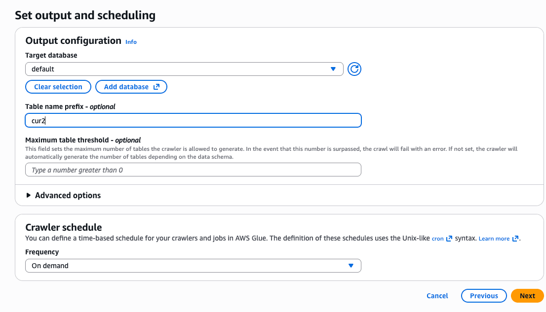
Once created, run the crawler.
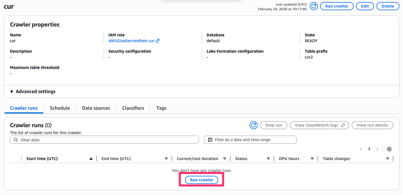
If successful without issues, the table should be created as shown below.

Creating a Dataset
Once the table is created, move to Quick and create a dataset.
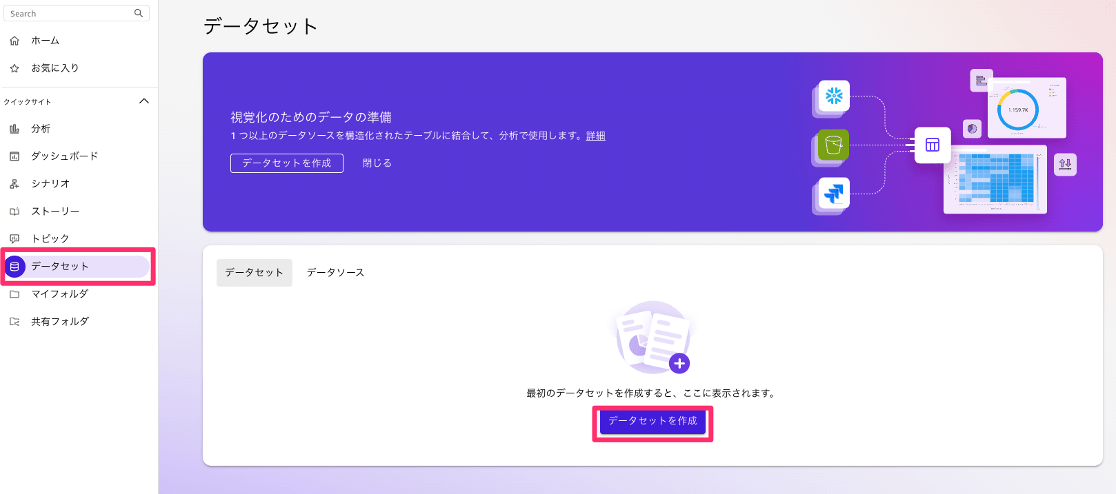
First, a data source is needed, so create a data source.
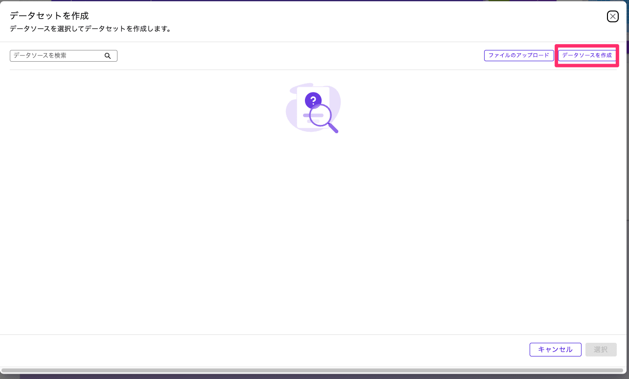
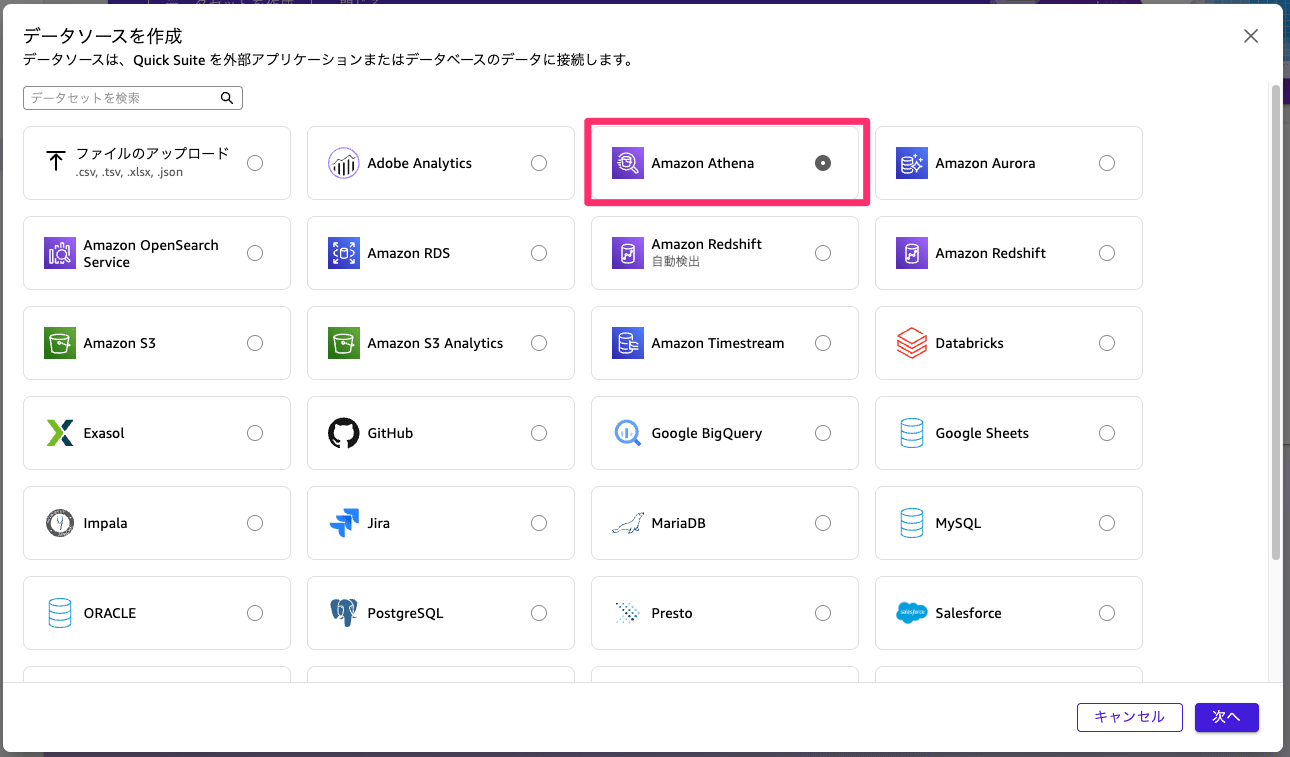
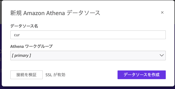
Once the data source is created, proceed to create the dataset.
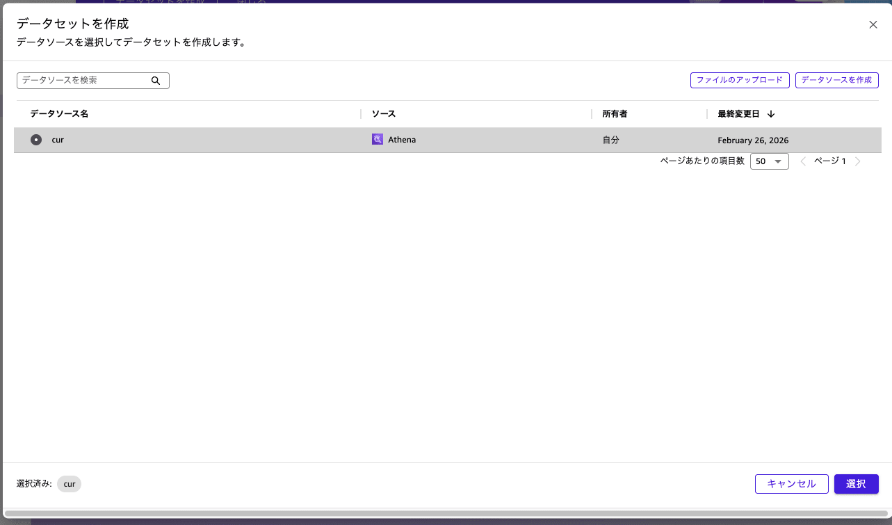
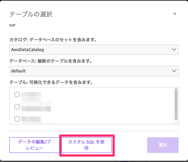
Please enter the following SQL. Replace <database name> and <table name> as appropriate.
SELECT
DATE_TRUNC('hour', line_item_usage_start_date) as usage_hour,
line_item_usage_account_id as account_id,
line_item_usage_account_name as account_name,
product['region'] as region,
product_instance_type as instance_type,
product_instance_family as instance_family,
CASE
WHEN product_instance_type IS NOT NULL
THEN REGEXP_EXTRACT(product_instance_type, '^([a-z]+[0-9]+[a-z]*)')
ELSE product_instance_family
END as instance_family_only,
product['operating_system'] as operating_system,
line_item_usage_type as usage_type,
line_item_operation,
CASE
WHEN line_item_line_item_type IN ('SavingsPlanCoveredUsage', 'SavingsPlanNegation') THEN '1_SavingsPlan'
WHEN line_item_line_item_type = 'Usage' AND line_item_usage_type NOT LIKE '%SpotUsage%' THEN '2_OnDemand'
WHEN line_item_line_item_type = 'Usage' AND line_item_usage_type LIKE '%SpotUsage%' THEN '3_Spot'
WHEN line_item_line_item_type = 'DiscountedUsage' THEN '4_Reserved'
WHEN line_item_line_item_type = 'RIFee' THEN '4_Reserved'
ELSE '5_Other'
END as purchase_option,
SUM(line_item_usage_amount) as usage_hours,
-- Calculate Savings Plans effective cost
SUM(
CASE
WHEN line_item_line_item_type IN ('SavingsPlanCoveredUsage', 'SavingsPlanNegation')
THEN savings_plan_savings_plan_effective_cost
ELSE line_item_unblended_cost
END
) as unblended_cost,
SUM(pricing_public_on_demand_cost) as on_demand_cost,
COUNT(DISTINCT line_item_resource_id) as instance_count
FROM <database name>.<table name>
WHERE
line_item_product_code = 'AmazonEC2'
AND product_servicecode = 'AmazonEC2'
AND product_product_family = 'Compute Instance'
AND line_item_line_item_type IN ('Usage', 'SavingsPlanCoveredUsage', 'DiscountedUsage', 'RIFee')
AND line_item_usage_start_date >= DATE('2024-1-01')
AND (product_instance_type IS NOT NULL OR line_item_line_item_type LIKE '%SavingsPlan%')
GROUP BY
DATE_TRUNC('hour', line_item_usage_start_date),
line_item_usage_account_id,
line_item_usage_account_name,
product['region'],
product_instance_type,
product_instance_family,
CASE
WHEN product_instance_type IS NOT NULL
THEN REGEXP_EXTRACT(product_instance_type, '^([a-z]+[0-9]+[a-z]*)')
ELSE product_instance_family
END,
product['operating_system'],
line_item_usage_type,
line_item_operation,
CASE
WHEN line_item_line_item_type IN ('SavingsPlanCoveredUsage', 'SavingsPlanNegation') THEN '1_SavingsPlan'
WHEN line_item_line_item_type = 'Usage' AND line_item_usage_type NOT LIKE '%SpotUsage%' THEN '2_OnDemand'
WHEN line_item_line_item_type = 'Usage' AND line_item_usage_type LIKE '%SpotUsage%' THEN '3_Spot'
WHEN line_item_line_item_type = 'DiscountedUsage' THEN '4_Reserved'
WHEN line_item_line_item_type = 'RIFee' THEN '4_Reserved'
ELSE '5_Other'
END
ORDER BY usage_hour DESC
Once the data is loaded, create an analysis.
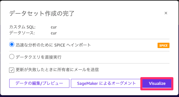
Creating the Dashboard
From here, I will create the dashboard.
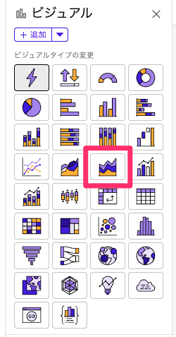
First, create a visual. Select the stacked area line chart.
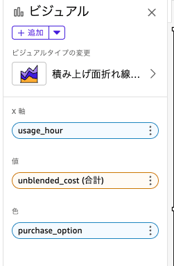
You can select values to set for each field, so please select the following 3 items.
Once selected, the visual will be displayed as follows.
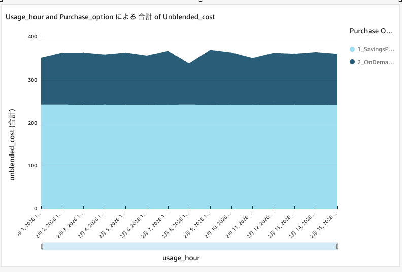
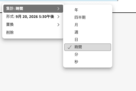
In the initial state, the X-axis aggregation unit is set to "day," so change it to hourly.
This way, you can now check usage costs on an hourly basis.
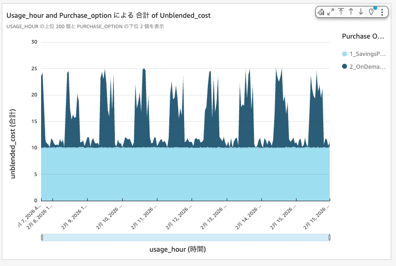
In this environment, you can see that approximately 10 USD per hour is being covered by SP.
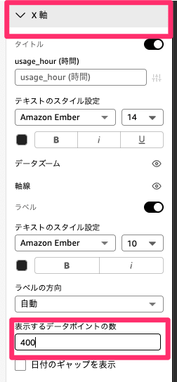
Next, I'd like to expand the range of data that can be displayed. The default data points are set to 200, so I'd like to expand to the maximum value of 400 (16 days' worth).
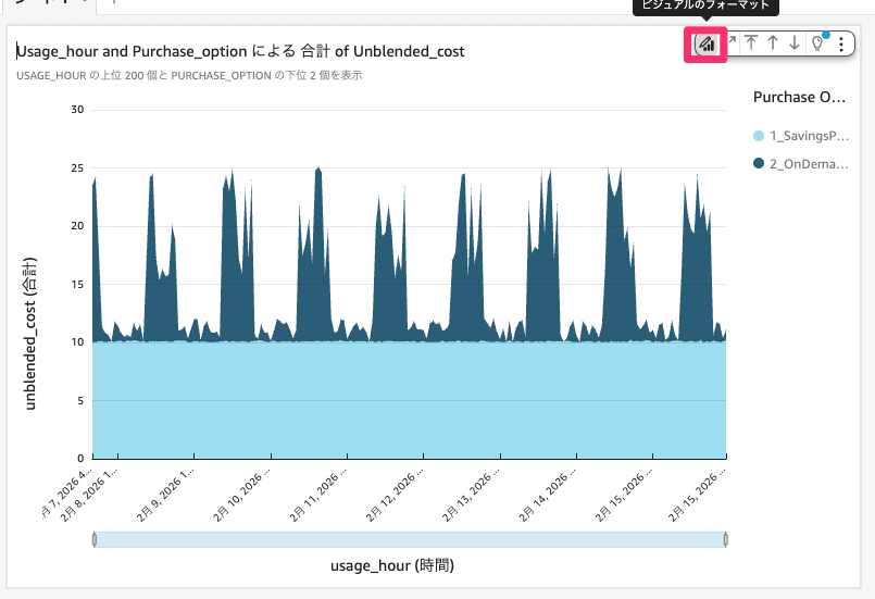
Select the visual format, enter 400 in the options, and click anywhere on the screen.
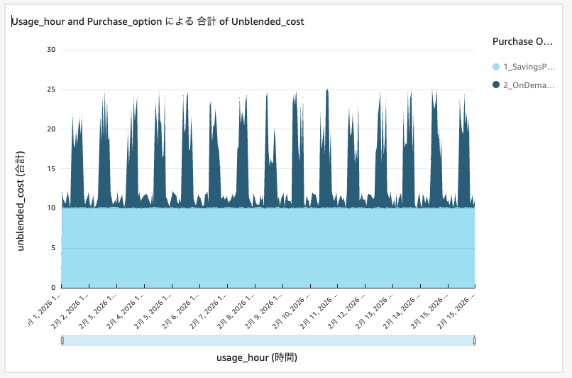
After the change, you will be able to see 16 days' worth of data as shown below.
Next, let's set up a filter by instance type. Select the visual you created and click the filter button.
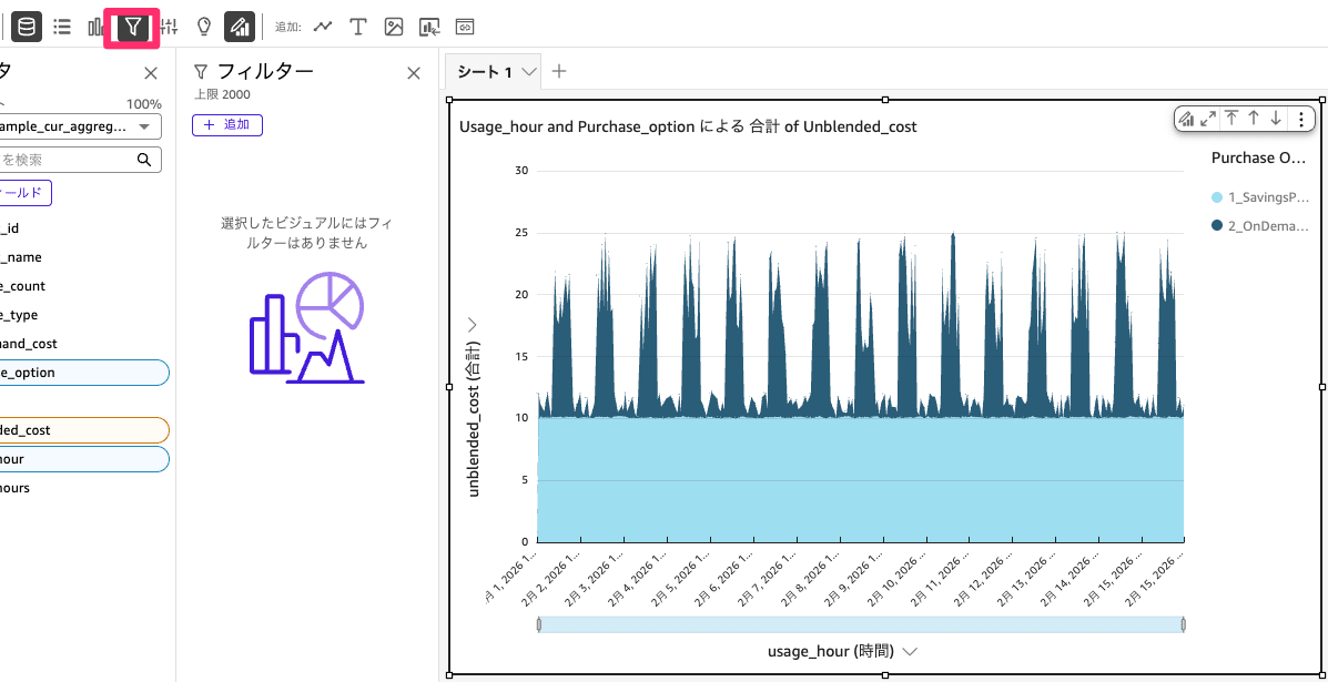
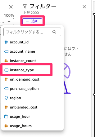
From "Add filter," select "instance_type."
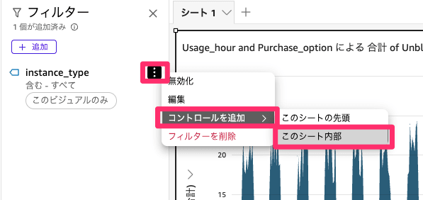
Once the filter is added, add a control inside the sheet as shown below so that the filter can be selected from the sheet.
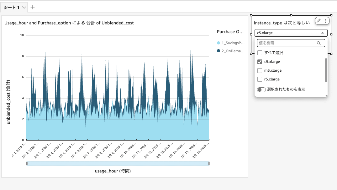
This allows you to filter by instance type as shown below. When considering Instance SP, please use this to check usage costs.
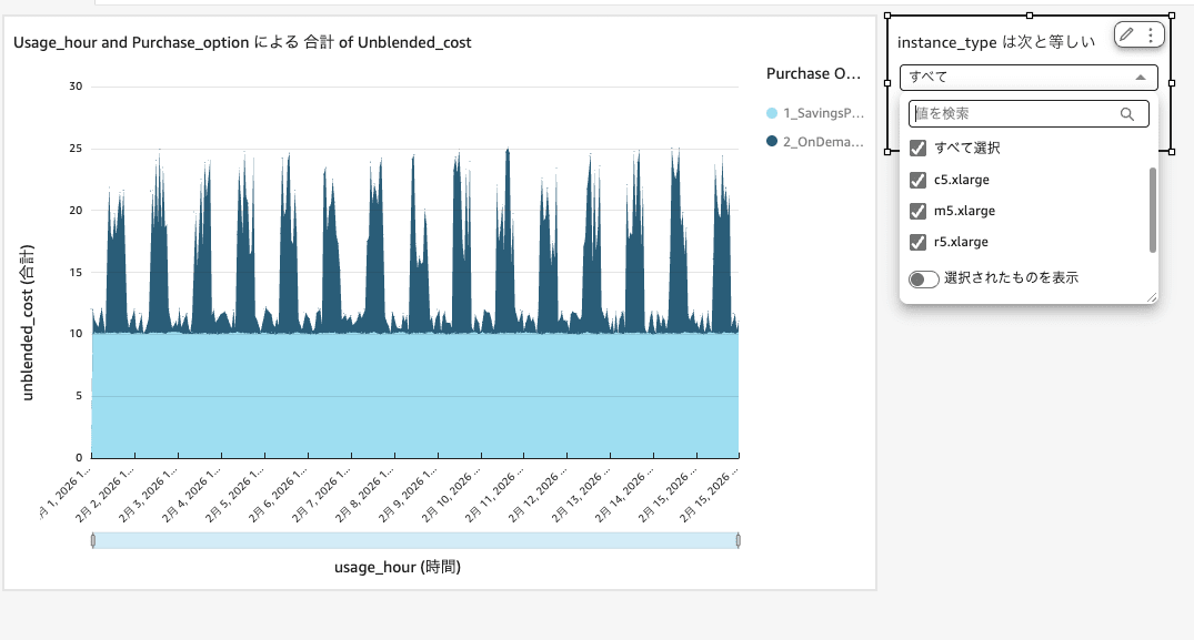
Applying the filter, you can see that c5.xlarge shows quite significant fluctuations as shown below.
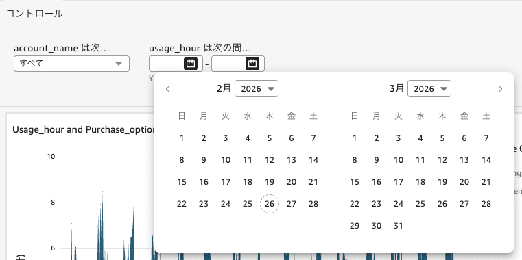
Similarly, by setting filters for the period and account name, you can narrow down from the sheet. Please add them as needed for your use.
The sample data for this time does not include it so it is not displayed, but Spot can also be shown in the cost graph.
I hope you will use this kind of hourly check as one of the materials for considering SP.
Summary
This time, I used Amazon Quick to enable checking of usage costs on an hourly basis.
I was supporting SP purchase decisions, and by visualizing the data, it was greatly useful in determining the purchase strategy and the purchase amount.
The same visualization can be done for services other than EC2 as well, so please try creating it by modifying the SQL.
I hope this article will be of some help in cost optimization.
This has been Kimura from the Cloud Business Division.