![I tried the new blocks in Slack Block Kit [General Display Edition]](https://images.ctfassets.net/ct0aopd36mqt/wp-thumbnail-b803788be81ed4dff8256a1a01d1f2c2/dbdb94b4897959aa969f4bcc4a9330db/slack-eyecatch.jpg?w=3840&fm=webp)
I tried the new blocks in Slack Block Kit [General Display Edition]

This page has been translated by machine translation. View original
Since entering 2026, new blocks have been added one after another to Slack's Block Kit. In this series, we will introduce these new blocks while actually trying them out.
- Part 1: Data edition
- Part 2: General display edition (this article)
- Part 3: Agent edition
- Part 4: Streaming edition
- Part 5: Verification/CI edition
For this second installment, we will look at 5 general-purpose display blocks: alert / card / carousel / container / markdown.
Overview of the 5 Blocks
| Block | Added | Purpose |
|---|---|---|
| alert | April 16, 2026[1] | Displaying messages with severity levels |
| card | April 16, 2026[1:1] | Hierarchical display of information |
| carousel | April 16, 2026[1:2] | Horizontal scrolling display of cards |
| container | June 29, 2026[2] | Grouping and collapsing blocks |
| markdown | February 3, 2025[3] | Displaying standard Markdown |
The markdown block was added back in February 2025, making it somewhat older, but since its supported syntax was expanded in March 2026 to include tables, task lists, and more[4], we will introduce it in this article as well.
The official Slack blog describes card as being used for hierarchical display of information, and alert for visually representing severity levels[5].
Verification is performed in Block Kit Builder, as in the previous installment.
alert block
This block expresses severity levels with colors[6].
| Item | Details |
|---|---|
text |
Required. plain_text or mrkdwn format. Maximum 200 characters |
level |
5 levels: default / info / warning / error / success. Defaults to default if omitted |
| Supported surfaces | Currently modals only |
As a note, alert blocks cannot be used in messages and can only be placed in modals. Therefore, in Block Kit Builder, switch to modal mode before pasting.
{
  "type": "modal",
  "title": { "type": "plain_text", "text": "Deploy Confirmation" },
  "submit": { "type": "plain_text", "text": "Execute" },
  "close": { "type": "plain_text", "text": "Cancel" },
  "blocks": [
    {
      "type": "alert",
      "level": "warning",
      "text": {
        "type": "mrkdwn",
        "text": "*This is a production environment deployment.* Please complete verification in staging before proceeding."
      }
    }
  ]
}
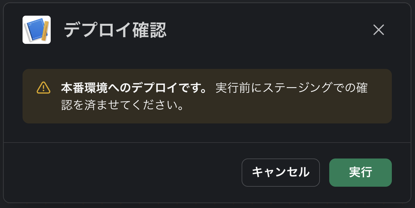
Since this is exactly the kind of block you'd want to use for deploy or error notifications, it's a bit surprising that it can't be placed in messages. We look forward to support for additional surfaces in the future.
card block
This block combines an icon, title, body text, and buttons into a single card[7].
| Item | Details |
|---|---|
| Components | icon (or slack_icon), title, subtitle, hero_image, body, subtext, actions |
| Required conditions | All are optional, but at least one of hero_image / title / actions / body is required |
| Character limits | title and subtitle max 150 characters, body and subtext max 200 characters |
actions |
Up to 3 buttons. danger style is left-aligned, primary is placed at the right end |
| Other | No attribute to specify card size. icon and slack_icon are mutually exclusive |
{
  "blocks": [
    {
      "type": "card",
      "title": { "type": "mrkdwn", "text": "v2.4.0 Release Notes" },
      "subtitle": { "type": "mrkdwn", "text": "Published 2026-08-25" },
      "body": { "type": "mrkdwn", "text": "Includes search performance improvements and a bug fix for notification settings." },
      "actions": [
        {
          "type": "button",
          "text": { "type": "plain_text", "text": "View Details" },
          "action_id": "view_release"
        }
      ]
    }
  ]
}
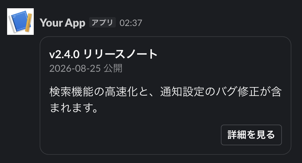
Layouts that previously required combining section, context, and actions can now be completed with a single block, improving readability as well.
carousel block
This block arranges cards in a horizontal scroll[8]. The only field is elements, which holds a minimum of 1 and a maximum of 10 cards. Blocks other than card cannot be included.
{
  "blocks": [
    {
      "type": "carousel",
      "elements": [
        {
          "type": "card",
          "block_id": "release-240",
          "title": { "type": "mrkdwn", "text": "v2.4.0" },
          "body": { "type": "mrkdwn", "text": "Search performance improvements" }
        },
        {
          "type": "card",
          "block_id": "release-232",
          "title": { "type": "mrkdwn", "text": "v2.3.2" },
          "body": { "type": "mrkdwn", "text": "Bug fix for notification settings" }
        }
      ]
    }
  ]
}
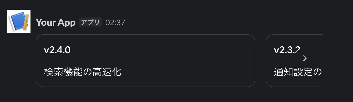
It is well-suited for situations where multiple pieces of information with the same structure need to be presented, such as options or search results.
container block
This block groups multiple blocks together with a title[9]. It supports collapsing.
| Item | Details |
|---|---|
| Title | Either title or rich_text_title is required. Maximum 150 characters |
child_blocks |
Required. Maximum 10 blocks |
| Blocks that can be children | 11 types: actions / context / divider / file / header / image / input / rich_text / section / table / video |
width |
4 levels: narrow / standard / wide / full. Defaults to standard if omitted |
| Collapsing | Setting is_collapsible to true enables collapsing. default_collapsed can set the initial state to collapsed |
{
  "blocks": [
    {
      "type": "container",
      "title": { "type": "plain_text", "text": "Weekly Report: Week of 8/24" },
      "subtitle": { "type": "plain_text", "text": "Expand to view details" },
      "is_collapsible": true,
      "child_blocks": [
        {
          "type": "section",
          "text": { "type": "mrkdwn", "text": "*Inquiry count*: 99 (up 12 from previous week)" }
        },
        { "type": "divider" },
        {
          "type": "context",
          "elements": [{ "type": "mrkdwn", "text": "Reporting period: 8/24–8/30" }]
        }
      ]
    }
  ]
}
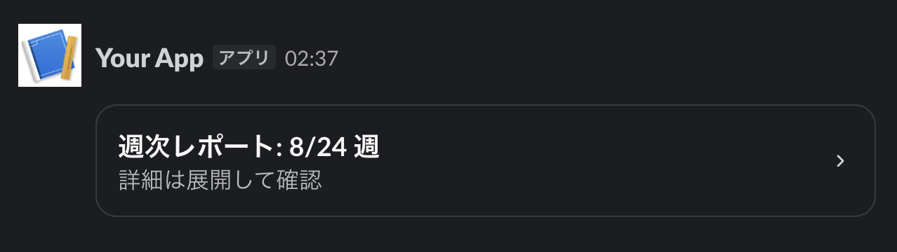
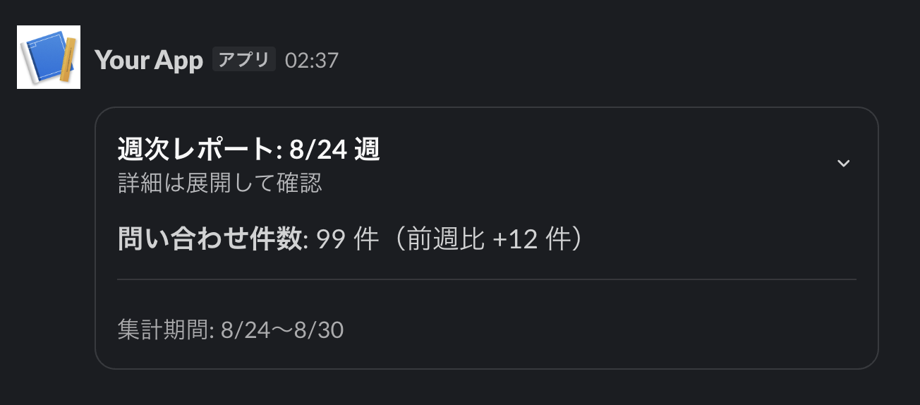
As a limitation, card, markdown, and data_table introduced in the previous installment cannot be placed as child elements. Since table can be included, if you want to collapse a table, you will need to use the table block.
markdown block
This block can display text in standard Markdown format[10].
| Item | Details |
|---|---|
text |
Required. Standard Markdown format. Up to 12,000 characters total across all markdown blocks in one payload |
block_id |
Ignored even if specified |
| Supported syntax | Bold, lists, headings, blockquotes, tables, task lists, code blocks with syntax highlighting, etc. |
| Display notes | Headings are displayed at the same size regardless of level. Image syntax is displayed as a link |
In Slack's own mrkdwn syntax, bold is written as *bold*, but in this block, standard Markdown's **bold** can be used.
This block appears to be designed for use cases such as displaying LLM responses that are already formatted in Markdown.
{
  "blocks": [
    {
      "type": "markdown",
      "text": "## Incident Response Log\n\n**Search API latency had degraded**.\n\n| Time | Status |\n| --- | --- |\n| 10:02 | Detected |\n| 10:30 | Resolved |\n\n- [x] Root cause identified\n- [ ] Prevention measures implemented"
    }
  ]
}
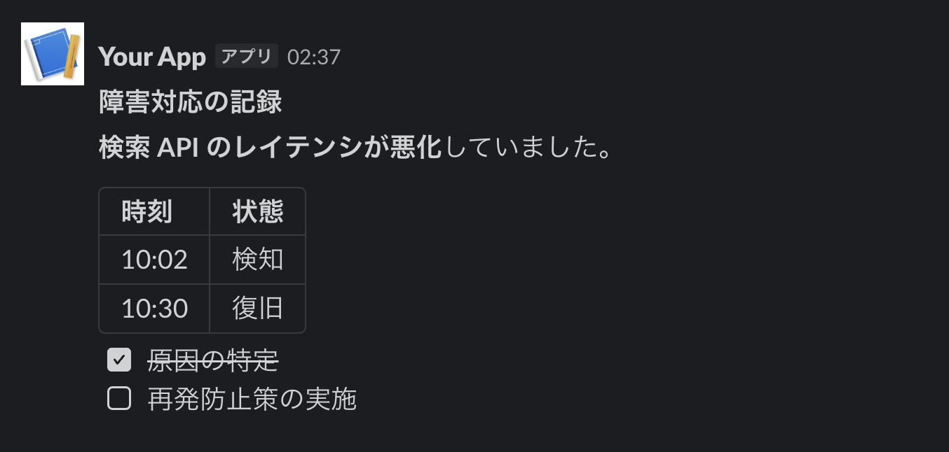
It's very convenient that tables and task lists render directly!
Summary
In this article, we looked at 5 blocks: alert / card / carousel / container / markdown.
All of these blocks can be easily tried by simply pasting the JSON from this article into Block Kit Builder, so please give any blocks that caught your interest a try.
In the next installment, Part 3, we will try out the agent-related blocks, which are attracting particularly high attention. Stay tuned!
https://docs.slack.dev/changelog/2026/04/16/block-kit-new-blocks/ ↩︎ ↩︎ ↩︎
https://docs.slack.dev/changelog/2026/06/29/block-kit-container-block ↩︎
https://docs.slack.dev/changelog/2025/02/03/block-kit-markdown ↩︎
https://docs.slack.dev/changelog/2026/03/06/block-kit-rich-text ↩︎
https://slack.dev/build-richer-agent-experiences-with-block-kit/ ↩︎
https://docs.slack.dev/reference/block-kit/blocks/alert-block ↩︎
https://docs.slack.dev/reference/block-kit/blocks/card-block ↩︎
https://docs.slack.dev/reference/block-kit/blocks/carousel-block ↩︎
https://docs.slack.dev/reference/block-kit/blocks/container-block ↩︎
https://docs.slack.dev/reference/block-kit/blocks/markdown-block ↩︎