![[Copilot Studio] Tried Displaying KPIs as Graphs in Chat: Two Routes Using Adaptive Cards and Code Interpreter](https://images.ctfassets.net/ct0aopd36mqt/wp-thumbnail-00eddef75cb5ee39286e0aa370a96e4f/040bbf127b84da0ee2c483485da1dd29/microsoft-eyecatch.jpg?w=3840&fm=webp)
[Copilot Studio] Tried Displaying KPIs as Graphs in Chat: Two Routes Using Adaptive Cards and Code Interpreter
This page has been translated by machine translation. View original
Introduction
Hello, I'm Keema.
When creating KPI reports, there's often a request to show not just tables of numbers but also bar charts and line graphs.
There are mainly two ways to display charts in a chat in Copilot Studio.
This article covers two routes for displaying KPI charts within a chat, verified with hands-on testing as of June 2026.
One is using the chart elements of Adaptive Cards, and the other is generating images with Python/matplotlib via Code Interpreter.
I hope this serves as a reference for those who want to display charts within a chat.
This article is the 7th installment in a series on building agents in Copilot Studio.
The series aims to build an agent that handles "collection → aggregation → graphing → insights → documentation" end-to-end, and this article covers the "graphing" part.
Target audience: Those who want to display KPI charts within a chat in Copilot Studio
Series Article List
| # | Theme | Article |
|---|---|---|
| Part 1 | First Agent | Creating Your First Agent |
| Part 2 | Knowledge | Trying Knowledge-Grounded Answers Based on Files |
| Part 3 | Topics, Tools, Flows | Building "Actions" with Topics, Tools, and Agent Flows |
| Part 4 | Templates, Autonomous Triggers, Multi-Agent | Expanding the Structure with Templates, Autonomous Triggers, and Multi-Agent |
| Part 5 | Collection (How to Pass Data) | Comparing Methods for Providing KPI Data to an Agent for Aggregation |
| Part 6 | Aggregation | Doing KPI Aggregation Deterministically Without Relying on LLMs |
| Part 7 | Graphing | (This article) |
1. What We're Doing This Time
We'll try two routes for displaying charts within a chat.
- Route A: Display a bar chart using the chart elements (
Chart.VerticalBar) of Adaptive Cards - Route B: Generate a bar chart image using Code Interpreter (Python/matplotlib)
- Organize how to choose between the two routes and the constraints regarding display destinations (channels)
For verification, we'll use the ARR (fictional values) of the same three fictional SaaS companies from previous installments (CloudNova / StreamForge / Datapeak).
2. Two Routes for Chart Display
There are two main options for displaying charts within a chat in Copilot Studio.
| Aspect | Route A: Adaptive Card Chart Elements | Route B: Code Interpreter |
|---|---|---|
| Mechanism | The host renders the card's Chart.* elements |
Generates images with Python/matplotlib |
| Cost | Does not use premium features | Premium (consumes Copilot Credits) |
| Flexibility | Chart types prepared by the card | Free with Python (axes, colors, annotations, etc.) |
| Output | Card (rendered within chat) | PNG image (displayed in chat / downloadable) |
| Setup effort | Write JSON card payload and embed it in the topic's message node | Just make a request in natural language. CI auto-generates and executes Python |
| Display constraints | Depends on the host's supported card version | Not displayed in Teams and Microsoft 365 Copilot channels |
Route A has the advantage of being testable without premium features, but requires the effort of manually writing a JSON card payload and embedding it in a topic.
Route B requires a premium subscription, but since you only need to ask "make a chart of ○○" and CI generates and executes the Python, the actual operation is intuitive.
Let's start with Route A, which doesn't use premium features.
3. Route A: Display Using Adaptive Card Chart Elements
3.1 Preparing the Bar Chart Card
Prepare an Adaptive Card JSON to display the ARR of three companies as a vertical bar chart.
Pass an array of { "x": label, "y": value } to the data of Chart.VerticalBar.
To ensure information is preserved on hosts that don't support chart elements, a FactSet (table format) is included as fallback.
Here, the ARR for Q2 FY2025 is written directly as a sample to demonstrate how the card works.
{
  "type": "AdaptiveCard",
  "$schema": "http://adaptivecards.io/schemas/adaptive-card.json",
  "version": "1.6",
  "body": [
    {
      "type": "TextBlock",
      "text": "SaaS 3社 ARR比較(2025 Q2・百万円)",
      "weight": "Bolder",
      "size": "Medium",
      "wrap": true
    },
    {
      "type": "Chart.VerticalBar",
      "title": "ARR(百万円)",
      "xAxisTitle": "企業",
      "yAxisTitle": "ARR(百万円)",
      "colorSet": "categorical",
      "data": [
        { "x": "CloudNova", "y": 1800 },
        { "x": "StreamForge", "y": 1150 },
        { "x": "Datapeak", "y": 2600 }
      ],
      "fallback": {
        "type": "FactSet",
        "facts": [
          { "title": "CloudNova", "value": "ARR 1,800百万円" },
          { "title": "StreamForge", "value": "ARR 1,150百万円" },
          { "title": "Datapeak", "value": "ARR 2,600百万円" }
        ]
      }
    }
  ]
}
Adaptive Cards chart elements include vertical bar, horizontal bar, line, pie, donut, and others.
Teams supports the following types of charts:
- Donut chart
- Gauge chart
- Grouped vertical bar chart
- Horizontal bar chart
- Line chart
- Pie chart
- Stacked horizontal bar chart
- Vertical bar chart
Source: Charts in Adaptive Cards | Microsoft Learn
3.2 Placing the Card in the Topic's Message Node
Cards that only display information (those that don't receive user input) are placed in message nodes.
- From the agent's "Topics", create an empty topic via "Add a topic" → "From blank"
- Write in the trigger description when this topic should be used (e.g., when you want to show the ARR of three companies as a bar chart)
- Add a message node via "Add node" → "Send a message"
- Select "Add" → "Adaptive Card" from the message node's toolbar
- Open the designer by clicking "Edit adaptive card" and paste the JSON above into the card payload editor
If the bar chart appears in the designer's preview, the card is functioning correctly.
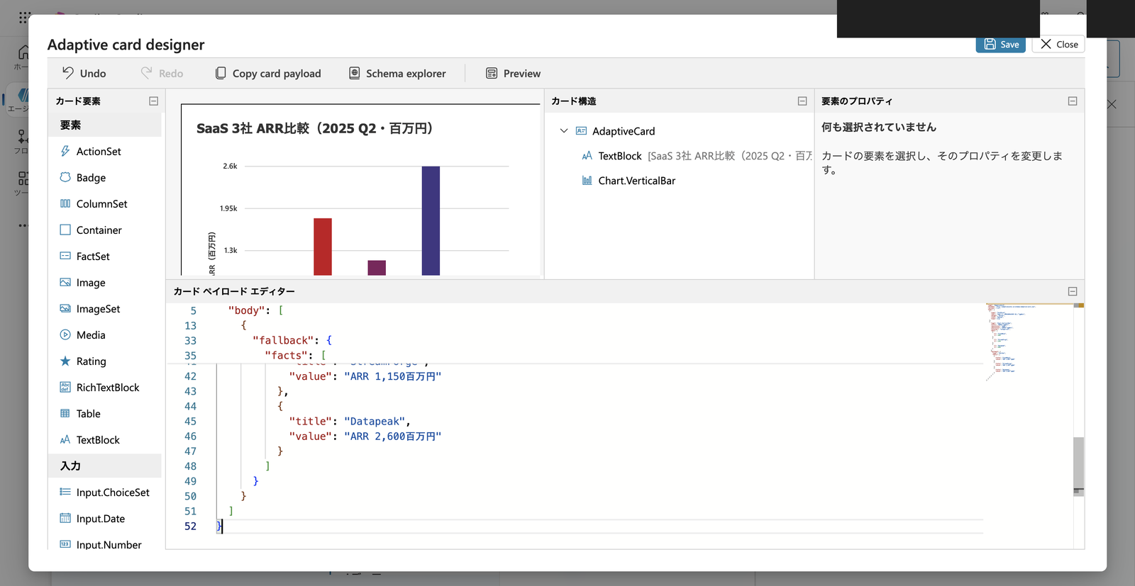
Adaptive Card designer. The bar chart is rendered in the preview (upper left), and Chart.VerticalBar is listed in the card structure
Save the JSON, close the designer, and save the topic.
3.3 Verifying Operation in the Test Chat
In the test chat, send an utterance that matches the trigger description (e.g., "Show me the ARR of CloudNova / StreamForge / Datapeak as a bar chart").
The card from the message node is returned, and the bar chart was actually rendered.
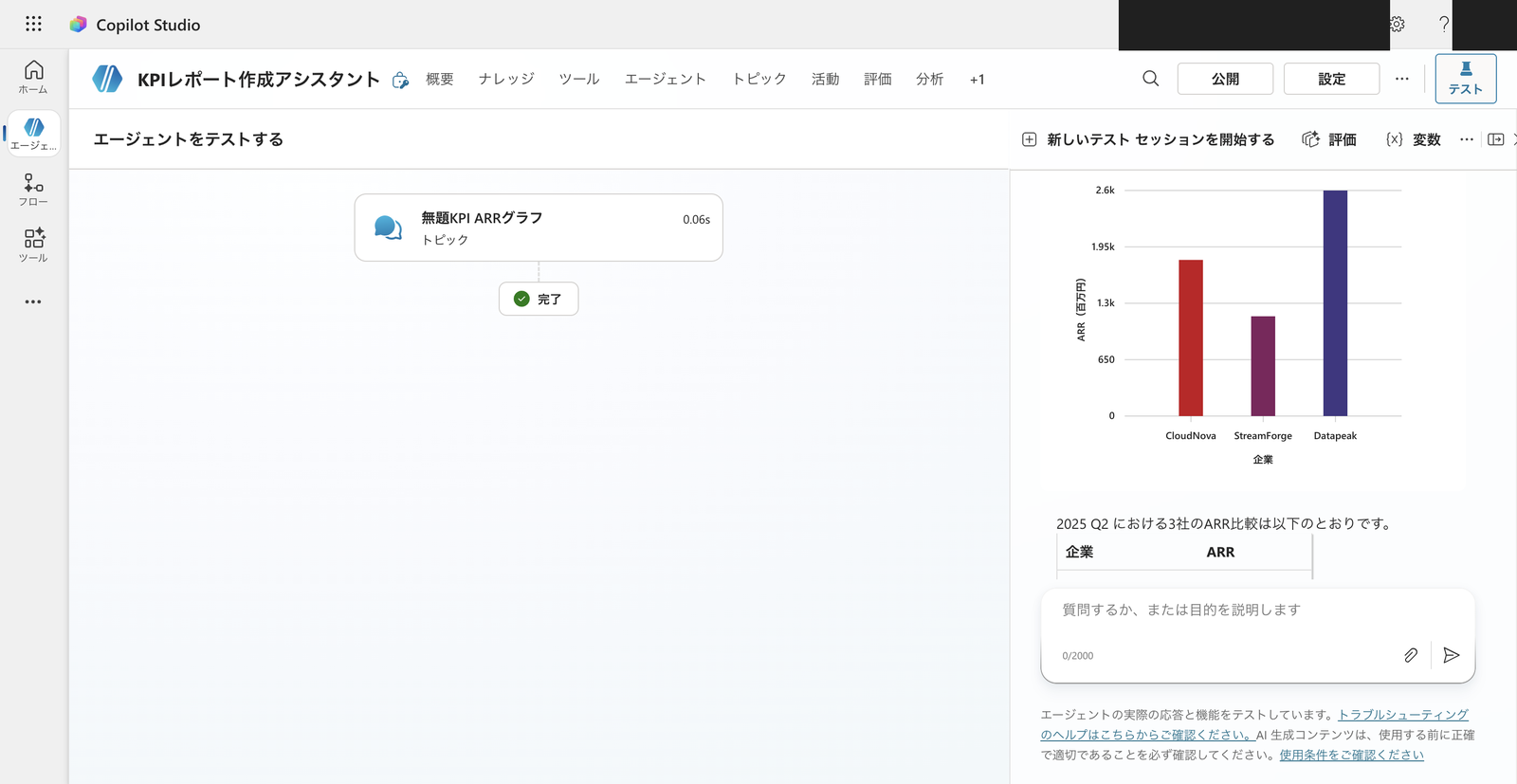
Chart.VerticalBar rendered in the test chat. The X-axis shows companies (CloudNova / StreamForge / Datapeak), the Y-axis shows ARR (in millions of yen), and the bars for all three companies are displayed
With generative orchestration turned on, in addition to displaying the card, the agent itself sometimes supplemented with a written summary comment and rankings.
The chart (card) and insights (text) were displayed side by side in the same response.
In this verification, the following text was returned after the chart attachment.
Here is a bar chart comparing the ARR for Q2 2025. Below is a summary of the numbers.
Company ARR 1st Datapeak 2,600 million yen 2nd CloudNova 1,800 million yen 3rd StreamForge 1,150 million yen Key Points
- Datapeak is at the top, accounting for approximately 47% of the total for all three companies (5,550 million yen).
- CloudNova is in the middle, 800 million yen behind Datapeak.
- StreamForge is the smallest in scale, at approximately 44% of Datapeak's level.
In addition to ARR, comparing NRR (Net Revenue Retention) and operating profit margin will make differences in growth efficiency and profitability clearer. Feel free to request comparisons of other KPIs or report creation!
The Adaptive Card itself was rendered in the test chat without using premium features like Code Interpreter.
3.4 Note: Channels That Can Render Chart Elements Are Limited
The charts were rendered in the test chat this time.
Adaptive Cards JSON specifies a schema version like "version": "1.6".
This is not the Copilot Studio version, but the Adaptive Cards specification version itself (the value of "version" written near the beginning of the JSON we created).
Chart elements (such as Chart.VerticalBar) are a specification added in version 1.6, and they will not be rendered unless the destination channel (host) supports that version.
Copilot Studio supports the Adaptive Cards schema versions 1.6 and earlier. However, the appropriate schema version depends on the targeted host app:
- The Bot Framework Web Chat component (that is, the default website integration pattern) supports version 1.6 but doesn't support
Action.Execute- The live chat widget (used for Omnichannel for Customer Service) is limited to version 1.5
- Teams is also limited to version 1.5
In addition, Copilot Studio only renders version-1.6 cards in the test chat, not on the canvas.
Source: Using Adaptive Cards in Copilot Studio | Microsoft Learn
Since Teams and live chat only support up to version 1.5, chart elements like Chart.VerticalBar will not be rendered.
When using in a published channel, always verify that the chart is actually rendered in the target channel (this article only confirms rendering in the test chat).
4. Route B: Generating Chart Images with Code Interpreter
Route A can render charts without premium features, but the expression is limited to the chart types provided by the card.
If you want to freely customize axis formatting and annotations, or if you want to paste the generated image into a document, Code Interpreter is the better choice.
4.1 Creating a Bar Chart from Aggregated Values
Route B uses Code Interpreter. This is a premium feature that consumes Copilot Credits.
Enable "Code Interpreter" under "File processing capability" in the agent's "Settings" → "Generative AI".
In the test chat, request that the aggregated average ARR of the three companies be made into a bar chart. The following prompt was sent first.
Please generate a bar chart as a PNG image using matplotlib to compare the average ARR for 2025 for three companies (CloudNova 1950, StreamForge 1300, Datapeak 2810). Add numerical labels to each bar, set the Y-axis to "ARR (millions of yen)", and use different colors for the three companies.
Code Interpreter generated a bar chart PNG with matplotlib, but the Y-axis label ("ARR (millions of yen)") was garbled.
After sending the request message, the flow of code execution and the returned image are displayed consecutively in the chat.
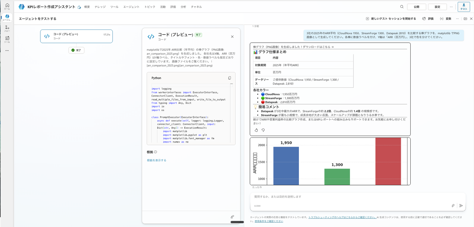
The utterance, code execution, and bar chart image were displayed in sequence within the chat. The Y-axis label is garbled
So I tried adding plt.rcParams['font.family'] = 'Yu Gothic' to the beginning of the prompt.
Please generate a bar chart using matplotlib to compare the average ARR for 2025 for three companies (CloudNova 1950, StreamForge 1300, Datapeak 2810). Set the Y-axis to "ARR (millions of yen)", use different colors for the three companies, and add numerical labels to each bar. Please include plt.rcParams['font.family'] = 'Yu Gothic' at the beginning.
This time the Y-axis label was correctly displayed in Japanese.
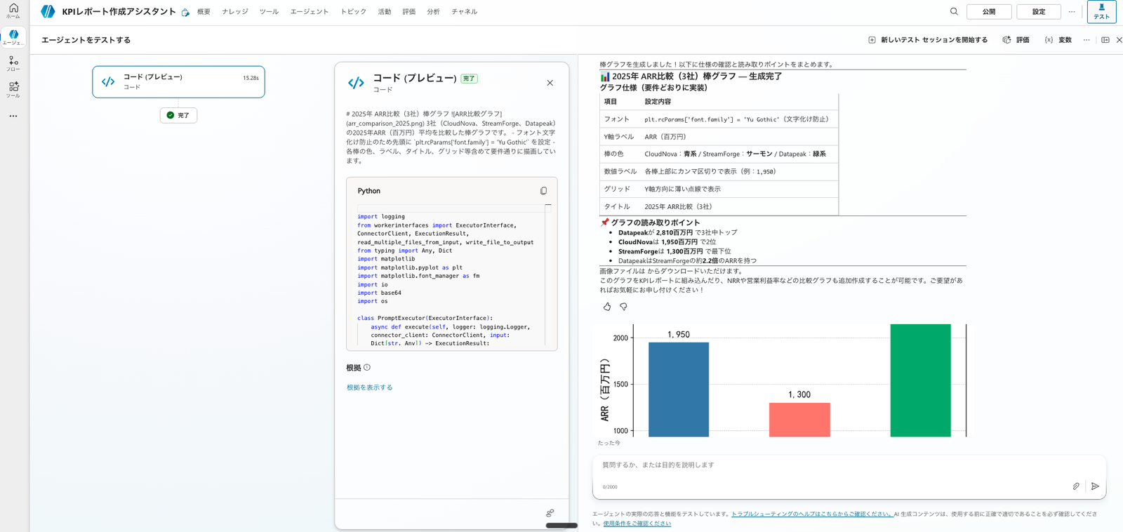
After specifying plt.rcParams['font.family'] = 'Yu Gothic'. The Y-axis label "ARR (millions of yen)" is correctly displayed
The bar values (1,950 / 1,300 / 2,810) are the average ARR for 2025 that Code Interpreter aggregated previously.
Following the aggregation, you can proceed directly to charting within the same Code Interpreter session.
4.2 Note: Images Generated by Code Interpreter Are Not Displayed in Some Channels
Images generated by Code Interpreter are not rendered in the Teams and Microsoft 365 Copilot channels.
Images created with code interpreter are not rendered in the Teams and Microsoft 365 Copilot channel
Source: FAQ for code interpreter | Microsoft Learn
Both Route A (Adaptive Card) and Route B (Code Interpreter-generated image) were displayable in the test chat in my environment, but display is restricted in some channels such as Teams.
It is necessary to verify whether content is actually displayed in the target channel before publishing.
5. Choosing Between the Two Routes
After running both in practice, the choice can be summarized as follows.
- If you want to avoid premium charges, use Route A (Adaptive Card). Charts can be rendered without using premium tools like Code Interpreter. However, there is the effort of writing a JSON card payload and embedding it in a topic, and chart types are limited to those provided by the card.
- If you prioritize freedom of expression, or if you want to paste generated images into documents, use Route B (Code Interpreter). Premium charges (Copilot Credits) are required, but since you only need to make a request in natural language and CI generates and executes the Python, the operational effort is low. You can freely customize axes, colors, and annotations.
For charts to be placed in final documents (PowerPoint, Excel), there is also an option to embed editable charts within the document rather than pasting images.
This will be covered in a future installment.
6. Summary
There are two ways to display KPI charts within a chat: Adaptive Cards, which doesn't use premium features, and Code Interpreter, which offers greater flexibility.
If you want to avoid premium charges, use Adaptive Cards (though it requires manually writing JSON). If you prioritize intuitive operation, freedom of expression, and image reusability—despite the premium charge—use Code Interpreter.
Both methods could render charts in the test chat, but display is restricted in some channels such as Teams.
I recommend choosing based on your purpose—whether you want a simple display within chat or a chart embedded in a document—taking into account the display constraints of the target channel.