![[Copilot Studio] Tried generating .pptx/.xlsx from scratch with Code Interpreter](https://images.ctfassets.net/ct0aopd36mqt/wp-thumbnail-00eddef75cb5ee39286e0aa370a96e4f/040bbf127b84da0ee2c483485da1dd29/microsoft-eyecatch.jpg?w=3840&fm=webp)
[Copilot Studio] Tried generating .pptx/.xlsx from scratch with Code Interpreter
This page has been translated by machine translation. View original
Introduction
Hello, I'm Kema.
In the previous article, I inserted values into Word template placeholders to generate a report.
That was a template hole-filling approach, specific to Word.
So the topic of this article is: what do you do when you want to create PowerPoint or Excel files — complete with editable native charts?
This article explores whether the code interpreter (Python execution) can generate real .pptx / .xlsx files from scratch without a template, verified with hands-on testing as of June 2026.
I also confirm whether the generated files are genuine files that can be opened and edited in Excel, not just images pasted in.
I hope this serves as a reference for those who want to automate document generation all the way to PowerPoint and Excel.
This article is the 10th installment in a series on building agents with Copilot Studio.
The series aims to build an agent that handles "collection → aggregation → charts → insights → documentation" end to end, and this article covers the "documentation (PowerPoint / Excel)" part.
Target audience: Those who want to automatically generate editable PowerPoint / Excel documents with Copilot Studio
Series Article List
| # | Theme | Article |
|---|---|---|
| Episode 1 | First Agent | Creating My First Agent |
| Episode 2 | Knowledge | Trying Knowledge-Grounded Answers Based on Files |
| Episode 3 | Topics, Tools, Flows | Building "Actions" with Topics, Tools, and Agent Flows |
| Episode 4 | Templates, Autonomous Triggers, Multi-Agent | Expanding the Configuration with Templates, Autonomous Triggers, and Multi-Agent |
| Episode 5 | Collection (How to Pass Data) | Comparing Methods for Giving KPI Data to an Agent for Aggregation |
| Episode 6 | Aggregation | Performing KPI Aggregation Deterministically Without Relying on LLM |
| Episode 7 | Charts | Displaying KPIs as Charts Within Chat |
| Episode 8 | Insights | Generating Insights from Aggregated Numbers |
| Episode 9 | Documentation (Word) | Automatically Generating a Word Report by Inserting Numbers into a Template |
| Episode 10 | Documentation (PowerPoint / Excel) | (This article) |
1. What We're Doing This Time
We will have the code interpreter generate real PowerPoint / Excel files from scratch.
- Use the code interpreter to generate a
.xlsxfile and embed an editable native bar chart - Use the code interpreter to generate a
.pptxfile
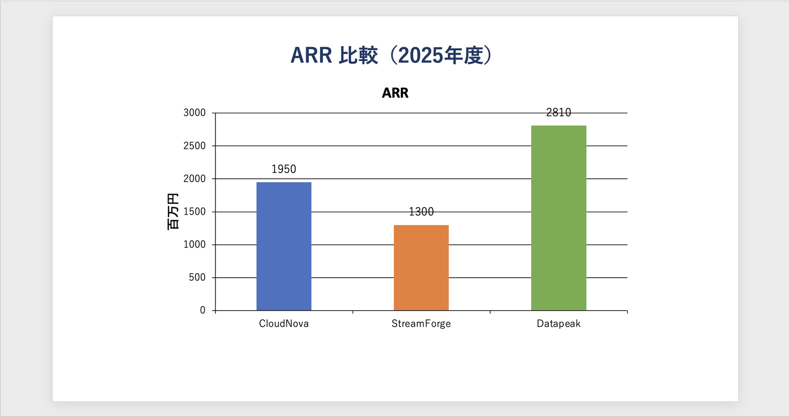
For verification, we use the same ARR aggregated values from 2025 for three fictional SaaS companies (CloudNova / StreamForge / Datapeak) that we've been using throughout the series (CloudNova 1,950 / StreamForge 1,300 / Datapeak 2,810 — fictional).
2. The Difference Between Insertion and Native Generation
The previous article (Word) and this article (PowerPoint / Excel) differ in how files are created.
| Aspect | Previous: Document output (insertion) | This article: Code interpreter |
|---|---|---|
| How it's made | Values are filled into {{field}} placeholders in a prepared template |
Python assembles the file from scratch |
| Supported formats | Word only | Word / Excel / PowerPoint / PDF |
| Charts | Range prepared in the template | Created freely in code (Excel produces editable native charts) |
| Template | Required | Not required |
| Billing | Prompt execution (Copilot Credits) | Premium (Copilot Credits) |
The code interpreter can run Python to process Word / Excel / PowerPoint / PDF files.
Code interpreter is a Python execution engine integrated within Copilot Studio and prompt builder prompts. It allows users to run code in a secure, sandboxed environment to perform data analysis, process Word, Excel, PowerPoint and PDF files, and generate visualizations.
Source: FAQ for code interpreter | Microsoft Learn
For the generation in this article, enable "Code Interpreter" under "Settings" → "Generative AI" → "File processing capabilities" in the agent settings, then run it in the test chat.
Note that to use the code interpreter, user authentication must be enabled on the agent side. It does not work without authentication (such as Direct Line with No authentication).
To use code interpreter, you need to configure your agent, in agent settings, to use user authentication. For example, using Direct Line with No authentication selected doesn't work for scenarios using code interpreter.
Source: Use code interpreter in a prompt to generate and execute Python code | Microsoft Learn
3. Generating Excel Natively
In the test chat, we request generation of an Excel file with a native chart summarizing the aggregated values.
Using only the 2025 ARR aggregated values for the three companies, generate a single .xlsx file using openpyxl. Arrange the table and bar chart to fit on one screen for blog purposes. Be sure to execute all steps.

1. Create a sheet named "ARR Summary". Put headers "Company Name" and "ARR (million yen)" in A1:B1, and enter CloudNova 1950 / StreamForge 1300 / Datapeak 2810 in A2:B4.
2. The header row (A1:B1) should have a dark navy background with white bold text. Column B should use number formatting (#,##0). Column A width 16, Column B width 14.
3. Using openpyxl.chart.BarChart and Reference, create a vertical bar chart with values=B2:B4 and categories=A2:A4. Title: "2025 ARR Comparison (million yen)", legend hidden, size width=11 · height=7 (cm). Embed it at cell D1 using add_chart (native chart with cell references, not an image).
4. Save the file, then report the "sheet list," "number of charts," and "chart placement cell and size," and return a download link for the .xlsx file.
Do not use any values not listed here.
The code interpreter executed openpyxl (a Python library for manipulating Excel files) and generated a .xlsx file.
The response displays an execution report (sheet list, number of charts, chart placement cell and size), and a download link for ARR_2025_comparison.xlsx is returned.
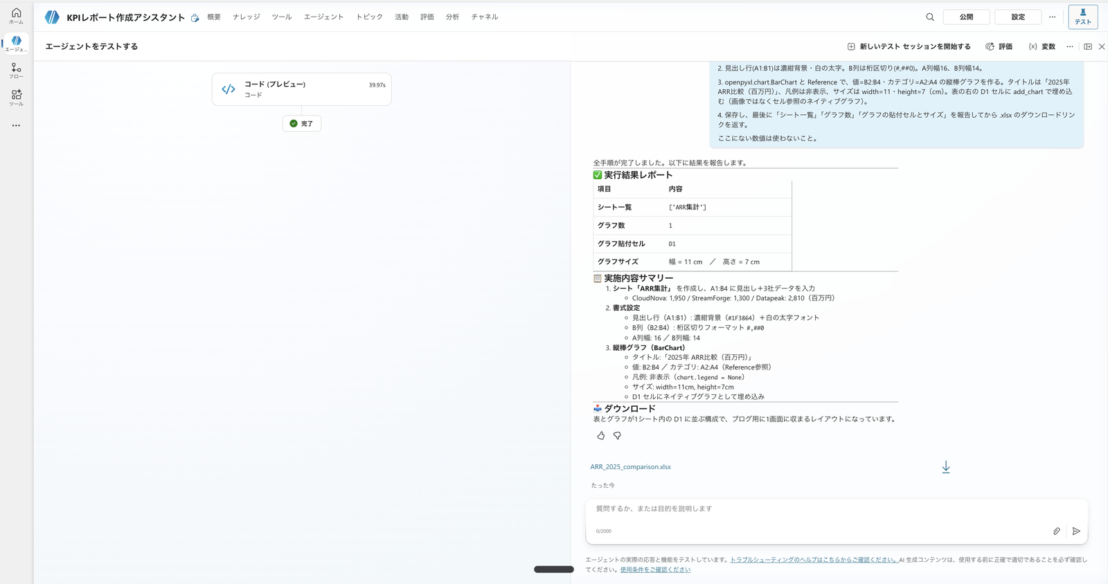
Excel generation response. As instructed, it reports "Sheet list = ARR Summary / Number of charts = 1 / Placement = D1 / Size = width 11cm × height 7cm," and a download link for ARR_2025_comparison.xlsx is shown
When downloaded and opened, it was a genuine, editable native Excel file with a bar chart placed to the right of the summary table.
Since the bar chart is a BarChart object with a cell reference (B2:B4) rather than an image, the series color, axes, and chart type can be edited within Excel.
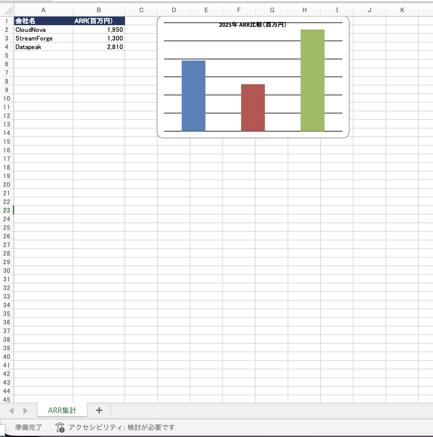
Opened ARR_2025_comparison.xlsx. Summary table on the left (header formatting, number separators), native bar chart with cell references on the right. Fits on one screen as specified
One observation here.
The bar chart generated this time had no company name labels on the horizontal axis and no data labels on the bars (as you can see in the image above, three bars are lined up, but you cannot tell which bar belongs to which company from the chart alone).
In openpyxl, data labels are off by default, and the category labels on the horizontal axis will not appear unless the category reference (set_categories) is correctly applied — so without explicit instructions, charts tend to be generated without labels like this.
While it is natively editable, the appearance may not be immediately usable as presentation material, and if labels are needed, they must be added through instructions or code.
4. Generating PowerPoint Natively
Similarly, we have PowerPoint generated from scratch.
We pass the 2025 KPIs for three companies and have python-pptx assemble a presentation with three slides.
Using only the following 2025 KPIs (in millions of yen and %), generate a PowerPoint comparing three companies using python-pptx. The structure should be three slides: cover, ARR bar chart, and insights. The file name should be 2025_KPI_Comparison.pptx. When complete, return a download link for the .pptx file. Do not use any values not listed here.
CloudNova: ARR 1950, NRR 120, Operating profit margin 13.5
StreamForge: ARR 1300, NRR 109, Operating profit margin 1.0
Datapeak: ARR 2810, NRR 128, Operating profit margin 19.0
The code interpreter executed python-pptx (a Python library for manipulating PowerPoint files).
The response explained that it generated 2025_KPI_Comparison.pptx consisting of three slides — a cover, ARR bar chart, and insights — and returned a download link.
Only the values provided (ARR, NRR, and operating profit margin for CloudNova / StreamForge / Datapeak) were used, and no values outside those provided were introduced.
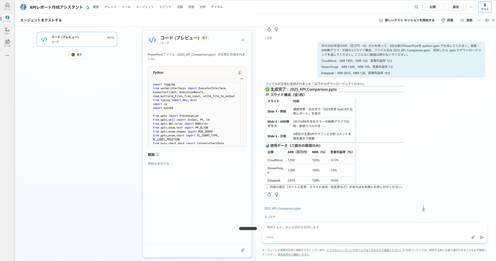
PowerPoint generation response. On the left is the executed python-pptx code; on the right, the slide structure (cover, ARR bar chart, key insights) and data used (only the 2025 values provided) are shown, with a download link for 2025_KPI_Comparison.pptx
Unlike the Word template filling (previous article), the slides are assembled without a template.
When downloaded and opened, three slides had been created as described. Let's look at each in turn.
The cover is a simple layout with just a title and the three target companies.
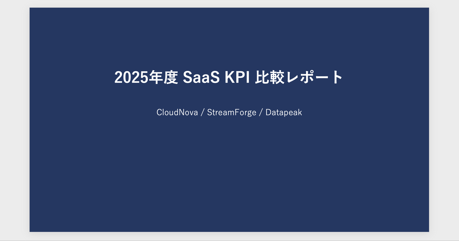
Slide 1 (Cover). "2025 SaaS KPI Comparison Report" and the three target companies (CloudNova / StreamForge / Datapeak)
The second slide is a bar chart of ARR.
Even though it's the same type of bar chart, this chart created with python-pptx was generated with both company name labels on the horizontal axis and data labels on the bars (in contrast to the Excel chart in Step 3, which had no axis labels or data labels).
Slide 2 (ARR bar chart). CloudNova 1,950 / StreamForge 1,300 / Datapeak 2,810. Company names on the horizontal axis and values on each bar are displayed, making the chart immediately usable in a presentation as-is
The third slide contains insights.
From the ARR, NRR, and operating profit margin provided, comments comparing the three companies were generated as bullet points.
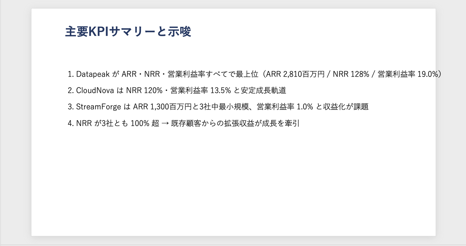
Slide 3 (Key Insights). Comments aligned with the provided numbers: "Datapeak leads across all metrics," "StreamForge has a low operating profit margin with profitability challenges," and "CloudNova is the balanced type"
Even when creating the "same native bar chart" in Excel (openpyxl) and PowerPoint (python-pptx), the resulting appearance is not necessarily the same.
Whether labels appear depends on whether the generated code sets categories and data labels. If you want a chart that can be used directly in a presentation, it's safer to include axis labels, data labels, and legends in your instructions.
6. Notes: Generation Time and Distribution
There are two points to note when using native generation.
The first is generation time.
In my environment, both PowerPoint and Excel took more than one minute to generate (roughly 1 to 1.5 minutes).
Agent flow tools need to respond synchronously within 100 seconds.
Respond to the agent within the 100-second action limit. Optimize the flow logic, queries, and the amount of data returned so that a typical run is below this 100-second limit.
Source: Add an agent flow or workflow as a tool to an agent | Microsoft Learn
Since file generation can take around 100 seconds, placing it directly in a synchronous flow risks a timeout.
It is safer to use generation directly in the test chat or agent chat.
Session timeouts for long-running tasks
Source: FAQ for code interpreter | Microsoft Learn
The second point is distribution.
The generated file is only available during the session, so to reliably deliver it to users, save it to OneDrive or similar and return a sharing link. This will be covered in the distribution article.
7. Summary
Using the code interpreter, you can generate PowerPoint / Excel files from scratch without a template.
Excel in particular embeds charts in a format with data references rather than images — native charts — so the recipient can edit them in Excel.
The facts that generation takes on the order of minutes, that distributing the generated files requires additional steps, and that this is a premium-billed feature are all things to understand before putting it into production.