The First Design Workshop Insights: CMJP x CMDN Collaboration
この記事は公開されてから1年以上経過しています。情報が古い可能性がありますので、ご注意ください。
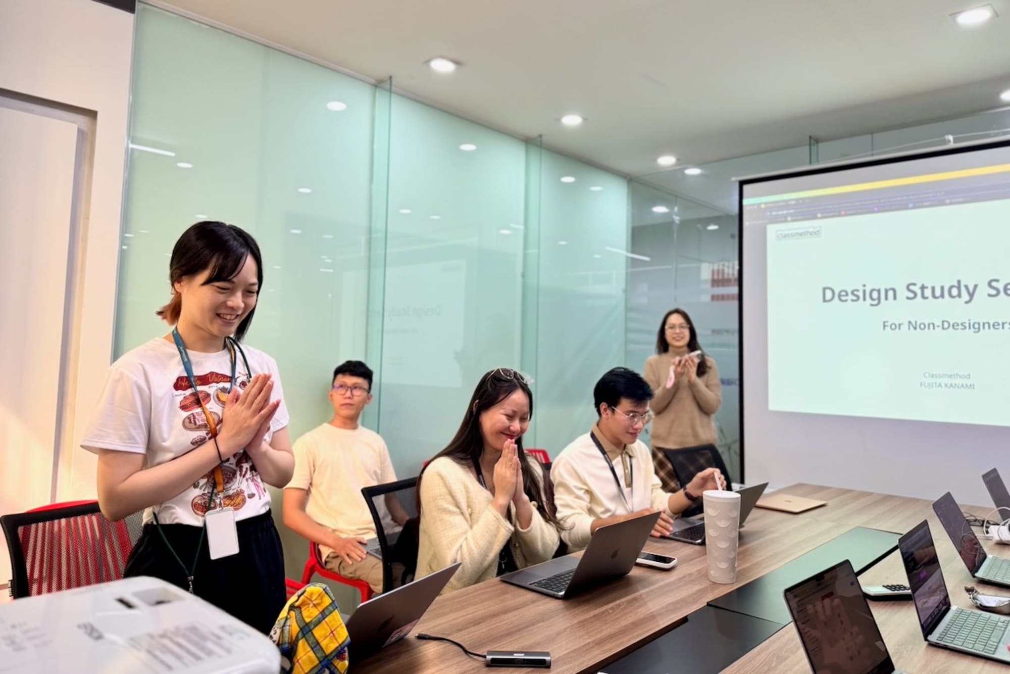
Recently, two designers from Classmethod Japan visited our Classmethod Da Nang (CMDN) office! During their visit, they held a design workshop for CMDN members which was a valuable opportunity for Japanese and Vietnamese members to exchange knowledge and strengthen our collaboration. Here's an overview of the event and key takeaways.
About the Workshop
The workshop was designed to provide a comprehensive learning experience and was divided into two key sections: Design Basics and User Story Mapping. Each segment delved into foundational concepts and included hands-on activities to ensure participants could connect theory to practice.
Section 1: Design Basics
Design is not just about making things look good—it’s about communicating effectively and solving problems visually. In this section, participants explored the four pillars of design principles, which are essential for creating impactful, user-friendly interfaces.
1. Contrast
Contrast is the art of creating differences to draw attention to important elements. In design, it’s used to:
- Highlight key information by using bold colors, larger text, or different fonts.
- Create visual hierarchies so users can easily distinguish between primary and secondary elements.
For example, in a call-to-action button, a bright red or blue color with bold text will naturally stand out against a muted background, prompting the user to take action.
Participants learned how to avoid overusing contrast, which can lead to cluttered designs, and instead, strike a balance that emphasizes clarity.
2. Repetition
Repetition builds consistency. It involves reusing design elements—such as fonts, colors, and shapes—across different sections of a product or website. This principle ensures that:
- The design feels cohesive and professional.
- Users can recognize patterns, improving usability and navigation.
For example, consistently placing a search bar at the top of every webpage allows users to intuitively know where to find it. Attendees explored real-world examples of inconsistent designs and discussed how they could apply repetition to fix them.
3. Alignment
Alignment refers to the arrangement of elements to create a clean, organized look. Proper alignment:
- Establishes clear relationships between elements.
- Improves readability by reducing visual clutter.
For example, aligning text and images to a grid ensures that users’ eyes follow a logical flow. Participants practiced aligning complex layouts using design tools, and understanding how to achieve a professional look without overwhelming the viewer.
4. Proximity
Proximity deals with grouping related elements. It helps users understand relationships between content and reduces cognitive load. For instance:
- A headline is placed closer to its paragraph rather than to unrelated elements, immediately clarifying the connection.
- Buttons related to a specific task are grouped to avoid confusion.
During exercises, participants evaluated poorly designed interfaces and redesigned them using proximity to improve clarity and user experience.
Section 2: User Story Mapping
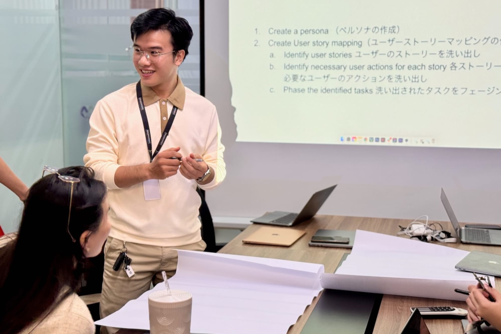
The second part of the workshop introduced User Story Mapping, a powerful tool in agile product development. It helps teams visualize a product's features and understand the user's journey, ensuring that development aligns with user needs and business goals.
1. Basic Understanding of User Story Mapping
Participants learned that User Story Mapping involves organizing tasks and features into a visual map that tells the story of the user's interaction with a product. Key benefits include:
- Breaking down complex workflows into manageable steps.
- Prioritizing features based on user value and business impact.
- Aligning cross-functional teams around a shared vision.
The presenters explained how this tool differs from traditional requirements documentation by focusing on user outcomes rather than technical specifications.
2. User Story Mapping in Action
The workshop featured live demonstrations of how to create a user story map. This included:
- Identifying User Goals: What does the user want to achieve?
- Breaking Down Tasks: What steps must the user take to reach their goal?
- Mapping Features: Which features support each step of the user journey?
An example used in the session was a mobile e-commerce application:
- User Goal: Make a purchase.
- Tasks: Browse products, add items to the cart, review the order and complete payment.
- Features: Search functionality, product details page, cart summary, payment integration.
Participants worked in groups to create their own user story maps for hypothetical projects.
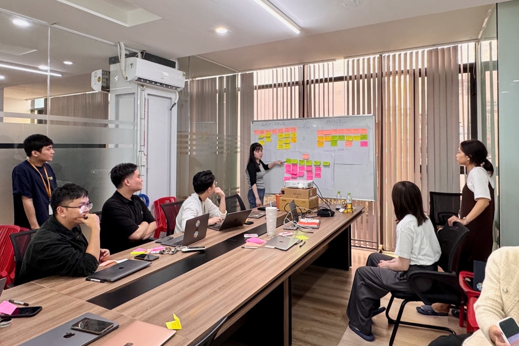
Attendees practiced translating vague requirements into specific outcomes by focusing on the user’s perspective. For instance, "the user can complete checkout smoothly" was broken down into smaller, actionable tasks like validating payment methods and ensuring mobile responsiveness.
Key Takeaways
This workshop left attendees with two key skill sets:
- Design Principles: A deeper understanding of contrast, repetition, alignment, and proximity, enabling them to create visually appealing and effective designs.
- User Story Mapping: A practical framework for organizing features, aligning teams, and prioritizing work to deliver user-centered solutions.
By combining these two areas of expertise, participants are now better equipped to build products and services that are both visually compelling and functionally robust.
Looking Forward to the Next Workshop
This workshop represented a remarkable milestone in fostering collaboration beyond project boundaries between Classmethod Japan and Classmethod Danang and, specifically, was a significant achievement for Da Nang members. Having the opportunity for Japanese and Vietnamese members to share knowledge and ideas will help everyone improve their skills. This, in turn, will have a positive impact on our projects.
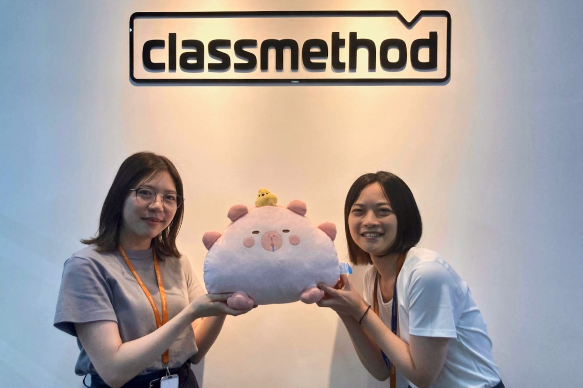
We want to create more opportunities like this in the future, where we can learn from each other, grow together, and build even better projects as a team! We’re already looking forward to the next workshop.
Lastly, thank you to Ms.Kanami Fujita and Ms.Karin Fujita for organizing this amazing workshop!
