様々なIoTデータを可視化できるTwinMaker Knowledge Graph #reinvent
この記事は公開されてから1年以上経過しています。情報が古い可能性がありますので、ご注意ください。
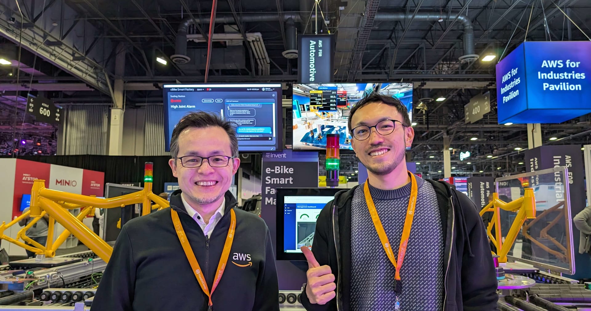
こんにちは、こんばんわ。 「re:Invent2022現地参加をして初セッションのレポートでワクワクしています。」 どうも、CX 事業本部 Delivery 部 @札幌の hiro です。
初めてのセッションレポートになるので、re:Invent全体を楽しんでいきたいと思います!
はじめに
「Unlocking business value and operational benefits with IoT solutions」のセッションの中で、11月17日にローンチされた「 TwinMaker Knowledge Graph 」がNEWとして紹介されていました。 今回は、その「TwinMaker Knowledge Graph」についてお話しします。


「Unlocking business value and operational benefits with IoT solutions」のセッションの概要については、こちらを参照してください。
内容
「TwinMaker Knowledge Graph」は、「AWS IoT TwinMaker」のワークスペース内部で扱う情報を可視化し、グラフ表示してくれるサービスです。 こちらから、「AWS IoT TwinMaker」について見ることができるので是非。

接点情報などだけではなく、3Dモデル情報など全てのセンサー情報を収集することができ遠隔監視のサポートをすることができるようになっています。これらで収集した情報を可視化でき、それ専用のIoT管理画面のようなものを作成する必要がなくなります。 IoT事業を展開しているサービスもいくつか国内にもありますが、その管理画面の代わりになる可能性があります。
また、以下の内容から古くから動作する工場のシステムを監視、データをキャッチアップすることが可能となったとのことです。
That's that's really what's exciting about this there's one more thing that in that in the in the manufacturing, we are releasing Knowledge Graph. This is another exciting feature we just released as well, which is represent a graphical representation of your assets. Let's say you have five or six facilities or buildings and you want to query pumps, see what's going on with the pumps and just have issues to to figure out if there's any issues with a box. You can see graphical representation on the pumps the relation with their connecting to the data that they are sending to and if there is one or two or some health problem, you get flagged. So it can easily dispatch maintenance people to the right. facility to actually take care of it. Before it was like a set of data that we owe this alarm and then you have to take in more and more this one this with the with the knowledge graph. You can see it in a graphical presentation (直訳: 製造業向けにはナレッジグラフをリリースしました。これもリリースしたばかりのエキサイティングな機能で、資産をグラフィカルに表現するものです。例えば、5~6棟の施設やビルがあり、ポンプを照会したり、ポンプに何が起こっているかを見たり、箱に問題がないかどうかを調べたりすることができます。ポンプに接続されているデータとポンプが送信しているデータの関係をグラフィカルに表示することができ、1つまたは2つ、あるいは何らかの健康問題があれば、フラグを立てることができます。そのため、メンテナンス担当者を適切な施設に派遣して、実際に対処させることができます。以前は、このアラームが鳴ったというデータの集合体だったのですが、ナレッジグラフを使うことで、より多くのこのアラームを取り込まなければなりません。グラフィカルなプレゼンテーションで見ることができます。)
実際の使用方法などには今回触れていませんが、ここから確認ができるようです。
最後に
今までIoT管理画面などを使用し、IoT機器から上がってきた情報を管理画面として構築したことのある人であればなんとなく想像できると思いますが、ここが自分にとっては衝撃でした。 もはや特別な管理画面は必要なく、簡単にIoTデータを閲覧でき、アラート検知もでき、遠隔からの操作ももちろん可能となっている。可視化することでユーザにとってより良いものとなっていることが驚きでした。