Web Design Essentials
この記事は公開されてから1年以上経過しています。情報が古い可能性がありますので、ご注意ください。
Web Design Essentials
Introduction
Designing a user-friendly website involves more than just creating an attractive visual appearance; it requires a thoughtful layout that ensures easy navigation and functionality across all devices. A well-structured layout helps create a positive first impression and enhances the overall user experience by prioritizing simplicity, consistency, and accessibility. By focusing on key design principles like spacing, typography, and color psychology, developers can build websites that not only look good but also provide a seamless and intuitive experience for users, whether they're on a desktop, tablet, or smartphone.
Understanding Web Layouts
The layout of a webpage is like its overall structure, and it's the first thing users see. This first impression matters because it can affect how users feel about how easy and friendly the website is.
It's about more than just about looking good, but about being user-friendly.
When creating a website, you should think about how the layout will work on different devices like computers, tablets, and smartphones. This way, the webpage will be easy to use on all devices. By focusing on the layout early on, developers can create a strong foundation for making the website work well on all devices. This helps to make sure that everyone has a consistent and friendly experience no matter what device they're using to visit the website.
Building Responsive Layouts
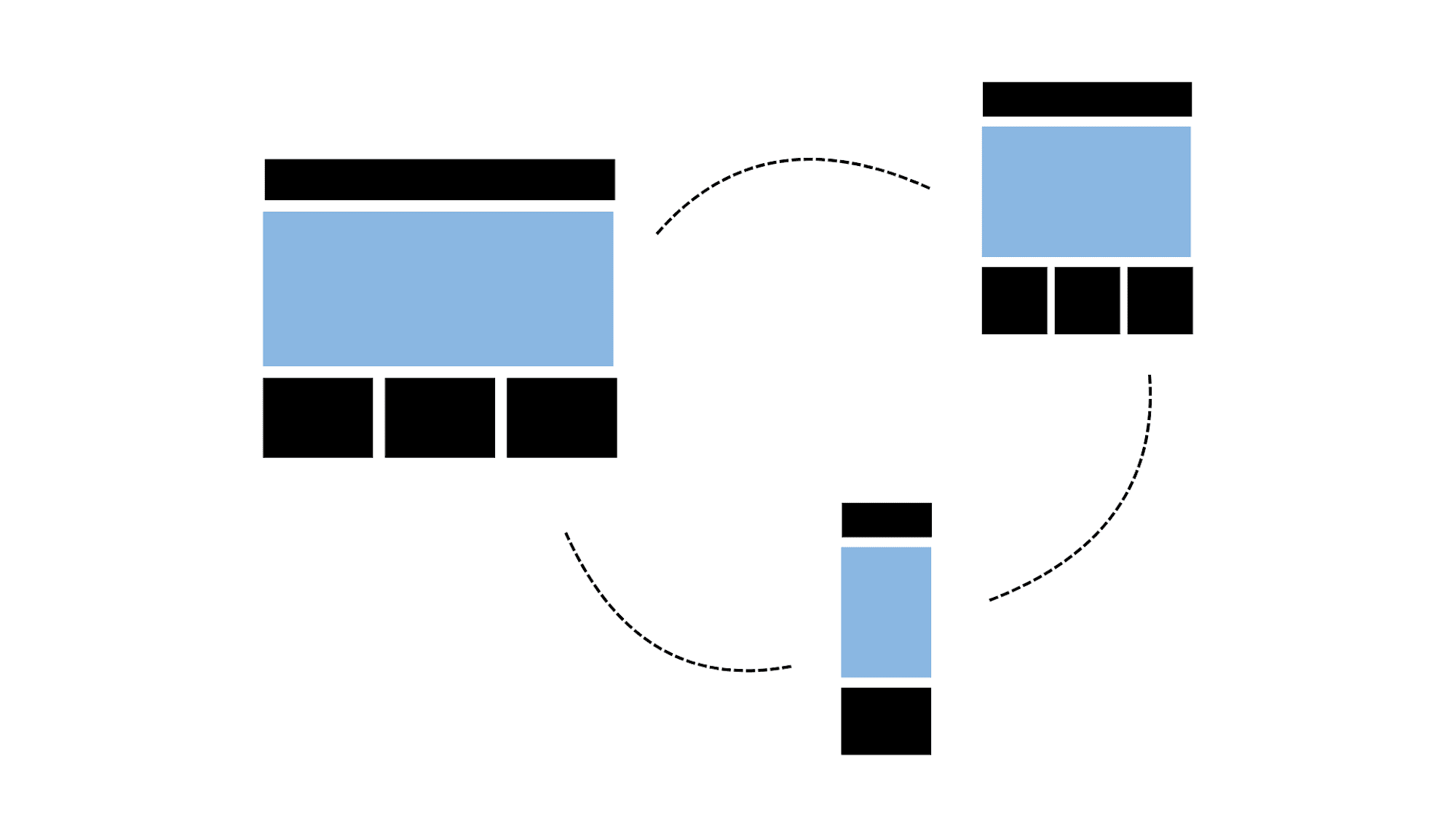
Let’s take a look at the example below, we have a layout like this.

What we need to do is split the image into rows and columns.
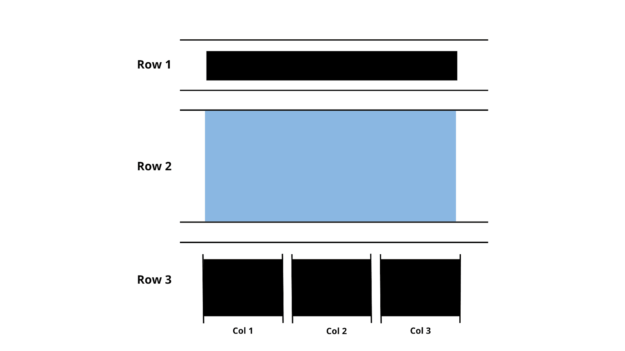
After that, we can decide what part will be showing in the layout on other types of devices, for example, row 3 on a PC can be in a row with 3 columns but on mobiles, we can push them down and make 3 rows, and 1 column.
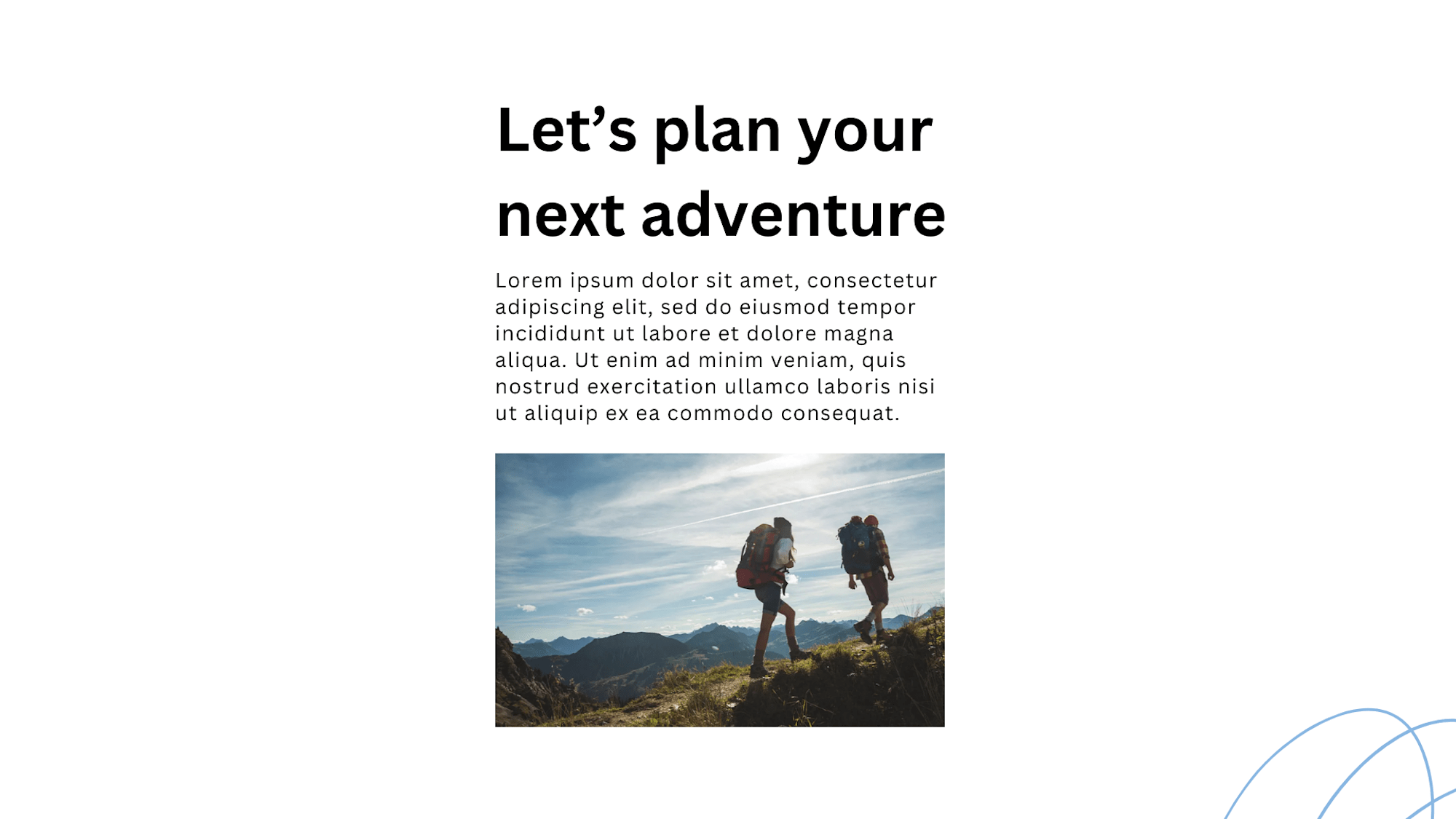
Here we have a simple component with a title and description on the left and an image on the right, We can define this as 1 row and 2 columns then in a PC/Laptop screen, we have enough space to show like this.
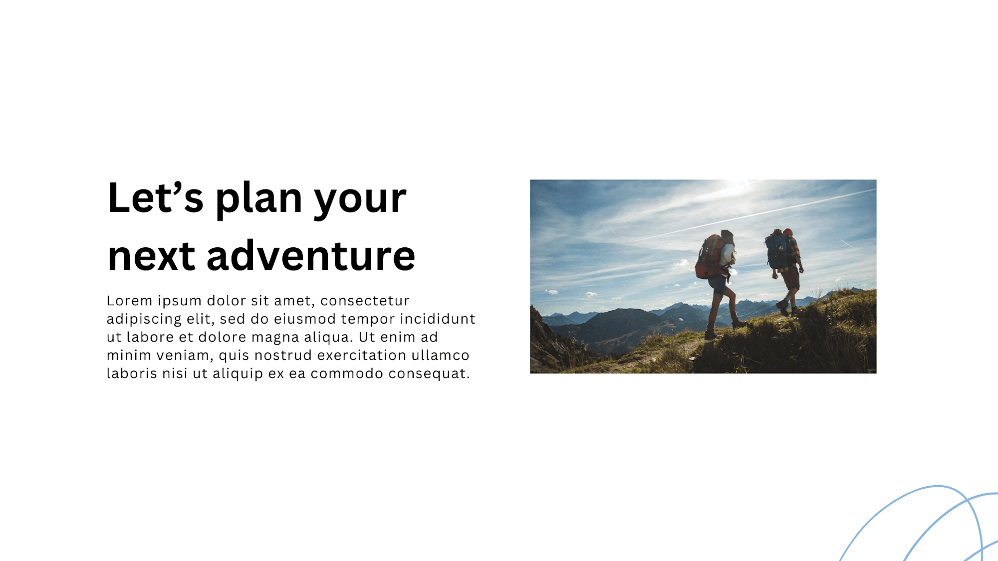
But on mobile device screen, we can not have enough space so we can simply push down 1 column and make the layout is 2 rows and 1 column like below. Easy right?
Design Principles for Effective Layouts
Look at this image
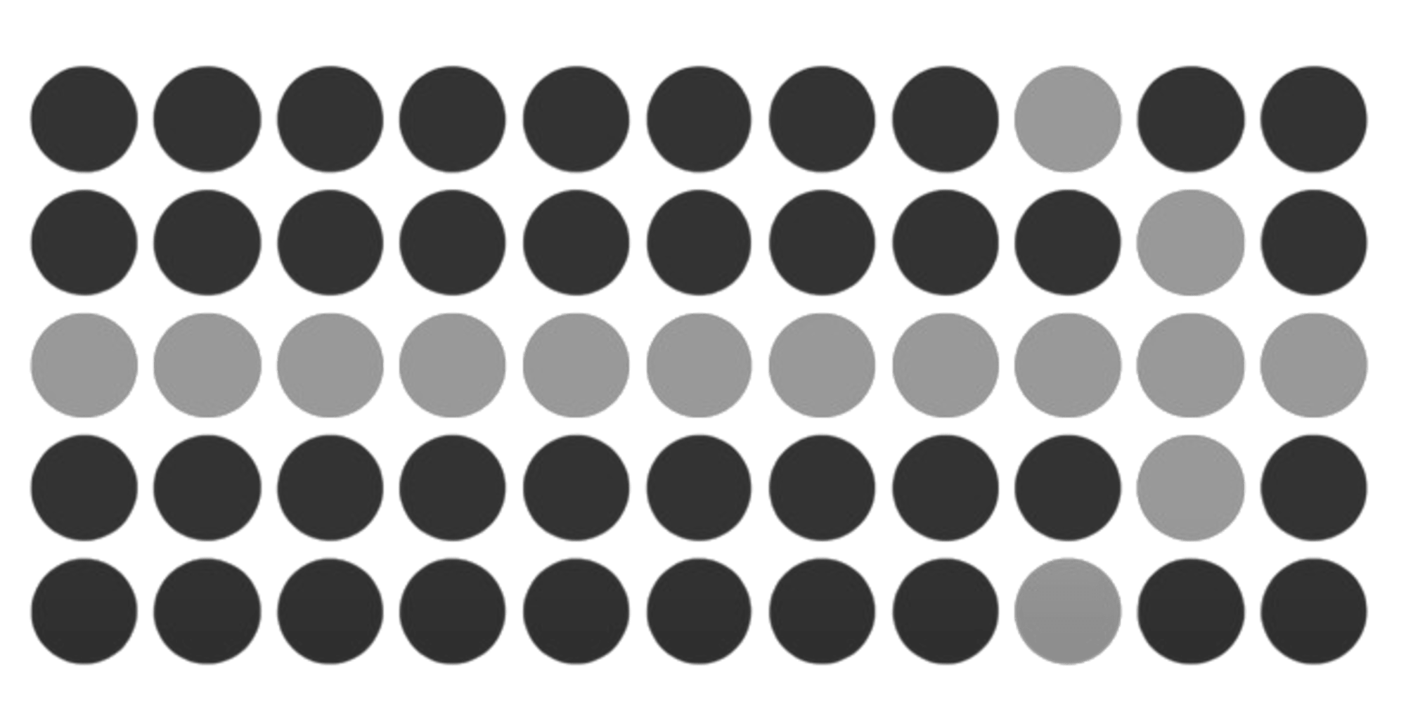
As you can see, when looking at the image you can imagine the arrow at first sight.

Following Gestalt psychology, our brain is always simple and makes it only notice key information. So why not build it simply and use the layout that users can notice more easily?
Here I have some laws for creating blocks of layout so that users can scan content faster.
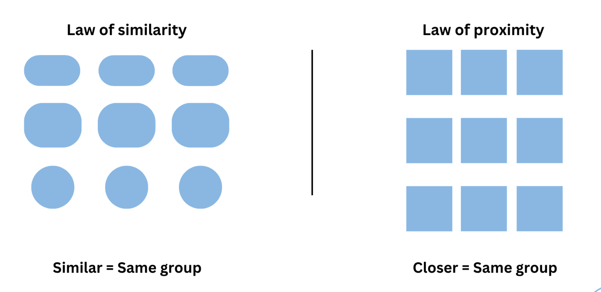
We can use the same size, shape, spacing, and even color to demonstrate that the element is the same group.
This is similar to Component-based design as you saw on many websites. Netflix applies this on its home page.
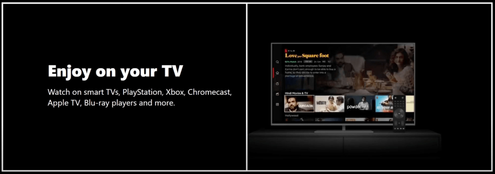
As you can see, they use a layout similar to our example above then they duplicate it more.
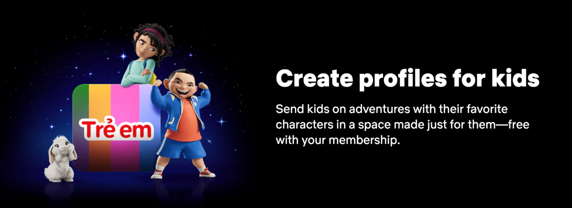
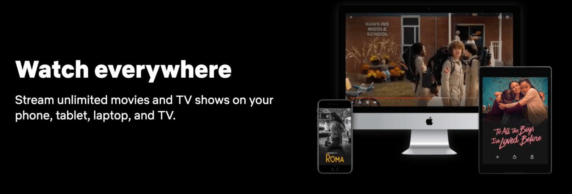
These help users can easily know all of this is the same section and function, also it helps the dev like us have an easier life.
Spacing and Size Considerations
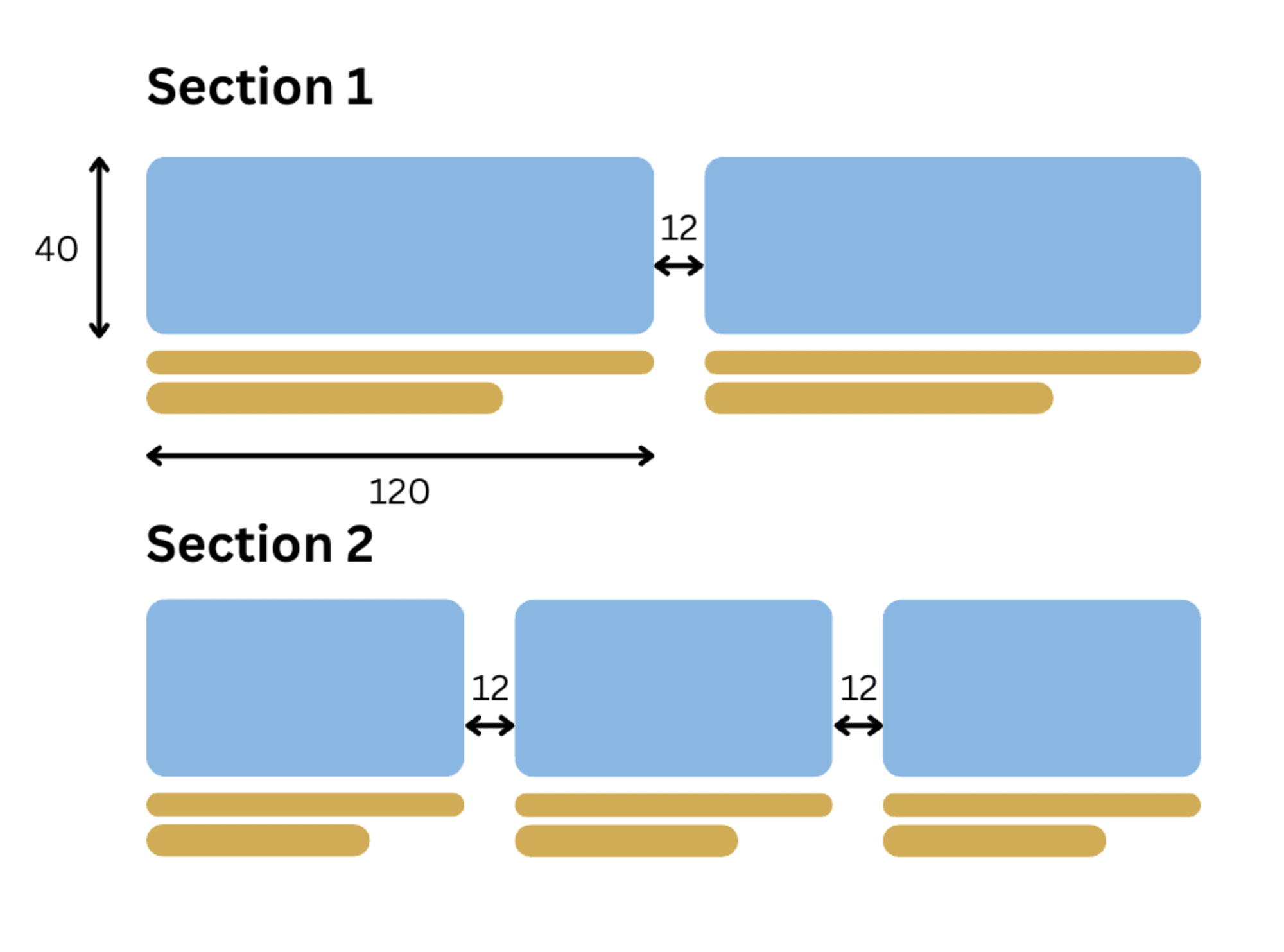
Remember that layout is not just about positioning, but also about Size & Spacing. To solve this issue, consider using the number "4".
Ensure that, all distances and element sizes on the website are divisible by 4. For instance: 8,12, 20, 32, and so on.
Typography in Web Design
Typography is a fancy way of saying fonts.
Looking at the Netflix page we mentioned earlier, you can see that it uses different font sizes. So, how do we decide which font size to use?
That's where type scales come in! We'll be using TypeScale (https://typescale.com), an application showing how the font size will look on a sample website. With this tool, we can choose the font size, font weight, and font family.
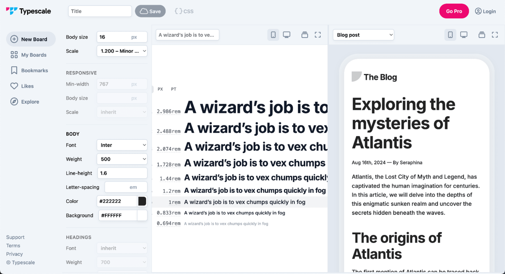
Once we have established the headings, we can then proceed to add them to our text paragraphs.
For instance, for the selected headings above, the important text should be in a large, bold size, while less important text can be in a smaller or normal size. It's advisable to keep fonts as simple as possible. One to two fonts should be used for the website, as using more fonts can make it appear cluttered and confusing.
In my experience, some effective fonts for web use are Inter, Montserrat, DM San, Raleway, and Roboto.
Color Psychology in Web Design
Based on color psychology, color affects what we feel when we see it. Here are some colors that we use frequently and what they represent.
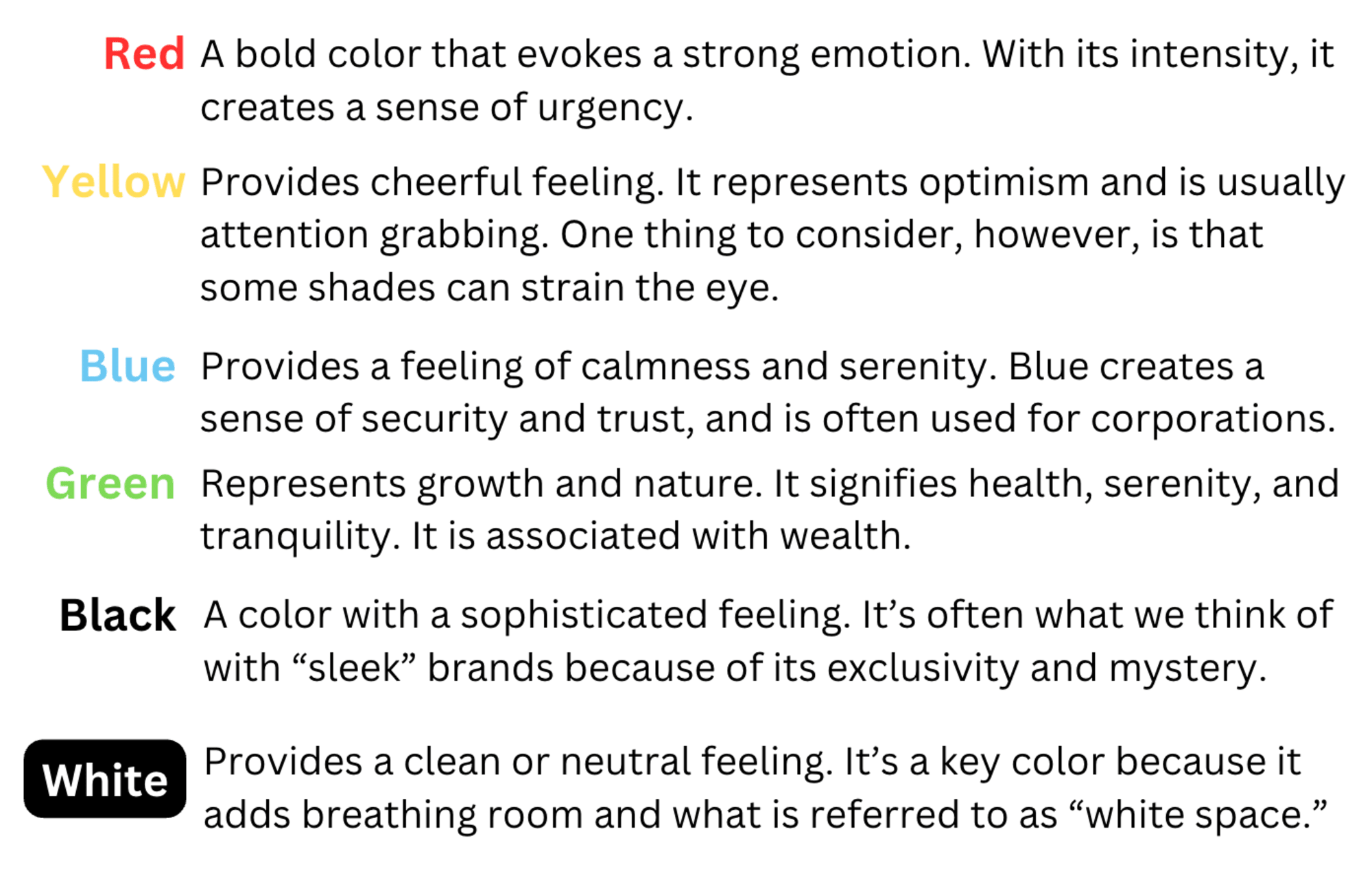
When you want to choose the color for your website you should consider your website function with the color.
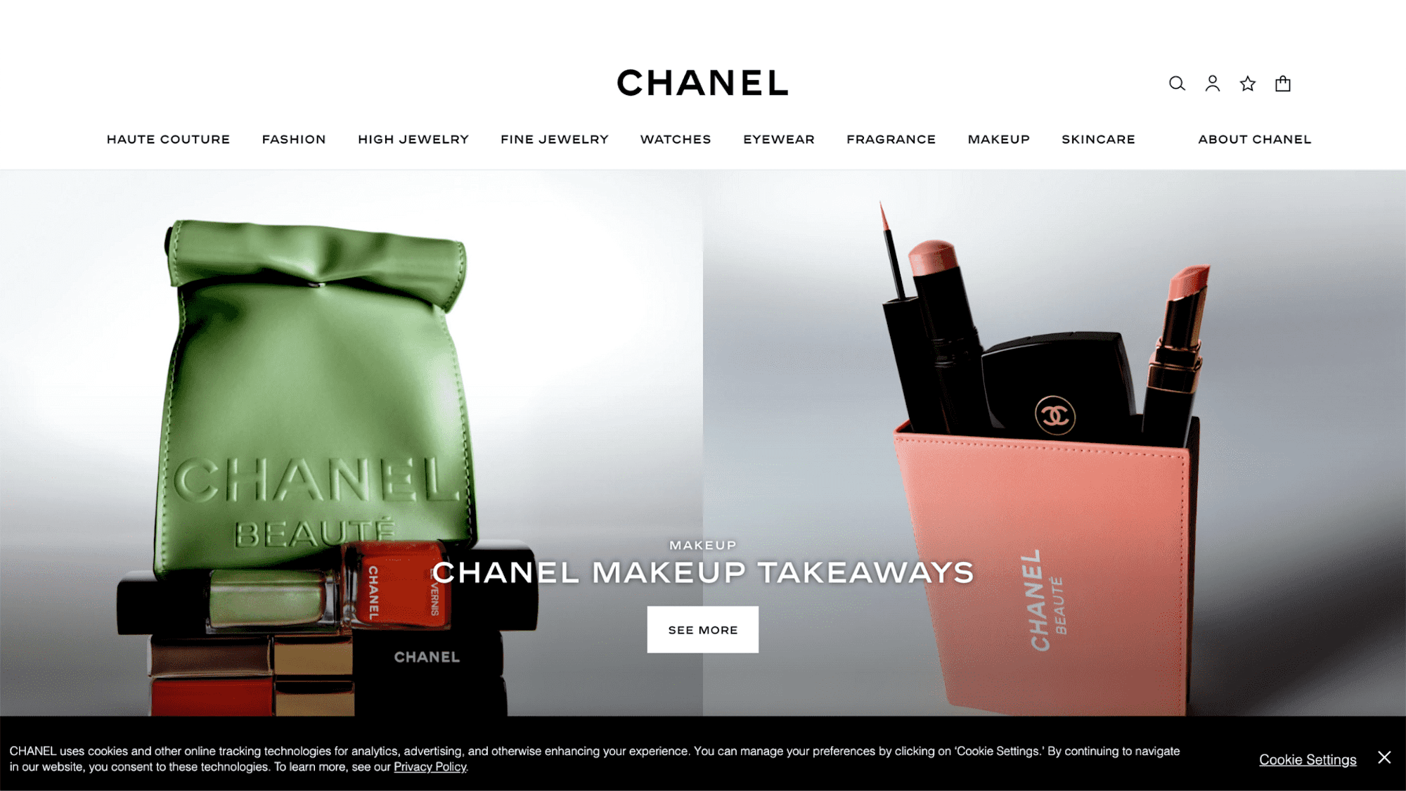
For example, Chanel is a luxury fashion brand so they use Black to represent the exclusivity of the product on the website.
Conclusion
Creating user-friendly websites requires careful layout design. By prioritizing simplicity, consistency, spacing, typography, and color psychology, designers can make visually appealing and intuitive designs. A thoughtful layout significantly enhances user experience, and prioritizing readability over aesthetics is crucial. Integrating these principles into the web design process is essential for creating engaging, user-friendly websites across all devices.
