Androidでイイカンジの選択ボタンを作ってみた
この記事は公開されてから1年以上経過しています。情報が古い可能性がありますので、ご注意ください。
Androidで次のようなボタンを作ることになりました。複数あるボタンのうち、どれか一つだけ選択できます。

社内のAndroidエンジニアに相談したところ、下記のライブラリを紹介されたため、本番アプリに組み込む前にサンプル実装をしてみました。
環境
- Android Studio 3.6
- Pixcel 3a (Android 10)
目指すボタンの要件
- ボタンの数は、任意(コード)で決められる
- ボタンは、どれか1つだけが必ず選択されている
- 選択されているボタンの色が変わる
- 初期状態では、一番左のボタンが選択されている
サンプルアプリを作ってみる
プロジェクトの新規作成
Empty Activityを選択して作成します。

ライブラリの導入
READMEに従って、ライブラリの導入を行います。まずはbuild.gradleです。
allprojects {
    repositories {
        google()
        jcenter()
        maven { url "https://jitpack.io" }
    }
}
続いてapp/build.gradleです。バージョンは1.3.0にしています。
dependencies {
    ...
    implementation 'com.github.savvyapps:ToggleButtonLayout:1.3.0'
    ...
}
ボタンを動的に追加する
activity_main.xmlにあるTextViewを少し修正し、ToggleButtonLayoutを追加します。
<TextView
        android:id="@+id/text1"
        android:layout_width="wrap_content"
        android:layout_height="wrap_content"
        android:text="Hello World!"
        app:layout_constraintBottom_toTopOf="@id/toggle_button_layout1"
        app:layout_constraintLeft_toLeftOf="parent"
        app:layout_constraintRight_toRightOf="parent"
        app:layout_constraintTop_toTopOf="parent"/>


<com.savvyapps.togglebuttonlayout.ToggleButtonLayout
        android:id="@+id/toggle_button_layout1"
        android:layout_width="wrap_content"
        android:layout_height="wrap_content"
        app:layout_constraintBottom_toBottomOf="parent"
        app:layout_constraintLeft_toLeftOf="parent"
        app:layout_constraintRight_toRightOf="parent"
        app:layout_constraintTop_toBottomOf="@id/text1"/>
続いて、MainActivity.ktのonCreateでボタンの追加処理を記載します。この例だと3つのボタンを追加しています。
override fun onCreate(savedInstanceState: Bundle?) {
    super.onCreate(savedInstanceState)
    setContentView(R.layout.activity_main)

    repeat(3) {
        val toggle = Toggle(1 + it, null, "test$it")
        toggle_button_layout1.addToggle(toggle)
    }
}
この時点で次の画面ができました!

ボタンを選択すると色が変わります。

ボタンを押したときにTextViewを更新する
MainActivity.ktにボタンが押された処理を記載します。
override fun onCreate(savedInstanceState: Bundle?) {
    super.onCreate(savedInstanceState)
    setContentView(R.layout.activity_main)

    repeat(3) {
        val toggle = Toggle(1 + it, null, "test$it")
        toggle_button_layout1.addToggle(toggle)
    }

    toggle_button_layout1.onToggledListener = { _, toggle, selected ->
        text1.text = "id:${toggle.id}, selected:$selected"
    }
}
test0を押すと、TextViewが変わりました!

この状態で再度test0を押すと、selectedの値とボタンの選択状態が変わりました。

選択状態を解除できないようにする
ToggleButtonLayoutにapp:allowDeselection="false"を追記します。
<com.savvyapps.togglebuttonlayout.ToggleButtonLayout
        android:id="@+id/toggle_button_layout1"
        android:layout_width="wrap_content"
        android:layout_height="wrap_content"
        app:allowDeselection="false"
        app:layout_constraintBottom_toBottomOf="parent"
        app:layout_constraintLeft_toLeftOf="parent"
        app:layout_constraintRight_toRightOf="parent"
        app:layout_constraintTop_toBottomOf="@id/text1"/>
これでボタンが解除できなくなりました。
初期状態で一番左のボタンを選択する
setToggled()で選択状態にしておき、TextViewに初期値を設定しておきます。
override fun onCreate(savedInstanceState: Bundle?) {
    super.onCreate(savedInstanceState)
    setContentView(R.layout.activity_main)

    repeat(3) {
        val toggle = Toggle(1 + it, null, "test$it")
        toggle_button_layout1.addToggle(toggle)
    }

    toggle_button_layout1.onToggledListener = { _, toggle, selected ->
        text1.text = "id:${toggle.id}, selected:$selected"
    }

    toggle_button_layout1.setToggled(1, true)
    text1.text = "id:1, selected:true"
}
ボタンの色を変える
選択時の色とボタン境界の色を変えます。
<com.savvyapps.togglebuttonlayout.ToggleButtonLayout
        android:id="@+id/toggle_button_layout1"
        android:layout_width="wrap_content"
        android:layout_height="wrap_content"
        app:allowDeselection="false"
        app:selectedColor="@color/colorPrimary"
        app:dividerColor="@color/colorPrimaryDark"
        app:layout_constraintBottom_toBottomOf="parent"
        app:layout_constraintLeft_toLeftOf="parent"
        app:layout_constraintRight_toRightOf="parent"
        app:layout_constraintTop_toBottomOf="@id/text1"/>
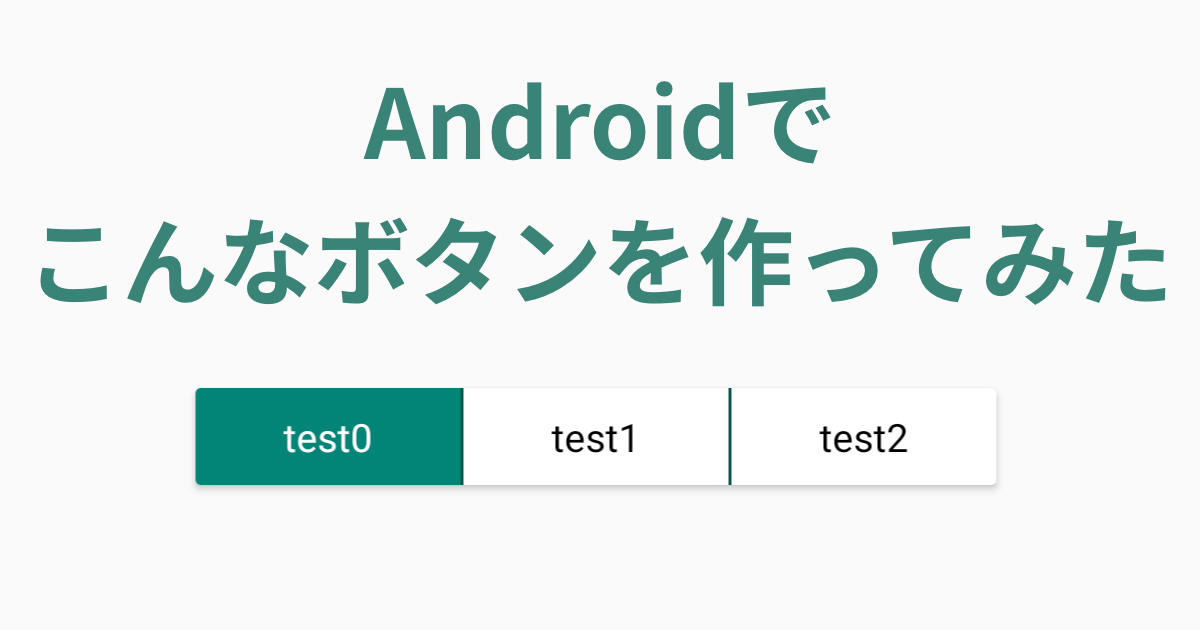
それっぽくなりました!

ボタンの見た目を変える
res/layout/view_toggle_button.xmlを新規作成します。ここでpaddingを設定しボタンを大きくしています。
<?xml version="1.0" encoding="utf-8"?>
<androidx.constraintlayout.widget.ConstraintLayout
        xmlns:android="http://schemas.android.com/apk/res/android"
        xmlns:tools="http://schemas.android.com/tools"
        xmlns:app="http://schemas.android.com/apk/res-auto"
        android:layout_width="match_parent"
        android:layout_height="match_parent"
        android:paddingTop="8dp"
        android:paddingBottom="8dp"
        android:paddingLeft="32dp"
        android:paddingRight="32dp">

    <TextView
            android:id="@android:id/text1"
            android:layout_width="match_parent"
            android:layout_height="match_parent"
            android:layout_gravity="center"
            android:gravity="center"
            tools:text="something"
            app:layout_constraintBottom_toBottomOf="parent"
            app:layout_constraintLeft_toLeftOf="parent"
            app:layout_constraintRight_toRightOf="parent"
            app:layout_constraintTop_toBottomOf="parent" />

</androidx.constraintlayout.widget.ConstraintLayout>
続いて、activity_main.xmlで上記のview_toggle_button.xmlを使用するように変更します。
<com.savvyapps.togglebuttonlayout.ToggleButtonLayout
        android:id="@+id/toggle_button_layout1"
        android:layout_width="wrap_content"
        android:layout_height="wrap_content"
        app:allowDeselection="false"
        app:selectedColor="@color/colorPrimary"
        app:dividerColor="@color/colorPrimaryDark"
        app:customLayout="@layout/view_toggle_button"
        app:layout_constraintBottom_toBottomOf="parent"
        app:layout_constraintLeft_toLeftOf="parent"
        app:layout_constraintRight_toRightOf="parent"
        app:layout_constraintTop_toBottomOf="@id/text1"/>
いい感じになりました!

ボタンの文字色を変える
選択時と非選択時でボタンの文字色を変えてみます。
まずはres/color/color_toggle_button.xmlを新規作成します。
<?xml version="1.0" encoding="utf-8"?>
<selector xmlns:android="http://schemas.android.com/apk/res/android">
    <item android:color="#ffffff" android:state_selected="true" />
    <item android:color="#000000" />
</selector>
続いて、view_toggle_button.xmlで上記のcolor_toggle_buttonを使用するように変更します。
<TextView
        android:id="@android:id/text1"
        android:layout_width="match_parent"
        android:layout_height="match_parent"
        android:layout_gravity="center"
        android:gravity="center"
        android:textColor="@color/color_toggle_button"
        app:layout_constraintBottom_toBottomOf="parent"
        app:layout_constraintLeft_toLeftOf="parent"
        app:layout_constraintRight_toRightOf="parent"
        app:layout_constraintTop_toBottomOf="parent"
        tools:text="something" />
完成したボタンは下記です。さらにいい感じになりました!!!
さいごに
AndroidのUIの作り方がなんとなーく分かった気がします。

