I tried to Visualize and Forecast Data using Amazon QuickSight
この記事は公開されてから1年以上経過しています。情報が古い可能性がありますので、ご注意ください。
Data Visualization
The process of putting information into a visual context, such as a map or graph, in order to make it easier for the human brain to absorb and extract insights. The primary purpose of data visualization is to make identifying patterns, trends, and abnormalities in vast amounts of data easier.
These information visualizations explain complicated data correlations and data-driven insights in an easy-to-understand manner.
In this blog, I will be showing how to visualize data using Amazon QuickSight as a tool to see trends and patterns in the data.
QuickSight setup
- In a new browser tab, open AWS Console, and search for QuickSight.
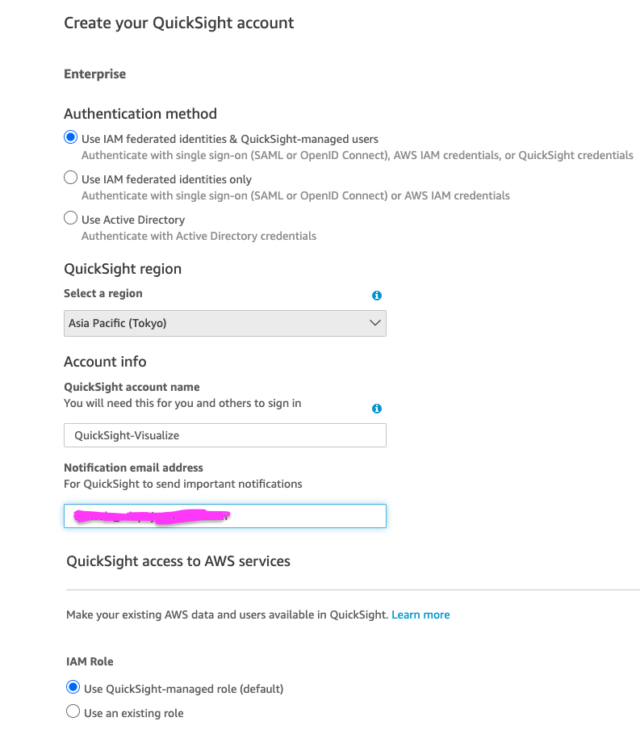
- Click the Sign up for QuickSight button on the QuickSight page.
- Continue with the default Enterprise edition, scrolling down and clicking the Continue button.
- Enter your QuickSight account name and email address for notifications.
- Scroll down and press the Finish button.
- Go to Amazon QuickSight by clicking the Go to Amazon QuickSight button. You will now be sent to the QuickSight console.


Build Your Dashboard
- Select Datasets from the menu on the left.
- Click the New Dataset button in the upper right corner of your screen.
- Select the first option, Upload a file.
- Select Next.
- Select Visualize.


Visualization
We will try to visualize the Sales by Month.
- To verify that the empty visual is chosen (shown by a blue border), click it.
- Select Sales and Order Date from the list of Fields.
- If the axis labels are not visible, enlarge the visual.
- On your X-axis, click the arrow next to the Order Date label and select Aggregate->Month.
- Alternatively, you may open the Field Wells section at the top of the page, click the arrow in the Order Date field, and then change the aggregate to Month.

Let's add Forecast to the visualization
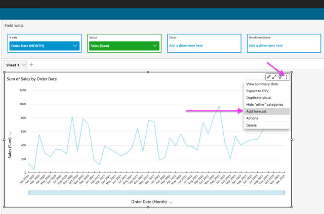
- From the visual menu in the upper right of the visual, click the ellipsis icon, and choose Add Forecast.
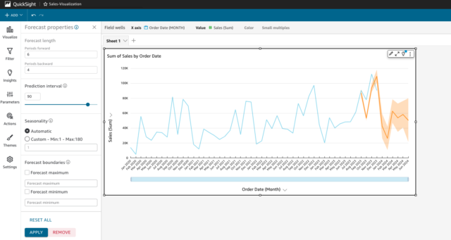
- Optional - when adding/editing the forecast, you can apply a backward or forward forecast as well to see how close the forecast is to the actuals for the previous months.
- Change Periods backward to 4 and Period forward to 6, and click Apply.


From this visualization dashboard, you can decide to use any preferred visual type like a pie chart and so on.
Amazon QuickSight is a good tool to visualize business and also make a forecast for the business.


